
使用“`ggplot2` 2”自定义饼图中的标签位置
使用“`ggplot2` 2”自定义饼图中的标签位置
提问于 2020-07-13 19:55:55
问题
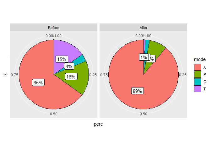
我正在尝试创建一个通用函数来使用绘制带有标签的ggplot2饼图。在大多数情况下我所写的作品。它执行次优的上下文是当有小比例时(见下面的图)。因此,我想定制标签沿径向轴的位置,使重叠最小化。请注意,我只需对标签的位置值进行硬编码,使其适用于此图,但我想选择一种更具通用性的策略。
数据
# setup
set.seed(123)
library(ggplot2)

# for reproducibility
df <-
  structure(list(
    epoch = structure(c(1L, 2L, 1L, 2L, 1L, 2L, 1L, 2L),
      .Label = c("Before", "After"),
      class = "factor"
    ),
    mode = structure(c(1L, 1L, 2L, 2L, 3L, 3L, 4L, 4L),
      .Label = c("A", "P", "C", "T"), class = "factor"
    ),
    counts = c(30916L, 21117L, 7676L, 1962L, 1663L, 462L, 7221L,
               197L),
    perc = c(
      65.1192181312663,
      88.9586317297161,
      16.1681691802174,
      8.26522874715646,
      3.50282247872609,
      1.94624652455978,
      15.2097902097902,
      0.829892998567697
    ),
    label = c("65%", "89%", "16%", "8%",
              "4%", "2%", "15%", "1%")
  ),
  row.names = c(NA, -8L),
  class = c("tbl_df",
            "tbl", "data.frame")
  )
绘图
请注意,对于After面,标签是重叠的,我想找到一个通用的解决方案,如何扰动标签的径向位置,使它们的重叠最小。
这是如何做到的呢?
ggplot2::ggplot(data = df, mapping = ggplot2::aes(x = "", y = perc)) +
  ggplot2::geom_col(
    mapping = ggplot2::aes(fill = mode),
    position = "fill",
    color = "black",
    width = 1,
    na.rm = TRUE
  ) + # adding label with percentages and/or counts
  rlang::exec(
    .fn = ggplot2::geom_label,
    mapping = ggplot2::aes(label = label, group = mode),
    position = ggplot2::position_fill(vjust = 0.5),
    show.legend = FALSE,
    na.rm = TRUE
  ) +
  ggplot2::facet_wrap(facets = ~epoch) +
  ggplot2::coord_polar(theta = "y")
回答 2
Stack Overflow用户
回答已采纳
发布于 2020-07-13 20:26:15
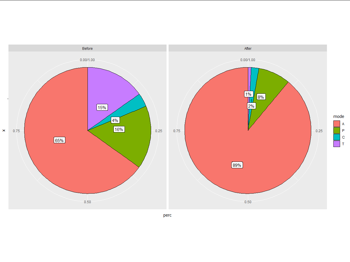
您可以从geom_label_repel包中尝试ggrepel。只需确保将方向参数设置为"y":
ggplot2::ggplot(data = df, mapping = ggplot2::aes(x = "", y = perc)) +
  ggplot2::geom_col(
    mapping = ggplot2::aes(fill = mode),
    position = "fill",
    color = "black",
    width = 1,
    na.rm = TRUE
  ) + # adding label with percentages and/or counts
  rlang::exec(
    .fn = ggrepel::geom_label_repel,
    mapping = ggplot2::aes(label = label, group = mode),
    position = ggplot2::position_fill(vjust = 0.5), direction = "y",
    show.legend = FALSE,
    na.rm = TRUE
  ) +
  ggplot2::facet_wrap(facets = ~epoch) +
  ggplot2::coord_polar(theta = "y")
页面原文内容由Stack Overflow提供。腾讯云小微IT领域专用引擎提供翻译支持
原文链接:
https://stackoverflow.com/questions/62883325
复制相关文章
相似问题
腾讯云开发者

Copyright © 2013 - 2026 Tencent Cloud. All Rights Reserved. 腾讯云 版权所有
深圳市腾讯计算机系统有限公司 ICP备案/许可证号:粤B2-20090059 ![]() 粤公网安备44030502008569号
粤公网安备44030502008569号
腾讯云计算(北京)有限责任公司 京ICP证150476号 | 京ICP备11018762号