
matplotlib中的散点图和组合极直方图
matplotlib中的散点图和组合极直方图
提问于 2020-06-18 18:49:05
回答 3
Stack Overflow用户
回答已采纳
发布于 2020-06-18 20:58:00
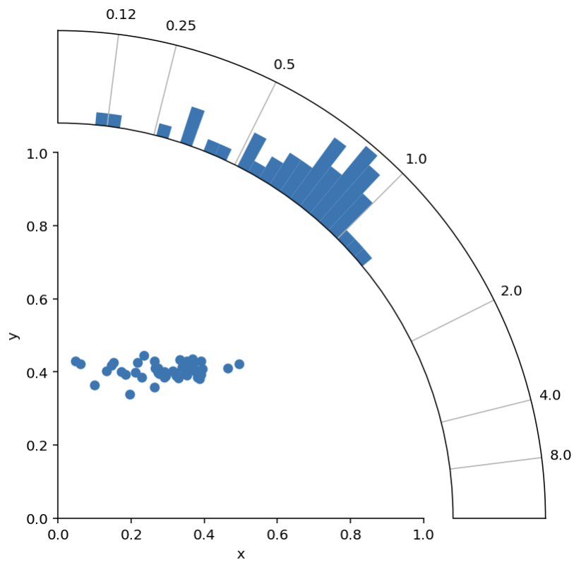
好的。感谢尼古拉斯的回答和tomjn的回答,我有了一个可行的解决方案:)
import numpy as np
import matplotlib.pyplot as plt

# Scatter data
n = 50
x = 0.3 + np.random.randn(n)*0.1
y = 0.4 + np.random.randn(n)*0.02

def radial_corner_plot(x, y, n_hist_bins=51):
    """Scatter plot with radial histogram of x/y ratios"""

    # Axis setup
    fig = plt.figure(figsize=(6,6))
    ax1 = fig.add_axes([0.1,0.1,.6,.6], label="cartesian")
    ax2 = fig.add_axes([0.1,0.1,.8,.8], projection="polar", label="polar")
    ax2.set_rorigin(-20)
    ax2.set_thetamax(90)

    # define useful constant
    offset_in_radians = np.pi/4

    def rotate_hist_axis(ax):
        """rotate so that 0 degrees is pointing up and right"""
        ax.set_theta_offset(offset_in_radians)
        ax.set_thetamin(-45)
        ax.set_thetamax(45)
        return ax

    # Convert scatter data to histogram data
    r = np.sqrt(x**2 + y**2)
    phi = np.arctan2(y, x)
    h, b = np.histogram(phi,
                        bins=np.linspace(0, np.pi/2, n_hist_bins),
                        density=True)

    # SCATTER PLOT -------------------------------------------------------
    ax1.scatter(x,y)

    ax1.set(xlim=[0, 1], ylim=[0, 1], xlabel="x", ylabel="y")
    ax1.spines['right'].set_visible(False)
    ax1.spines['top'].set_visible(False)


    # HISTOGRAM ----------------------------------------------------------
    ax2 = rotate_hist_axis(ax2)
    # rotation of axis requires rotation in bin positions
    b = b - offset_in_radians

    # plot the histogram
    bars = ax2.bar(b[:-1], h, width=b[1:] - b[:-1], align='edge')

    def update_hist_ticks(ax, desired_ratios):
        """Update tick positions and corresponding tick labels"""
        x = np.ones(len(desired_ratios))
        y = 1/desired_ratios
        phi = np.arctan2(y,x) - offset_in_radians
        # define ticklabels
        xticklabels = [str(round(float(label), 2)) for label in desired_ratios]
        # apply updates
        ax2.set(xticks=phi, xticklabels=xticklabels)
        return ax

    ax2 = update_hist_ticks(ax2, np.array([1/8, 1/4, 1/2, 1, 2, 4, 8]))

    # just have radial grid lines
    ax2.grid(which="major", axis="y")

    # remove bin count labels
    ax2.set_yticks([])

    return (fig, [ax1, ax2])

fig, ax = radial_corner_plot(x, y)
谢谢你的指点!
Stack Overflow用户
发布于 2020-06-18 20:06:43
我相信其他人会有更好的建议,但是有一种方法可以得到你想要的东西(不需要额外的轴艺术家),那就是使用一个极坐标投影和一个散点图和条形图。有点像
import matplotlib.pyplot as plt
import numpy as np

x = np.random.uniform(size=100)
y = np.random.uniform(size=100)

r = np.sqrt(x**2 + y**2)
phi = np.arctan2(y, x)

h, b = np.histogram(phi, bins=np.linspace(0, np.pi/2, 21), density=True)
colors = plt.cm.Spectral(h / h.max())

ax = plt.subplot(111, projection='polar')
ax.scatter(phi, r, marker='.')
ax.bar(b[:-1], h, width=b[1:] - b[:-1],
       align='edge', bottom=np.max(r) + 0.2,  color=colors)
# Cut off at 90 degrees
ax.set_thetamax(90)
# Set the r grid to cover the scatter plot
ax.set_rgrids([0, 0.5, 1])
# Let's put a line at 1 assuming we want a ratio of some sort
ax.set_thetagrids([45], [1])
它会给
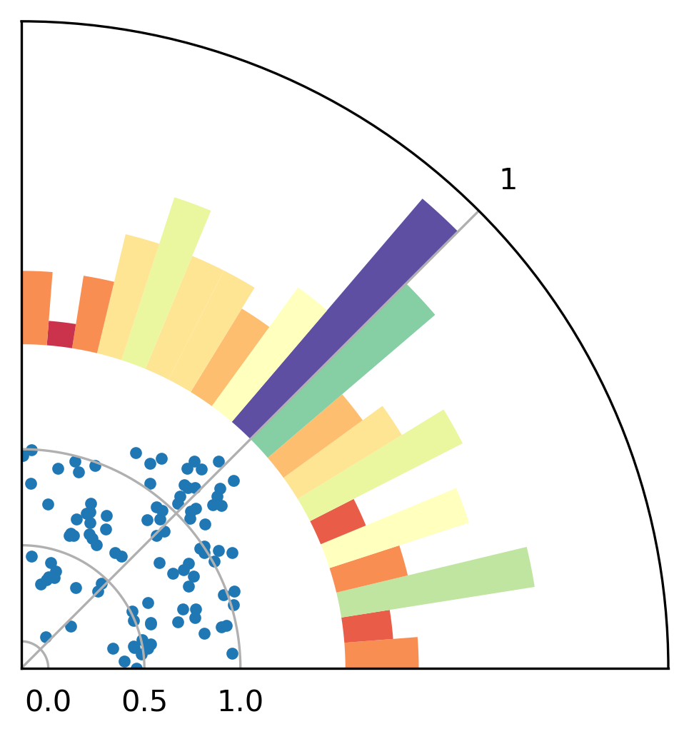
它缺少斧头标签和一些美化,但它可能是一个起点。我希望这会有所帮助。
Stack Overflow用户
发布于 2020-06-18 20:28:57
您可以使用两个轴在另一个上面:
import matplotlib.pyplot as plt
fig = plt.figure(figsize=(6,6))
ax1 = fig.add_axes([0.1,0.1,.8,.8], label="cartesian")
ax2 = fig.add_axes([0.1,0.1,.8,.8], projection="polar", label="polar")

ax2.set_rorigin(-1)
ax2.set_thetamax(90)
plt.show()
页面原文内容由Stack Overflow提供。腾讯云小微IT领域专用引擎提供翻译支持
原文链接:
https://stackoverflow.com/questions/62457321
复制相关文章
相似问题
腾讯云开发者

Copyright © 2013 - 2026 Tencent Cloud. All Rights Reserved. 腾讯云 版权所有
深圳市腾讯计算机系统有限公司 ICP备案/许可证号:粤B2-20090059 ![]() 粤公网安备44030502008569号
粤公网安备44030502008569号
腾讯云计算(北京)有限责任公司 京ICP证150476号 | 京ICP备11018762号