
挠曲盒中的意外失真
挠曲盒中的意外失真
提问于 2020-06-04 20:43:16
我有三个均匀的列使用挠性盒。在CodePen中,它看上去更清楚:https://codepen.io/pixy-dixy/pen/KKVwvoQ
以下是代码:
.rowIdeas {
  text-align: center;
  display: flex;
  justify-content: space-around;
  flex-direction: row-reverse;
}

.columnIdeas {
  flex-basis: 25%;
}

.maxSize {
  max-height: 300px;
}<!-- about ideas section start -->
<div class="rowIdeas">
<div class="columnIdeas iransansdnlight">
<div>
<img class="maxSize" src="https://langfox.ir/vc/philosophy.svg">
<h2>Item one</h2>
<p>Flex items do not need to be block level unless the content they contain requires it. Also, you've prefixed all of the display properties, but didn't prefix any of the other Flexbox properties (which have different names in the other drafts).</p>
</div>
</div>
<div class="idea columnIdeas iransansdnlight">
<div>
<img class="maxSize" src="https://langfox.ir/vc/idea.svg">
<h2>item two</h2>
<p>Flex items do not need to be block level unless the content they contain requires it. Also, you've prefixed all of the display properties, but didn't prefix any of the other Flexbox properties (which have different names in the other drafts).
</div>
</div>
<div class="columnIdeas iransansdnlight">
<div>
<img class="maxSize" src="https://langfox.ir/vc/results.svg">
<h2>item three</h2>
<p>Flex items do not need to be block level unless the content they contain requires it. Also, you've prefixed all of the display properties, but didn't prefix any of the other Flexbox properties (which have different names in the other drafts).</p>
</div>
</div>
</div>
<!-- about ideas section ends -->
代码在这里和在CodePen,中运行良好,但是当我将相同的代码放到我的登陆页面时,我看到了这个。
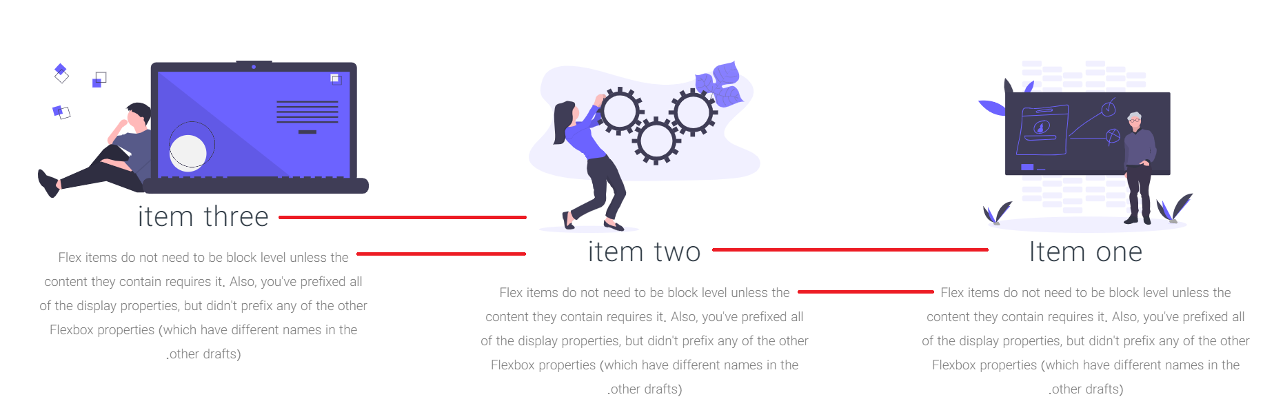
正如你所看到的,第一个比其他的要高一点。
知道问题出在哪里吗?
回答 1
Stack Overflow用户
回答已采纳
发布于 2020-06-04 20:50:11
问题是svg图像是不同比例的。所以左边的那个更短,所以标题不会像其他的一样低。你要么给他们一个特定的高度,重新做,使他们都是相同的高度,或以其他方式解释不同的大小。
页面原文内容由Stack Overflow提供。腾讯云小微IT领域专用引擎提供翻译支持
原文链接:
https://stackoverflow.com/questions/62203778
复制相关文章
相似问题
腾讯云开发者
