
如何显示与使用的变量不同的另一个标签
如何显示与使用的变量不同的另一个标签
提问于 2020-05-03 20:46:45
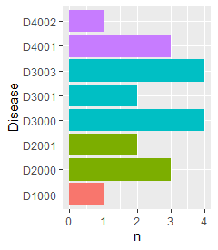
你好,我想表示的是,与同一功能系统相关的疾病都是以同样的方式着色的。由于根据它们的代码对类似疾病进行分组比较容易,所以我已经这样做了。然而,这是我想展示的疾病标签。但是我不能用它们的标签来分组类似的疾病,因为这些标签没有任何共同之处(在我的真实数据中),而且我不能手动进行,因为我在一个大型数据库上工作。这就是我的数据库的样子。
ID=1:20
Hospital<-sample(c(rep("A",10),rep("B",10)))
Disease<-c("D1000",rep("D2001",2),rep("D2000",3),rep("D3000",4),
           rep("D3001",2),rep("D3003",4),rep("D4001",3),"D4002")
labels<-c("Infection",rep("Cancer.type1",2),rep("Cancer.type0",3),
          rep("Trauma.type0",4),rep("Trauma.type1",2),
          rep("Trauma.type3",4),rep("Heart.type1",3),"Heary.type2"  )
data<-data.frame(ID,Hospital,Disease,labels)
data$Disease<-as.factor(data$Disease)
下面是我如何绘制条形图。从D4开始的所有疾病都有相同的colors.All,以D3开头的疾病也有颜色。诸若此类。现在我希望疾病标签出现在图表上,而不是它们的代码上。
data%>%count(Disease)%>%
ggplot(aes(x=Disease,y=n))+
geom_col(aes(fill=substr(Disease,1,2)),show.legend = F)+
coord_flip()
回答 2
Stack Overflow用户
回答已采纳
发布于 2020-05-03 21:02:03
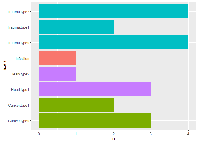
您只需将labels添加到您的count函数中,并将其作为绘图的基础:
data %>%
  count(labels, Disease) %>%
  ggplot(aes(x = labels, y = n)) +
    geom_col(aes(fill = substr(Disease,1,2)), show.legend = FALSE) +
    coord_flip()
Stack Overflow用户
发布于 2020-05-03 21:02:18
使用scale_x_discrete(labels= ...),您可以设置标签(因为您使用了coord_flip,所以它是x而不是y)。例如,请参见更改滴答标记节这里。您必须提供一个命名向量,例如我在下面第一行中生成的向量:
labels <- setNames(labels, Disease)

data%>%count(Disease)%>%
  ggplot(aes(x=Disease,y=n))+
  geom_col(aes(fill=substr(Disease,1,2)),show.legend = F)+
  coord_flip() +
scale_x_discrete(labels=labels)页面原文内容由Stack Overflow提供。腾讯云小微IT领域专用引擎提供翻译支持
原文链接:
https://stackoverflow.com/questions/61581394
复制相关文章
相似问题
腾讯云开发者
