
以日期或其他类型值的特定间隔设置绘图上的背景色。
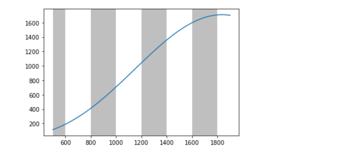
我想要做一个类似于雅虎财务图表的图形,其中背景色根据轴的刻度、日期标记以交替的间隔变灰。在一个类似问题的答案之后,我得到了这样的图像:
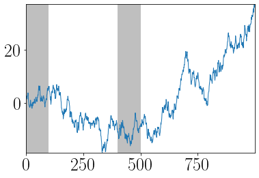
使用此代码:
n = 1000
xs = np.random.randn(n).cumsum()

plt.plot(xs)
plt.autoscale(enable=True, axis='both', tight=True)

for i in range(0, len(y_series), 400):
  plt.axvspan(i, i+100, facecolor='grey', alpha=0.5)
但是,这个代码的问题是,我们使用数据输入作为确定灰色区域的参考。相反,我希望灰色区域由x轴或y轴上可见的滴答决定,与输入解耦。我不想使用定位器函数,因为这也违背了根据可见的滴答值“自动”对背景进行灰化的目的。此外,我们在x轴中使用整数,但理想情况下,这应该适用于日期、浮点数和其他。
下面是一个使用日期的示例,没有灰色区域:
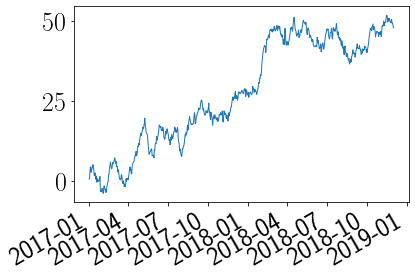
用此代码制作,没有自动刻度:
n = 700
x_series = pd.date_range(start='2017-01-01', periods=n, freq='D')
y_series = np.random.randn(n).cumsum()

fig, ax = plt.subplots()
ax.plot(x_series, y_series)
plt.gcf().autofmt_xdate()
PS:我试着阅读棍棒列表,但是如果关闭自动缩放的话,这个列表并不能准确地反映可见值。
locs, labels = plt.xticks()
print(locs)
-200。0。200。400。600。800。1000。1200。
回答 3
Stack Overflow用户
发布于 2020-04-18 19:44:14
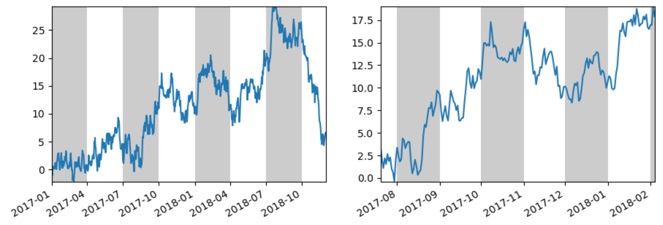
由于注释似乎太复杂,无法解释一切,下面是一些示例代码,包括subplots、autoscale、autofmt_xdate和重置xlims。
autoscale移动xlim,因此应该在alt_bands获取和重置这些xlim之前调用它。
在处理子图时,大多数函数应该是axes版本,而不是plt版本。所以,ax.get_ticks()代替了plt.ticks(),ax.axvspan代替了plt.axvspan。autofmt_xdate更改完整的图形(旋转和重新对齐x轴上的日期,并删除x轴上的日期,除了底部的图)。应该在创建绘图后(在fig.autofmt_xdate()之后)和在可能更改滴答位置的操作之后调用ax.plot。
import numpy as np
import pandas as pd
from matplotlib import pyplot as plt

def alt_bands(ax=None):
    ax = ax or plt.gca()
    x_left, x_right = ax.get_xlim()
    locs = ax.get_xticks()
    for loc1, loc2 in zip(locs[::2], np.concatenate((locs, [x_right]))[1::2]):
        ax.axvspan(loc1, loc2, facecolor='black', alpha=0.2)
    ax.set_xlim(x_left, x_right)

n = 700
x_series = pd.date_range(start='2017-01-01', periods=n, freq='D')
y_series = np.random.normal(.01, 1, n).cumsum()

fig, axes = plt.subplots(ncols=2)
axes[0].plot(x_series, y_series)
axes[0].autoscale(enable=True, axis='both', tight=True)
alt_bands(axes[0])

axes[1].plot(x_series[200:400], y_series[200:400])
axes[1].autoscale(enable=True, axis='both', tight=True)
alt_bands(axes[1])

fig.autofmt_xdate()
plt.show()
Stack Overflow用户
发布于 2020-04-18 05:35:58
我认为这个问题有点微妙,要确保所有案件都包括在内是很乏味的。的确,xticks有时会将值返回到xlim的左右两个位置,但这仅仅是个开始。如果数据超出了最右边的xtick,或者开始于最左边的xtick,等等,会发生什么?
例如,在下面的许多情况下,我想在xmin或xmax开始(或停止)乐队,因为如果我不开始,索引跳过乐队之后开始(或停止),将有一个很长的部分是不带的,它看起来不对。
因此,在处理几个不同的角落案件时,我把它当成了(至少)我尝试过的那些:
import numpy as np
import matplotlib.pyplot as plt

x = np.linspace(100, 11000, 7500)
y = x * np.sin(0.001*x) ** 2

def alt_bands(x):
    locs, labels = plt.xticks()
    x_left, x_right = plt.xlim()
    for i, loc in enumerate(locs):
        if i%2 == 1 and i<len(locs)-1 and loc<x[-1] and (loc>x_left or x[0]>x_left):
            L = max(x_left, x[0], loc)
            R = min(x_right, x[-1], locs[i+1])
            if x[0] <= L and R>L:
                plt.axvspan(L, R, facecolor='grey', alpha=0.5)

plt.plot(x, y)
alt_bands()
下面是一些例子:
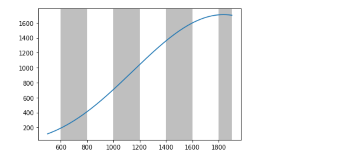
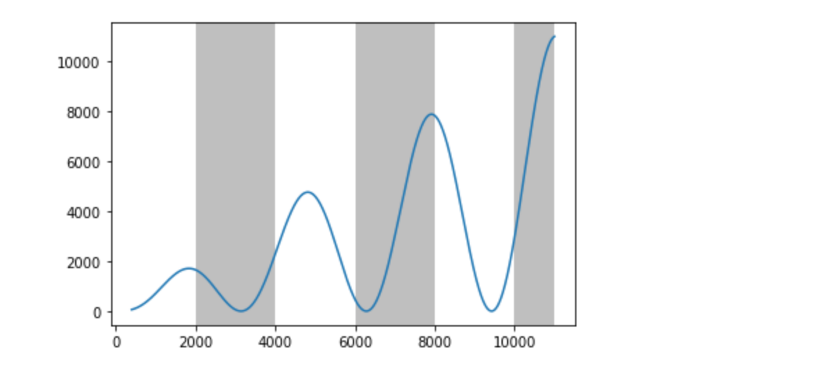
老实说,这不是我最自豪的答案。我没有仔细考虑这个逻辑,而是逐步增加了一些条件来处理我尝试过的每一个新的角落案例,但以一种不会碰到上一个案例的方式。如果你想把它想清楚,请随时把它清理干净。还是有一种本质上干净的方法?
Stack Overflow用户
发布于 2020-04-18 00:10:30
检查一下密码能帮到你!
在这里,axes([0.01, 0.01, 0.98, 0.90], facecolor="white", frameon=True) in facecolor,您可以更改背景,也可以用十六进制格式'#F0F0F0'灰色。
from matplotlib.pyplot import *
import subprocess
import sys
import re

# Selection of features following "Writing mathematical expressions" tutorial
mathtext_titles = {
    0: "Header demo",
    1: "Subscripts and superscripts",
    2: "Fractions, binomials and stacked numbers",
    3: "Radicals",
    4: "Fonts",
    5: "Accents",
    6: "Greek, Hebrew",
    7: "Delimiters, functions and Symbols"}
n_lines = len(mathtext_titles)

# Randomly picked examples
mathext_demos = {
    0: r"$W^{3\beta}_{\delta_1 \rho_1 \sigma_2} = "
       r"U^{3\beta}_{\delta_1 \rho_1} + \frac{1}{8 \pi 2} "
       r"\int^{\alpha_2}_{\alpha_2} d \alpha^\prime_2 \left[\frac{ "
       r"U^{2\beta}_{\delta_1 \rho_1} - \alpha^\prime_2U^{1\beta}_"
       r"{\rho_1 \sigma_2} }{U^{0\beta}_{\rho_1 \sigma_2}}\right]$",

    1: r"$\alpha_i > \beta_i,\ "
       r"\alpha_{i+1}^j = {\rm sin}(2\pi f_j t_i) e^{-5 t_i/\tau},\ "
       r"\ldots$",

    2: r"$\frac{3}{4},\ \binom{3}{4},\ \genfrac{}{}{0}{}{3}{4},\ "
       r"\left(\frac{5 - \frac{1}{x}}{4}\right),\ \ldots$",

    3: r"$\sqrt{2},\ \sqrt[3]{x},\ \ldots$",

    4: r"$\mathrm{Roman}\ , \ \mathit{Italic}\ , \ \mathtt{Typewriter} \ "
       r"\mathrm{or}\ \mathcal{CALLIGRAPHY}$",

    5: r"$\acute a,\ \bar a,\ \breve a,\ \dot a,\ \ddot a, \ \grave a, \ "
       r"\hat a,\ \tilde a,\ \vec a,\ \widehat{xyz},\ \widetilde{xyz},\ "
       r"\ldots$",

    6: r"$\alpha,\ \beta,\ \chi,\ \delta,\ \lambda,\ \mu,\ "
       r"\Delta,\ \Gamma,\ \Omega,\ \Phi,\ \Pi,\ \Upsilon,\ \nabla,\ "
       r"\aleph,\ \beth,\ \daleth,\ \gimel,\ \ldots$",

    7: r"$\coprod,\ \int,\ \oint,\ \prod,\ \sum,\ "
       r"\log,\ \sin,\ \approx,\ \oplus,\ \star,\ \varpropto,\ "
       r"\infty,\ \partial,\ \Re,\ \leftrightsquigarrow, \ \ldots$"}


def doall():
    # Colors used in mpl online documentation.
    mpl_blue_rvb = (191. / 255., 209. / 256., 212. / 255.)
    mpl_orange_rvb = (202. / 255., 121. / 256., 0. / 255.)
    mpl_grey_rvb = (51. / 255., 51. / 255., 51. / 255.)

    # Creating figure and axis.
    figure(figsize=(6, 7))
    axes([0.01, 0.01, 0.98, 0.90], facecolor="white", frameon=True)
    gca().set_xlim(0., 1.)
    gca().set_ylim(0., 1.)
    gca().set_title("Matplotlib's math rendering engine",
                    color=mpl_grey_rvb, fontsize=14, weight='bold')
    gca().set_xticklabels("", visible=False)
    gca().set_yticklabels("", visible=False)

    # Gap between lines in axes coords
    line_axesfrac = (1. / n_lines)

    # Plotting header demonstration formula
    full_demo = mathext_demos[0]
    annotate(full_demo,
             xy=(0.5, 1. - 0.59 * line_axesfrac),
             color=mpl_orange_rvb, ha='center', fontsize=20)

    # Plotting features demonstration formulae
    for i_line in range(1, n_lines):
        baseline = 1 - i_line * line_axesfrac
        baseline_next = baseline - line_axesfrac
        toptitle = mathtext_titles[i_line] + ":"
        fill_color = ['white', mpl_blue_rvb][i_line % 2]
        fill_between([0., 1.], [baseline, baseline],
                     [baseline_next, baseline_next],
                     color=fill_color, alpha=0.5)
        annotate(toptitle,
                 xy=(0.07, baseline - 0.3 * line_axesfrac),
                 color=mpl_grey_rvb, weight='bold')
        demo = mathext_demos[i_line]
        annotate(demo,
                 xy=(0.05, baseline - 0.75 * line_axesfrac),
                 color=mpl_grey_rvb, fontsize=16)

    for i1 in range(n_lines):
        s1 = mathext_demos[i1]
        print(i1, s1)
    show()


if __name__ == '__main__':
    if '--latex' in sys.argv:
        # Run: python mathtext_examples.py --latex
        # Need amsmath and amssymb packages.
        fd = open("mathtext_examples.ltx", "w")
        fd.write("\\documentclass{article}\n")
        fd.write("\\usepackage{amsmath, amssymb}\n")
        fd.write("\\begin{document}\n")
        fd.write("\\begin{enumerate}\n")

        for i in range(n_lines):
            s = mathext_demos[i]
            s = re.sub(r"(?<!\\)\$", "$$", s)
            fd.write("\\item %s\n" % s)

        fd.write("\\end{enumerate}\n")
        fd.write("\\end{document}\n")
        fd.close()

        subprocess.call(["pdflatex", "mathtext_examples.ltx"])
    else:
doall()https://stackoverflow.com/questions/61282135
复制相似问题
腾讯云开发者
