
将分类列项绘制为单独的叠加条图中的和
将分类列项绘制为单独的叠加条图中的和
提问于 2020-02-05 20:11:03
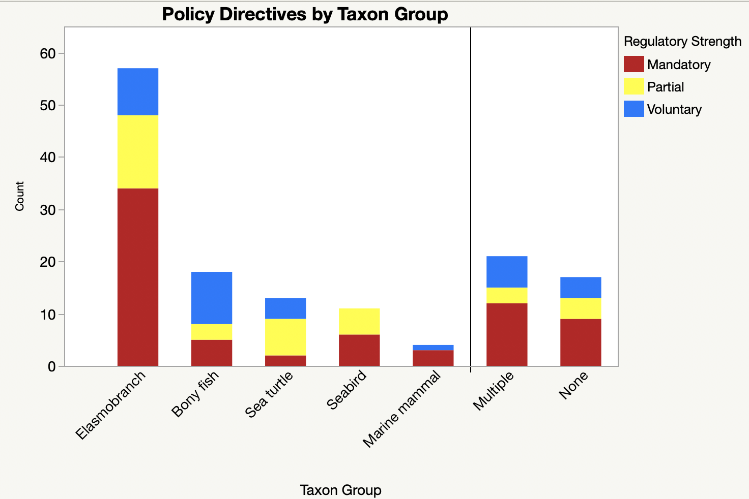
我想从本质上重新创建我在JMP中创建的这个地块,但是对于R,这些值来自一个定性数据集,其中物种组是一个列中的条目。我想把SpeciesGroup画在x轴上,但是在一个堆叠的条形图中,用强度来填充颜色。我想我需要重新排序数据,但不太清楚怎么做。
df<- data.frame(ID=c(1,2),
                policy=c("Policy A", "Policy B", "Policy C", "Policy D",
                         "Policy E","Policy F" ),
                SpeciesGroup= c("ray", "ray", "mammal", "mammal", "fish", "reptile"),
                Stength=c("M", "V", "M", "P", "P", "M"),
                stringsAsFactors=FALSE)
到目前为止,我已经尝试过:
ggplot(aes(x=factor(Group), fill = Regulatory_Strength)) +
  geom_bar(mapping = NULL, data = RFMO_Policies, stat = "count",
           position = "stack",  width = .7, binwidth = NULL,
           na.rm = FALSE, show.legend = TRUE, inherit.aes = TRUE )+
  labs(title="Policy Directives by Taxa",  x="Directive Type", y = "Count", size = 13 )+
  theme(plot.title = element_text(hjust=1))+
  theme_classic()+
  scale_fill_manual(values=c( "firebrick3","yellow1","dodgerblue1" ),
                    labels= c("Mandatory","Partial", "Voluntary" ))+
  theme(axis.text.x=element_text(angle=45,hjust=1,vjust=1, size= 13))+
  guides(fill=guide_legend(title="Regulatory Strength"))
下面是我用JMP制作的图,我想复制它:
谢谢您的帮助!!
回答 1
Stack Overflow用户
回答已采纳
发布于 2020-02-05 20:40:07
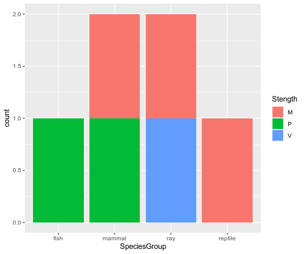
这就是你要找的东西吗?
library(ggplot2)
ggplot(df, aes(x = SpeciesGroup, fill =  Stength))+
  geom_bar(stat = "count")
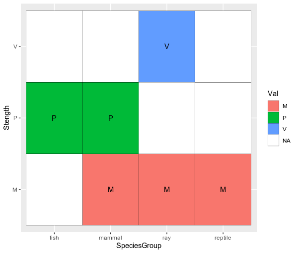
使用geom_tile的替代方案
在我看来,由于您的数据是定性值,使用geom_tile绘制它们可能更有意义。
library(dplyr)
All_val <- expand(df,SpeciesGroup, Stength)

library(ggplot2)
df %>% mutate(Val = Stength) %>%
    select(SpeciesGroup, Stength, Val) %>%
    full_join(., All_val) %>%
    ggplot(aes(x = SpeciesGroup, y = Stength, fill = Val))+
    geom_tile(color = "black")+
    scale_fill_discrete(na.value = "white")+
    geom_text(aes(label = Val))
页面原文内容由Stack Overflow提供。腾讯云小微IT领域专用引擎提供翻译支持
原文链接:
https://stackoverflow.com/questions/60083378
复制相关文章
相似问题
腾讯云开发者
