
海运订购点
海运订购点
提问于 2019-12-03 09:25:31
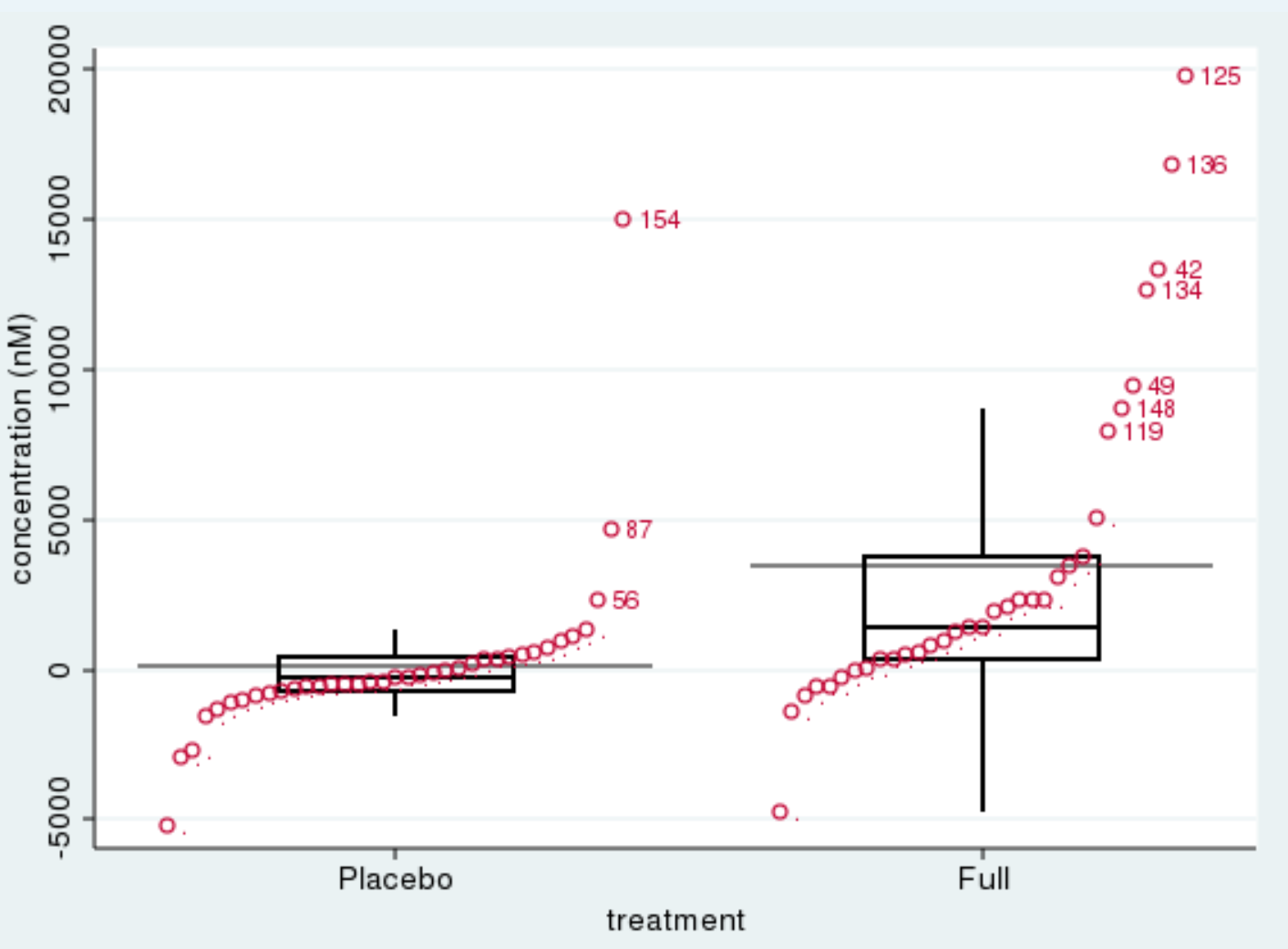
我正在尝试制作一个条形图/点图/散点图,其中每个类别中的点都根据y值进行排序(参见这个论坛帖子中的示例)。我想在每一类基因排序(如在两个类别的链接例子:安慰剂和完全)。
如何才能在海上/熊猫中做到这一点?
一个简单的例子是:
pd.DataFrame({
    "Gene": ["Gene1", "Gene1", "Gene1", "Gene1", "Gene1", "Gene1",
             "Gene2", "Gene2", "Gene2", "Gene2", "Gene2", "Gene2"],
    "Value": [80, 1205, 5, 150, 50, 80,
              12, 5235, 235, 1245, 126, 10]})
并更详细地说明:
pd.DataFrame({
    "Gene": ["Gene1", "Gene1", "Gene1", "Gene1", "Gene1", "Gene1",
             "Gene2", "Gene2", "Gene2", "Gene2", "Gene2", "Gene2"],
    "Value": [80, 1205, 5, 150, 50, 80,
              12, 5235, 235, 1245, 126, 10]}),
"State": ["active", "inactive", "active", "inactive", "active", "active",
              "active", "active", "active", "inactive", "inactive", "inactive"]})
所以基因是y-蜱,值是点,活动是色调。
为了说明所需的结果,请举一个条带图的例子:
回答 2
Stack Overflow用户
回答已采纳
发布于 2019-12-03 21:03:05
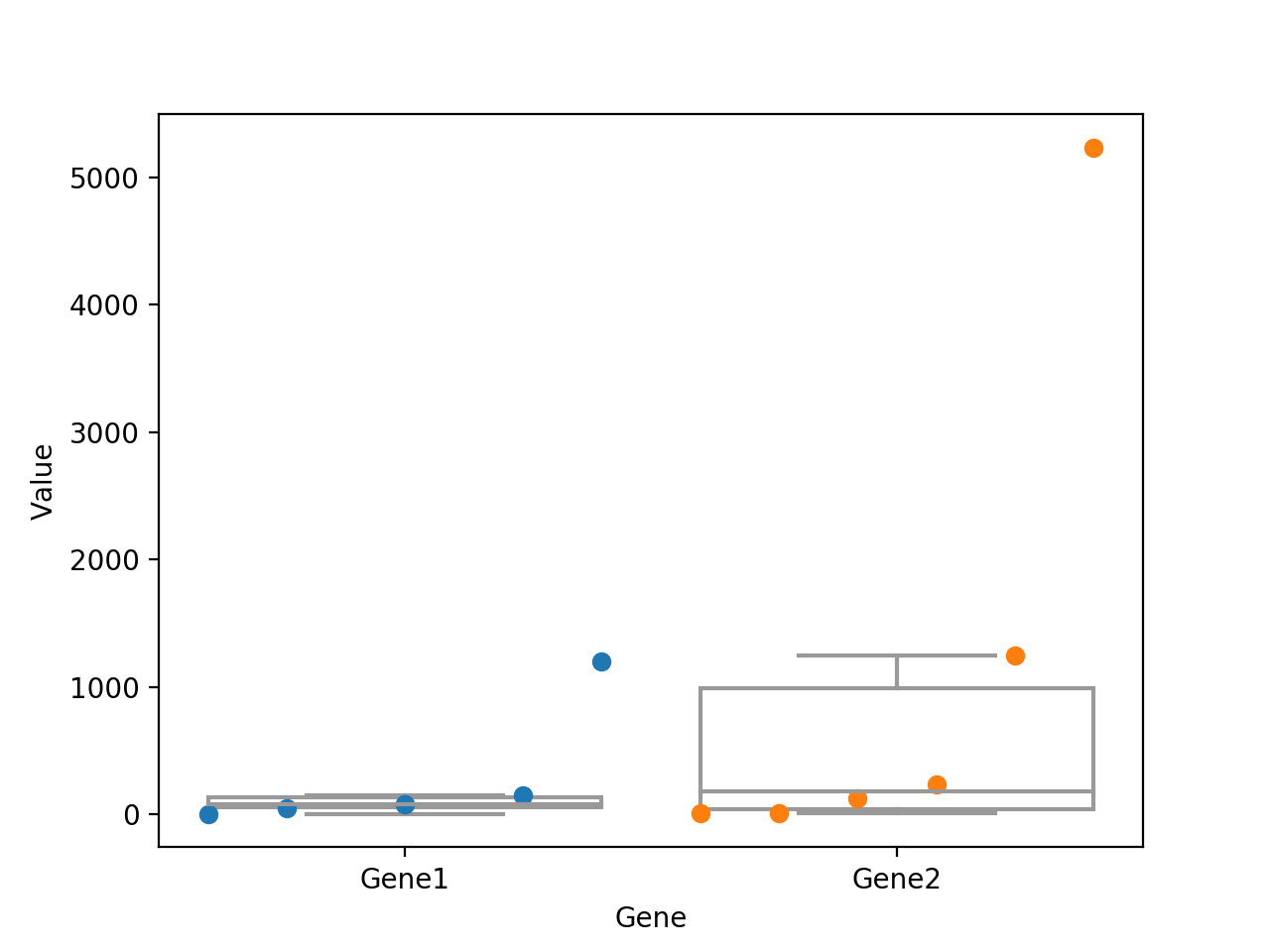
在@Fourier回答的基础上,我提出了以下解决方案。
我不认为您可以使用stripplot来达到预期的结果,但没关系,这并不是stripplot的目的。如果您没有几个hues,那么情况就相当简单了。然后方格图简单地位于x值0,1,2.并具有一个width,该width可以在对boxplot的调用中定义(默认情况下为0.8)。了解这些信息,计算出我们的点的x值应该是什么非常简单,这样它们就集中在方框图上:
df = pd.DataFrame({
    "Gene": ["Gene1", "Gene1", "Gene1", "Gene1", "Gene1", "Gene1",
             "Gene2", "Gene2", "Gene2", "Gene2", "Gene2", "Gene2"],
    "Value": [80, 1205, 5, 150, 50, 80,
              12, 5235, 235, 1245, 126, 10]})

order = ['Gene1','Gene2']
width = 0.8
fig, ax = plt.subplots()
sns.boxplot(x='Gene',y='Value',data=df, orient='v', color='w', fliersize=0, order=order, width=width, ax=ax)
for x0,o in enumerate(order):
    temp_df = df[df['Gene']==o]
    x_vals = temp_df['Value'].rank(method='first')
    x_vals = np.interp(x_vals, [x_vals.min(), x_vals.max()],[x0-width/2, x0+width/2])
    ax.plot(x_vals, temp_df['Value'], 'o')
编辑:使用色调嵌套的解决方案
事实上,如果你使用的是色调嵌套,情况并不是真的更复杂。这只是知道不同方框图的x坐标及其宽度的问题。碰巧的是,我最近回答了另一个问题具有几乎相同的需求,因此这两种解决方案都非常接近。
df = pd.DataFrame({
    "Gene": ["Gene1", "Gene1", "Gene1", "Gene1", "Gene1", "Gene1",
             "Gene2", "Gene2", "Gene2", "Gene2", "Gene2", "Gene2"],
    "Value": [80, 1205, 5, 150, 50, 80,
              12, 5235, 235, 1245, 126, 10],
    "State": ["active", "inactive", "active", "inactive", "active", "active",
              "active", "active", "active", "inactive", "inactive", "inactive"]
})


order = ['Gene1','Gene2']
hue_order = ['active','inactive']
width = 0.8
# get the offsets used by boxplot when hue-nesting is used
# https://github.com/mwaskom/seaborn/blob/c73055b2a9d9830c6fbbace07127c370389d04dd/seaborn/categorical.py#L367
n_levels = len(hue_order)
each_width = width / n_levels
offsets = np.linspace(0, width - each_width, n_levels)
offsets -= offsets.mean()

fig, ax = plt.subplots()
sns.boxplot(x='Gene',y='Value',hue='State', data=df, orient='v', color='w', fliersize=0, order=order, hue_order=hue_order, width=width, ax=ax)

for x0,o in enumerate(order):
    for h,off in zip(hue_order, offsets):
        temp_df = df[(df['Gene']==o)&(df['State']==h)]
        x_vals = temp_df['Value'].rank(method='first')
        x_vals = np.interp(x_vals, [x_vals.min(), x_vals.max()],[(x0+off)-each_width/2, (x0+off)+each_width/2])
        ax.plot(x_vals, temp_df['Value'], 'o')

Stack Overflow用户
发布于 2019-12-03 09:40:56
对于未来的问题,请考虑这个帮助页面,它将指导您提供一些数据来说明您的问题,并帮助其他人更准确地回答:https://stackoverflow.com/help/minimal-reproducible-example。
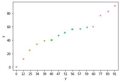
最普通的方法
import seaborn as sns
import pandas as pd

#generate some random points to plot
df = pd.DataFrame({"y":np.random.randint(0,100,20)})

#plot by sorted values using stripplot
sns.stripplot(df['y'].sort_values(), df['y'])
输出:
还可以创建一个包含y-值级别的新列:
df['ranks'] = df['y'].rank()然后使用以下方法绘制此图:
sns.stripplot(df['ranks'], df['y'])编辑
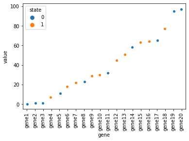
对于你的数据,我会尝试:
df = pd.DataFrame({"gene":["gene{}".format(i) for i in np.arange(1,21)], "value":np.random.randint(0,100,20), "state":np.random.randint(0,2,20)})

sns.stripplot(data=df.sort_values("value"), x="gene", y="value", hue="state")
输出
页面原文内容由Stack Overflow提供。腾讯云小微IT领域专用引擎提供翻译支持
原文链接:
https://stackoverflow.com/questions/59153844
复制相关文章
相似问题
腾讯云开发者
