
如何在一个图形中绘制不同的数据?
如何在一个图形中绘制不同的数据?
提问于 2019-10-31 17:22:20
我需要一些指导来策划:
- df1数据散点图:时间对y使用色调表示列z
- 线图df2数据: time vs y
- y=c (c为常数)
df1和df2中的y数据是不同的,但它们在相同的范围内。
我不知道从哪里开始。如有任何指导,将不胜感激。
更多的解释。这里提供了部分数据。我想要策划:
- 时间散点图与CO2
- 相比较,发现CO2的年滚动平均值( 01/01/2016至09/30/2019 )是基于小时数据的。因此,第一个平均值将从"01/01/2016 00“到"12/31/2016 23”,第二个平均数将从"01/01/2016 01“到"01/01/2017”(类似于图below)
- finding中的趋势),即所有数据的最大值,并通过地块上的一条线(如下面的直线)
。

样本数据
data = {'Date':['0     01/14/2016 00', '01/14/2016 01','01/14/2016 02','01/14/2016 03','01/14/2016 04','01/14/2016 05','01/14/2016 06','01/14/2016 07','01/14/2016 08','01/14/2016 09','01/14/2016 10','01/14/2016 11','01/14/2016 12','01/14/2016 13','01/14/2016 14','01/14/2016 15','01/14/2016 16','01/14/2016 17','01/14/2016 18','01/14/2016 19'],
        'CO2':[2415.9,2416.5,2429.8,2421.5,2422.2,2428.3,2389.1,2343.2,2444.,2424.8,2429.6,2414.7,2434.9,2420.6,2420.5,2397.1,2415.6,2417.4,2373.2,2367.9],
        'Year':[2016,2016,2016,2016,2016,2016,2016,2016,2016,2016,2016,2016,2016,2016,2016,2016,2016,2016,2016,2016]}

# Create DataFrame
df = pd.DataFrame(data)

# DataFrame view
                Date     CO2  Year
 0     01/14/2016 00  2415.9  2016
       01/14/2016 01  2416.5  2016
       01/14/2016 02  2429.8  2016
       01/14/2016 03  2421.5  2016
01/14/2016 04 2422.2 2016回答 2
Stack Overflow用户
回答已采纳
发布于 2019-10-31 18:55:21
使用matplotlib.pyplot
plt.hlines在常数
处添加一条水平线
import numpy as np
import pandas as pd
import matplotlib.pyplot as plt
# with synthetic data
np.random.seed(365)
data = {'CO2': [np.random.randint(2000, 2500) for _ in range(783)],
'Date': pd.bdate_range(start='1/1/2016', end='1/1/2019').tolist()}
# create the dataframe:
df = pd.DataFrame(data)
# verify Date is in datetime format
df['Date'] = pd.to_datetime(df['Date'])
# set Date as index so .rolling can be used
df.set_index('Date', inplace=True)
# add rolling mean
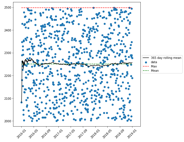
df['rolling'] = df['CO2'].rolling('365D').mean()
# plot the data
plt.figure(figsize=(8, 8))
plt.scatter(x=df.index, y='CO2', data=df, label='data')
plt.plot(df.index, 'rolling', data=df, color='black', label='365 day rolling mean')
plt.hlines(max(df['CO2']), xmin=min(df.index), xmax=max(df.index), color='red', linestyles='dashed', label='Max')
plt.hlines(np.mean(df['CO2']), xmin=min(df.index), xmax=max(df.index), color='green', linestyles='dashed', label='Mean')
plt.xticks(rotation='45')
plt.legend(loc='center left', bbox_to_anchor=(1, 0.5))
plt.show()使用合成数据绘制:
关于执行部分数据中日期格式的问题:
df['Date'] = pd.to_datetime(df['Date'])之前,
- 使用正则表达式修复
Date列 - ,将修复
Date的代码放置在
import re

# your data
                Date     CO2  Year
 0     01/14/2016 00  2415.9  2016
       01/14/2016 01  2416.5  2016
       01/14/2016 02  2429.8  2016
       01/14/2016 03  2421.5  2016
       01/14/2016 04  2422.2  2016

df['Date'] = df['Date'].apply(lambda x: (re.findall(r'\d{2}/\d{2}/\d{4}', x)[0]))

# fixed Date column
       Date     CO2  Year
 01/14/2016  2415.9  2016
 01/14/2016  2416.5  2016
 01/14/2016  2429.8  2016
 01/14/2016  2421.5  2016
01/14/2016 2422.2 2016Stack Overflow用户
发布于 2019-10-31 18:46:28
您可以使用双轴图.理想情况下,它看起来和你的一样,因为两个轴都是相同的比例。可以直接用熊猫数据帧进行绘图
import matplotlib.pyplot as plt
import pandas as pd

# create a color map for the z column
color_map = {'z_val1':'red', 'z_val2':'blue', 'z_val3':'green', 'z_val4':'yellow'}

fig = plt.figure()
ax1 = fig.add_subplot(111)
ax2 = ax1.twinx() #second axis within the first

# define scatter plot
df1.plot.scatter(x = 'date',
                 y = 'CO2',
                 ax = ax1,
                 c = df['z'].apply(lambda x:color_map[x]))

# define line plot
df2.plot.line(x = 'date',
         y = 'MA_CO2', #moving average in dataframe 2
         ax = ax2)


# plot the horizontal line at y = c (constant value)
ax1.axhline(y = c, color='r', linestyle='-')

# to fit the chart properly
plt.tight_layout()页面原文内容由Stack Overflow提供。腾讯云小微IT领域专用引擎提供翻译支持
原文链接:
https://stackoverflow.com/questions/58648448
复制相关文章
相似问题
腾讯云开发者
