
更改默认的海运热图图
更改默认的海运热图图
提问于 2019-11-18 13:10:01
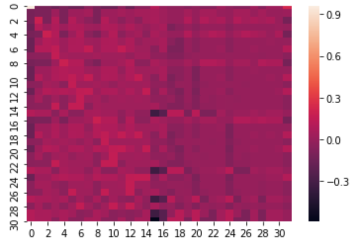
我已经从Matlab导出了一个大型矩阵到一个data.dat文件,该文件是由制表符分隔的。我将这些数据导入到iPython脚本中,以便使用seaborn来使用下面的MWE创建矩阵的热图:
import numpy as np
import seaborn as sns
import matplotlib.pylab as plt

uniform_data = np.loadtxt("data.dat", delimiter="\t")
ax = sns.heatmap(uniform_data, linewidth=0.0)
plt.show()
此代码运行良好,并输出正确的热图,生成以下输出:
如何更改此输出的样式?具体来说,我想改变配色方案,也有LaTeX格式的字体。这是因为我希望将此输出作为.pdf文件导出并导入到LaTeX文档中。
回答 1
Stack Overflow用户
回答已采纳
发布于 2019-11-25 15:38:44
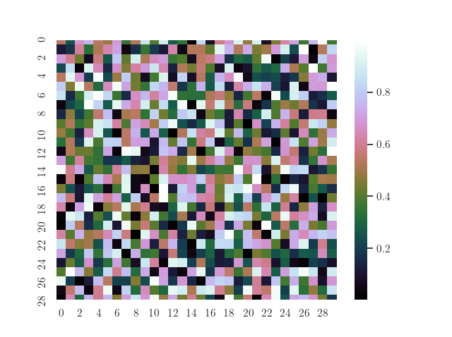
- 您可以使用
cmap键sns.heatmap()来控制配色方案。有关可用的彩色地图,请参见这里。 - 通常,要使绘图中的所有字体看起来像乳胶字体,您可以这样做。
sns.set(rc={'text.usetex': True})
它所做的是在图中的每个文本对象周围添加一个$,以允许底层tex环境“tex”它。这对于颜色条很好,但是,正如您可以看到的那样,这里似乎有一个(对我来说还没有解决的bug),使得它不能工作在轴的痒标签上。作为解决办法,您可以在所有滴答标签周围手动添加$,以便tex解释器再次识别为texàla。
# Collecting all xtick locations and labels and wrapping the labels in two '$'
plt.xticks(plt.xticks()[0], ['$' + label._text + '$' for label in plt.xticks()[1]])
所以为了演示你的例子
import matplotlib.pyplot as plt
import numpy as np
import seaborn as sns

# Use tex for all labels globally in the plot
sns.set(rc={'text.usetex': True})

uniform_data = np.random.rand(30, 30)

# Adjust colormap with the cmap key (here 'cubehelix')
ax = sns.heatmap(uniform_data, linewidth=0.0, cmap='cubehelix')

# workaround wrap '$' around tick labels for x and y axis
# commenting the following two lines makes only the colorbar in latex font
plt.xticks(plt.xticks()[0], ['$' + label._text + '$' for label in plt.xticks()[1]])
plt.yticks(plt.yticks()[0], ['$' + label._text + '$' for label in plt.yticks()[1]])

plt.show()
通向
页面原文内容由Stack Overflow提供。腾讯云小微IT领域专用引擎提供翻译支持
原文链接:
https://stackoverflow.com/questions/58915345
复制相关文章
相似问题
腾讯云开发者
