
如何将内容垂直和水平地集中在内联块-div中?
如何将内容垂直和水平地集中在内联块-div中?
提问于 2020-01-14 17:39:18
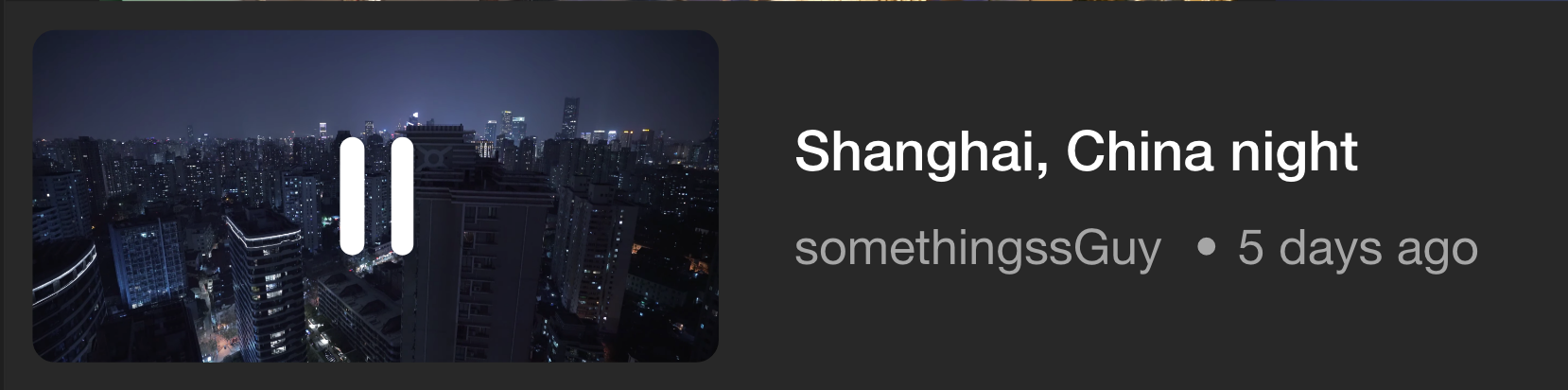
在创建了两个div元素inline-block,然后是vertical-align: top之后,我得到了一个图像,该图像最初在div中垂直和水平地居中,位于左上角。以下是代码:
.soundscapeImgDiv {
  /* background-color: white; */
  background-image: url('../images/testImg.png');
  background-size: 100%;
  background-repeat: no-repeat;
  width: 260px;
  height: 85%;
  margin-left: 10px;
  margin-top: 12px;
  border-radius: 12px;
  /* text-align: center; */
  display: flex;
  align-items: center;
  justify-content: center;
  display: inline-block;
  vertical-align: top;
}

.portalInfoDiv {
  background-color: White;
  margin-left: 10px;
  height: 71px;
  width: 56%;
  display: inline-block;
  vertical-align: top;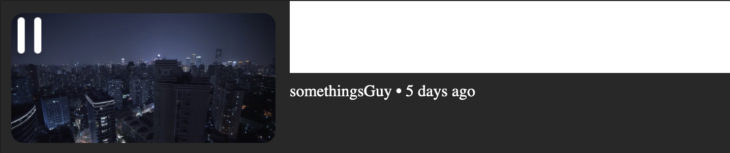
}<div class="bottomPlayerDiv">
<div class="soundscapeImgDiv">
<!-- <div class="playerDiv"> -->
<img id="pause/playIcon" src="images/pause.png">
<!-- </div> -->
<!-- <img id="soundscapeImg" src="images/testImg.png" width="100%"> -->
<!-- <img id="pause/playIcon" src="images/pause.png"> -->
</div>
<div class="portalInfoDiv">
<h1>Shanghai, China night lols</h1>
<p>somethingsGuy • 5 days ago</p>
</div>
</div>
我怎么才能像以前一样对着它呢?
目前的目标是:
回答 1
Stack Overflow用户
发布于 2020-01-14 17:59:19
你不能显示内联块和挠曲。如果你想使用‘说明内容’和对齐内容/对齐项/对齐自我属性,你必须使用‘显示(灵活或网格)’。
- 在下面的例子中,最后一个写的是正确的。
display: flex;
display:inline-block;
我添加了这个编辑,因为我突然意识到,在修复错误之后,您可能无法得到您想要的布局。您需要一个显示块内嵌的布局,而幸运的是,这正是柔性盒的目的所在。
W3Schools.com --这是一个学习如何使用像flex这样的新CSS工具的好地方。试一试,如果你有问题,使用Stack来解决它们!
“下面的文件”是我如何处理卡片制作的方法。布局工作,我简化了代码,使之尽可能可读。在开发这段代码时,我意识到,正如我对大多数HTML/CSS3 3布局所做的那样,“这可以通过多种不同的方式来完成”;您可能需要考虑一种方法,因为它创建了一个可以被认为是web的卡片布局标准,即Bootstrap4。BS4框架很容易使用,在美观上也很容易。不管怎样,我希望这能帮上忙。
<!DOCTYPE html>
<html LANG="en">

<head>
    <meta name=" viewport " content=" width=device-width, initial-scale=1.0 " />
    <meta name=" author " content="AFT3RL1F3">
    <meta charset="UTF-8">
    <link href="https://fonts.googleapis.com/css?family=Montserrat+Alternates&display=swap" rel="stylesheet">

    <style>
        body {
            background-color: #222
        }

        .flex-container {
            display: flex;
            width: 600px;
            height: 200px;
            margin: 20px;
            padding: 20px;
            border-radius: 10px;
            justify-content: center;
            align-items: center;
            text-align: center;
            background-color: rgb(70, 70, 70, 1);
        }

        .flex-container-L {
            background-color: #f1f1f1;
            width: 50%;
            height: 100%;
            text-align: center;
            background-color: #CCC;
            background-image: url('http://localhost/Sandbox/public/SF-002.png');
            background-size: 150%;
            background-repeat: no-repeat;
        }

        .flex-container-R {
            display: grid;
            grid-template-columns: auto;
            background-color: #f1f1f1;
            width: 50%;
            height: 100%;
            justify-content: center;
            align-items: center;
            text-align: center;
        }

        .title {
            display: block;
            margin: 0;
            padding: 0;
            font-family: 'Montserrat Alternates', sans-serif;
            font-size: 24px;
            font-weight: 700;
        }

        .subtitle {
            display: block;
            margin-top: -100px;
            padding: 0;
            font-family: sans-serif;
            font-size: 18px;
            font-weight: 400;
        }
    </style>
</head>

<body>
    <h2>StackOverFlow.com example by: AFT3RL1FE</h2>
    <hr>
    <div class="flex-container">

        <div class="flex-container-L"></div>

        <div class="flex-container-R">
            <p class="title">San Francisco</p>
            <p class="subtitle"> Worlds Most Diverse City</p>
        </div>

</div>
</body>

</html>页面原文内容由Stack Overflow提供。腾讯云小微IT领域专用引擎提供翻译支持
原文链接:
https://stackoverflow.com/questions/59739077
复制相关文章
相似问题
腾讯云开发者
