
用csv数据绘制频率直方图的误差
用csv数据绘制频率直方图的误差
提问于 2020-02-05 18:44:43
我正在python3上使用一个带有熊猫模块的csv文件。Csv文件由5列组成:职务、公司名称、职务描述、评审数量、职位位置;我想绘制一个频率直方图,其中我只选择包含“机械工程师”字样的工作,并查找“机械工程师”工作最频繁的5个地点的频率。
因此,我定义了一个变量engloc,它存储所有的“机械工程师”作业。
engloc=df[df.position.str.contains('mechanical engineer|mechanical engineering', flags=re.IGNORECASE, regex=True)].location用matplotlib和我在网上找到的代码做了直方图图
 x = np.random.normal(size = 1000)
 plt.hist(engloc, bins=50)
 plt.gca().set(title='Frequency Histogram ', ylabel='Frequency');
但印成这样
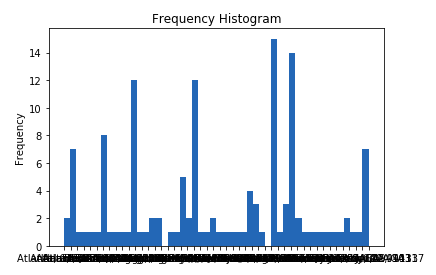
我如何绘制一个适当的频率直方图,它只使用5个最常见的工作地点包含“机械工程师”字,而不是把所有的位置在图表中?
这是csv文件中的一个示例

回答 1
Stack Overflow用户
回答已采纳
发布于 2020-02-05 19:56:41
下面的内容应该可以帮助您处理数字数据:
import numpy as np
counts_, bins_ = np.histogram(englog.values)
filtered = [(c,b) for (c,b) in zip(counts_,bins_) if counts_>=5]
counts, bins = list(zip(*filtered))
plt.hist(bins[:-1], bins, weights=counts)
对于字符串类型,请尝试:
from collections import Counter
coords, counts = list(zip(*Counter(englog.values).most_common(5)))
plt.bar(coords, counts)页面原文内容由Stack Overflow提供。腾讯云小微IT领域专用引擎提供翻译支持
原文链接:
https://stackoverflow.com/questions/60082233
复制相关文章
相似问题
腾讯云开发者
