
DataFrame -用分组列(至少两列)绘制数据帧的条形图
DataFrame -用分组列(至少两列)绘制数据帧的条形图
提问于 2021-02-02 19:05:26
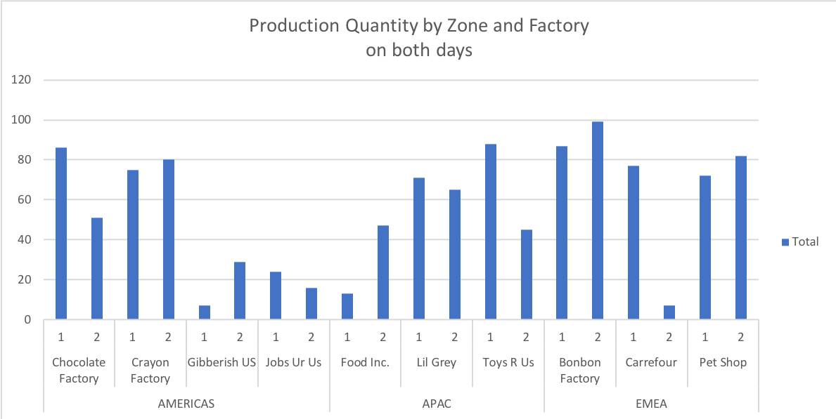
我一直在努力使用matlplotlib在python中重新创建这个Excel图:
数据在一个dataframe中;我正在尝试自动化生成这个图的过程。
我尝试过打开我的数据堆栈,进行细分,但是我还没有创建"Zone“索引,这个索引在Excel中是如此优雅。我已经成功地绘制了没有这个“区域”索引的图表,但这并不是我真正想要做的。
这是我的代码:
data = pd.DataFrame(
    {
        'Factory Zone':
        ["AMERICAS","APAC","APAC","APAC","APAC","APAC","EMEA","EMEA","EMEA","EMEA"],
        'Factory Name':
        ["Chocolate Factory","Crayon Factory","Jobs Ur Us", "Gibberish US","Lil Grey", "Toys R Us","Food Inc.",
        "Pet Shop", "Bonbon Factory","Carrefour"],
        'Production Day 1':
        [24,1,9,29,92,79,4,90,42,35],
        'Production Day 2':
        [2,43,17,5,31,89,44,49,34,84]
    })
df = pd.DataFrame(data)
print(df)
# Without FactoryZone, it works:
df = df.drop(['Factory Zone'], axis=1)
image = df.plot(kind="bar")
数据看起来如下:
  Unnamed: 0 FactoryZone       Factory Name  Production Day 1  Production Day 2
0           1    AMERICAS  Chocolate Factory                24                43
1           2    AMERICAS     Crayon Factory                 1                17
2           3        EMEA           Pet Shop                 9                 5
3           4        EMEA     Bonbon Factory                29                31
4           5        APAC           Lil Grey                92                89
5           6    AMERICAS         Jobs Ur Us                79                44
6           7        APAC          Toys R Us                 4                49
7           8        EMEA          Carrefour                90                34
8           9    AMERICAS       Gibberish US                42                84
9 10 APAC Food Inc. 35 62回答 3
Stack Overflow用户
回答已采纳
发布于 2021-02-09 14:50:39
您可以首先为分层数据集创建一个MultiIndex,其中0级是工厂区域,级别1是工厂名称
import numpy as np                 # v 1.19.2
import pandas as pd                # v 1.1.3
import matplotlib.pyplot as plt    # v 3.3.2

df = pd.DataFrame(
    {'Factory Zone': ['AMERICAS', 'AMERICAS', 'AMERICAS', 'AMERICAS', 'APAC',
                      'APAC', 'APAC', 'EMEA', 'EMEA', 'EMEA'],
     'Factory Name': ['Chocolate Factory', 'Crayon Factory', 'Jobs Ur Us',
                      'Gibberish US', 'Lil Grey', 'Toys R Us', 'Food Inc.',
                      'Pet Shop', 'Bonbon Factory','Carrefour'],
     'Production Day 1': [24,1,9,29,92,79,4,90,42,35],
     'Production Day 2': [2,43,17,5,31,89,44,49,34,84]
    })

df.set_index(['Factory Zone', 'Factory Name'], inplace=True)df
# Production Day 1 Production Day 2
# Factory Zone Factory Name
# AMERICAS Chocolate Factory 24 2
# Crayon Factory 1 43
# Jobs Ur Us 9 17
# Gibberish US 29 5
# APAC Lil Grey 92 31
# Toys R Us 79 89
# Food Inc. 4 44
# EMEA Pet Shop 90 49
# Bonbon Factory 42 34
# Carrefour 35 84就像广黄提议的那样,你可以为每个区域创建一个子小区,并将它们粘在一起。每个子图的宽度必须通过使用width_ratios字典中的gridspec_kw参数来根据工厂的数量进行校正,这样所有的列都具有相同的宽度。然后有无限的格式选择要做。
在下面的示例中,我选择只显示区域之间的分隔线,并为此使用较小的勾号。此外,由于图形宽度在这里仅限于10英寸,我在两行上重写了较长的标签。
# Create figure with a subplot for each factory zone with a relative width
# proportionate to the number of factories
zones = df.index.levels[0]
nplots = zones.size
plots_width_ratios = [df.xs(zone).index.size for zone in zones]
fig, axes = plt.subplots(nrows=1, ncols=nplots, sharey=True, figsize=(10, 4),
                         gridspec_kw = dict(width_ratios=plots_width_ratios, wspace=0))

# Loop through array of axes to create grouped bar chart for each factory zone
alpha = 0.3 # used for grid lines, bottom spine and separation lines between zones
for zone, ax in zip(zones, axes):
    # Create bar chart with grid lines and no spines except bottom one
    df.xs(zone).plot.bar(ax=ax, legend=None, zorder=2)
    ax.grid(axis='y', zorder=1, color='black', alpha=alpha)
    for spine in ['top', 'left', 'right']:
        ax.spines[spine].set_visible(False)
    ax.spines['bottom'].set_alpha(alpha)

    # Set and place x labels for factory zones
    ax.set_xlabel(zone)
    ax.xaxis.set_label_coords(x=0.5, y=-0.2)

    # Format major tick labels for factory names: note that because this figure is
    # only about 10 inches wide, I choose to rewrite the long names on two lines.
    ticklabels = [name.replace(' ', '\n') if len(name) > 10 else name
                  for name in df.xs(zone).index]
    ax.set_xticklabels(ticklabels, rotation=0, ha='center')
    ax.tick_params(axis='both', length=0, pad=7)

    # Set and format minor tick marks for separation lines between zones: note
    # that except for the first subplot, only the right tick mark is drawn to avoid
    # duplicate overlapping lines so that when an alpha different from 1 is chosen
    # (like in this example) all the lines look the same
    if ax.is_first_col():
        ax.set_xticks([*ax.get_xlim()], minor=True)
    else:
        ax.set_xticks([ax.get_xlim()[1]], minor=True)
    ax.tick_params(which='minor', length=55, width=0.8, color=[0, 0, 0, alpha])

# Add legend using the labels and handles from the last subplot
fig.legend(*ax.get_legend_handles_labels(), frameon=False, loc=(0.08, 0.77))

fig.suptitle('Production Quantity by Zone and Factory on both days', y=1.02, size=14);
参考文献: Quang,这是gyx的答案。的答案
Stack Overflow用户
发布于 2021-02-02 19:25:43
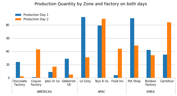
给出一个紧密的情节的一个想法是在一个子图中将每个Factory Zone绘制成一个彼此相邻的子图:
# setting up the subplots
fig, axes = plt.subplots(1, len(df['Factory Zone'].unique()),
                         figsize=(12,4),
                         sharex=True, sharey=True,
                         gridspec_kw={'wspace':0},
                         subplot_kw={'frameon':False})

# use groupby to loop through the `Factory Zone`
for (k,d), ax in zip(df.groupby('Factory Zone'), axes):

    # plot the data into subplot
    d.plot.bar(x='Factory Name', ax=ax)

    # set label to the `Factory Zone`
    ax.set_xlabel(k)

    # remove the extra legend in each subplot
    legend = ax.legend()
    handlers = ax.get_legend_handles_labels()
    ax.legend().remove()
    ax.grid(True, axis='y')

# reinstall the last legend
ax.legend(*handlers)
输出:
Stack Overflow用户
发布于 2022-06-23 19:21:20
Patrick提供的解决方案只有一行,它在Matplotlib 3.4中被废弃,并将在2个小版本中被删除。(我认为这是一种评论,而不是回答,但我还没有足够的声誉!)
更改:
if ax.is_first_col():至
if ax.get_subplotspec().is_first_col():页面原文内容由Stack Overflow提供。腾讯云小微IT领域专用引擎提供翻译支持
原文链接:
https://stackoverflow.com/questions/66016045
复制相关文章
相似问题
腾讯云开发者
