
如何在使用Flexbox和flex包装时制作文本包装:包装?
如何在使用Flexbox和flex包装时制作文本包装:包装?
提问于 2021-02-27 15:17:07
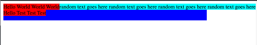
问题:在我当前的布局中,我有基于标准的特定高度的框。我希望使用列在该框/div中显示数据,但当我这样做时,到达第二列的项会溢出父容器的宽度。(见下图)
注意:调整屏幕大小以获得我在下面的屏幕截图中显示的结果
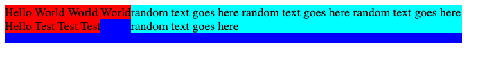
我正在寻找的结果是:,我希望元素在父容器中占用所需的空间,可能只在Y轴(垂直)上溢出。换句话说,我希望文本可以换成多行。(见下图)
代码:https://jsfiddle.net/sr9fj07m/
<div
      style="
        display: flex;
        flex-direction: column;
        height: 50px;
        background-color: blue;
        flex-wrap: wrap;
        align-content: flex-start;
      "
    >
      <div style="display: flex; flex-direction: row; align-items: center">
        <div style="background-color: red">Other text here</div>
      </div>
      <div style="display: flex; flex-direction: row; align-items: center">
        <div style="background-color: red">Another text here</div>
      </div>
      <div
        style="
          display: flex;
          flex-direction: row;
          align-items: center;
          flex-shrink: 1;

        "
      >
        <div style="background-color: aqua;">
          random text goes here random text goes here random text goes here
          random text goes here
        </div>
      </div>
    </div>
如何才能做到这一点?谢谢!
编辑:我正在寻找的是一个解决方案,我没有硬编码宽度和子的重新排列自动从上到下,包装成多个列(弯曲方向:列;挠性包装:包装),但不溢出父宽度,因此将文本分成多行。
回答 1
Stack Overflow用户
发布于 2021-02-27 15:38:20
我在这里的理解是,flex项将增长以满足子元素的内容,因此在本例中,包装长文本的div正在增长以满足文本长度。一种解决方案是在div上设置一个特定的宽度。以下将达到您想要的结果,但您将需要在第3 div的div宽度左右,以获得正确的结果。
<html>
  <body>
    <div
      style="
        display: flex;
        flex-direction: column;
        height: 50px;
        background-color: blue;
        flex-wrap: wrap;
        align-content: flex-start;
        width: 600px;
      "
    >
      <div style="display: flex; flex-direction: row; align-items: center">
        <div style="background-color: red">Other text here</div>
      </div>
      <div style="display: flex; flex-direction: row; align-items: center">
        <div style="background-color: red">Another text here</div>
      </div>
      <div
        style="
          display: flex;
          flex-direction: row;
          align-items: center;
          flex-shrink: 1;
          width: 400px;
        "
      >
        <div style="background-color: aqua;">
          random text goes here random text goes here random text goes here
          random text goes here
        </div>
      </div>
    </div>
  </body>
</html>页面原文内容由Stack Overflow提供。腾讯云小微IT领域专用引擎提供翻译支持
原文链接:
https://stackoverflow.com/questions/66400217
复制相关文章
相似问题
腾讯云开发者
