
X标签是在我的数字之外,因为图形大小
X标签是在我的数字之外,因为图形大小
提问于 2021-12-02 07:43:07
我正在用以下代码构造一个简单的图:
    plt.figure(figsize=(7, 3))
    plt.plot(idl_t, idl_q, color="blue", lw=2)
    plt.plot(dsc_t, dsc_q, color="red", lw=2)
    plt.plot(cha_t, cha_q, color="green", lw=2)
    plt.xlabel("Time (hour)")
    plt.show()
输入数据如下:
    idl_t, idl_q = [[0, 20], [8, 24]], [[100, 100], [100, 100]]
    dsc_t, dsc_q = [[8, 14], [12, 18]], [[100, 100], [5, 5]]
    cha_t, cha_q = [[12, 18], [14, 20]], [[5, 5], [100, 100]]
但是,代码以某种方式将x标签在图中删除如下:
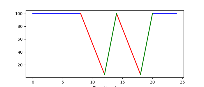
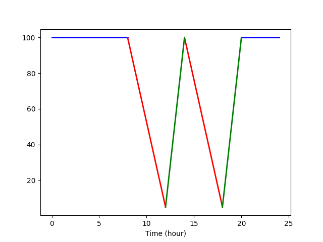
我非常肯定,这是因为更改了figsize,并且似乎它按比例分配了标签空间。请参见下面的正常figsize图:
如何为具有不同xlabel的figsize保留足够的空间?对我来说,它真的应该是这样的吗?
我非常感谢你的建议!
编辑1:
谢谢大家的答复。虽然我选择了tight_layout作为更好的解决方案,但我肯定会建议您使用Jody Klymak提出的方法。请在下面的答案中找到他的实现!
Stack Overflow用户
发布于 2021-12-02 14:31:40
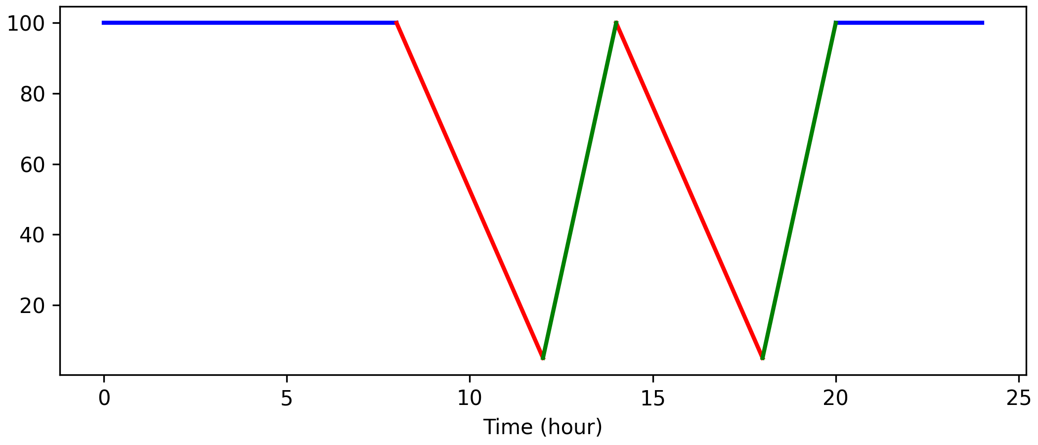
使用constrained_layout。它比tight_layout (通常)更灵活:
import matplotlib.pyplot as plt

idl_t, idl_q = [[0, 20], [8, 24]], [[100, 100], [100, 100]]
dsc_t, dsc_q = [[8, 14], [12, 18]], [[100, 100], [5, 5]]
cha_t, cha_q = [[12, 18], [14, 20]], [[5, 5], [100, 100]]

fig, ax = plt.subplots(figsize=(7, 3), constrained_layout=True)
ax.plot(idl_t, idl_q, color="blue", lw=2)
ax.plot(dsc_t, dsc_q, color="red", lw=2)
ax.plot(cha_t, cha_q, color="green", lw=2)
ax.set_xlabel("Time (hour)")
plt.show()
页面原文内容由Stack Overflow提供。腾讯云小微IT领域专用引擎提供翻译支持
原文链接:
https://stackoverflow.com/questions/70195707
复制相关文章
相似问题
腾讯云开发者

Copyright © 2013 - 2026 Tencent Cloud. All Rights Reserved. 腾讯云 版权所有
深圳市腾讯计算机系统有限公司 ICP备案/许可证号:粤B2-20090059 ![]() 粤公网安备44030502008569号
粤公网安备44030502008569号
腾讯云计算(北京)有限责任公司 京ICP证150476号 | 京ICP备11018762号