
在CSS中使用display: table;时,colspan的模拟是什么?
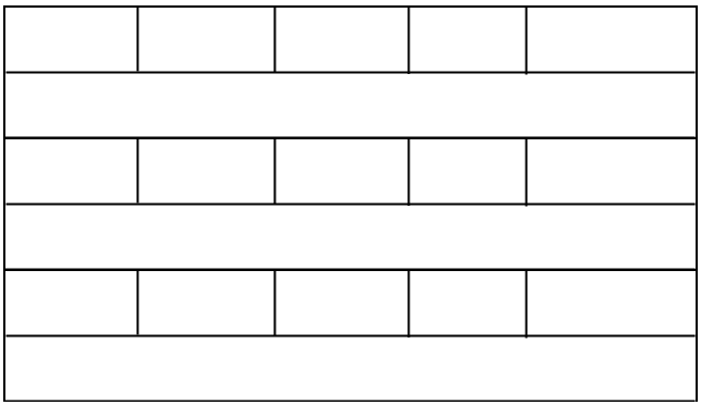
任务很奇怪。我必须创建html表,但是不允许使用传统的<table>标记。我的桌子应该是这样的
这样做很容易:
<table>
     <tr>
        <td></td>
        <td></td>
        <td></td>
        <td></td>
        <td></td>
     </tr>
     <tr>
         <td colspan="5"></td>
     </tr>
     ...
但是,正如我所说的,我不允许使用传统的表标记(table、tr、td、th)。这是我目前所拥有的JSFIddle。如何才能获得与<td colspan="5"></td> 相同的结果,但只使用div和CSS就可以获得。
编辑:
*表格单元格在一行中的宽度不能固定,它应该是动态的,并且应该可以使它们(单元格)不同的宽度(在一行中)。
*表格单元格在不同行中的宽度同列的必须为相等。就像在传统餐桌上一样。只有“斜纹”单元格的宽度必须不同。
回答 6
Stack Overflow用户
发布于 2013-07-18 11:04:56
正如CSS2.1规范在第"17.5表格内容的视觉布局“部分中所述
单元格可以跨越几行或几列。(虽然CSS 2.1没有定义跨行或列的数目是如何确定的.
所以答案很简单!不要将CSS表与HTML表完全相同。因为有一些差异,比如在"17.2.1匿名表对象“中提到的
..。为了使表模型工作,必须假定“缺少”元素。任何表元素本身都会自动生成必要的匿名表对象,其中至少包含三个嵌套对象,分别对应于“table”/“inline- table”元素、“table-row”元素和“table-cell”元素。..。
因此,您可以这样做(每一行作为表,并删除表行以避免不必要的div块),直到它们指定了定义跨行或列数的方法:
CSS
.row {
    display: table;
    width: 100%;
}
.cell {
    display: table-cell;
    width: 16.67%;
}
.wideCell {
    display: table-cell;
}<div class="row">
<div class="cell">One</div>
<div class="cell">Two</div>
<div class="cell">Three</div>
<div class="cell">Four</div>
<div class="cell">Five</div>
<div class="wideCell">Six</div>
</div>
<div>One Two Three Four Five Six</div>
<div class="row">
<div class="cell">One</div>
<div class="cell">Two</div>
<div class="cell">Three</div>
<div class="cell">Four</div>
<div class="cell">Five</div>
<div class="wideCell">Six</div>
</div>Stack Overflow用户
发布于 2013-03-19 10:20:18
编辑
CSS
.table{
        width: 100%;
    }
    .table .row{
        width: 100%;
        height: 25px;
        margin: 0px;
        padding: 0px;
    }
    .table .row .cell{
        width: 150px;
        float: left;
        border: solid 1px #CCC;
        height: 25px;
    }
    .table .clear_float{
        clear: both;
    }
    .table .row .cell.rowspan{
        width: 759px;
        border: solid 1px #CCC;
    }
html
<div class="table">
    <div class="row">
        <div class="cell">One</div>
        <div class="cell">Two</div>
        <div class="cell">Three</div>
        <div class="cell">Four</div>
        <div class="cell">Five</div>
    </div>
    <div class="clear_float" />
    <div class="row">
        <div class="cell rowspan">
            One Two Three Four Five
        </div>
    </div>
    <div class="clear_float" />
    <div class="row">
        <div class="cell">One</div>
        <div class="cell">Two</div>
        <div class="cell">Three</div>
        <div class="cell">Four</div>
        <div class="cell">Five</div>
    </div>
    <div class="clear_float" />
    <div class="row">
        <div class="cell rowspan">
            One Two Three Four Five
        </div>
    </div>
</div>Stack Overflow用户
发布于 2013-03-19 10:24:37
您需要使用CSS、float和width来获得您正在寻找的类似于表的效果。我所做的基本上是,我把5个divs都有一个固定的宽度和类名,并将它们浮动到左边。wideCell有相同的width,.wrapper,它把它们放在一个很好的块中。
<div class="wrapper">
    <div class="cell"></div>
    <div class="cell"></div>
    <div class="cell"></div>
    <div class="cell"></div>
    <div class="cell"></div>
    <div class="wideCell"></div>
</div>
CSS
.wrapper {
    width:510px;
}
.cell {
    width:100px;
    height:50px;
    background-color:#ff0000;
    float:left;
    border:1px #000 solid;
}
.wideCell {
    width:508px;
    height:50px;
    background-color:#ff0000;
    float:left;
    border:1px #000 solid;
}https://stackoverflow.com/questions/15496708
复制相似问题
腾讯云开发者
