
CSS 2列位置不正确
CSS 2列位置不正确
提问于 2013-10-12 08:10:38
我有下面的例子小提琴手,我已经张贴了所有的12列和所需的css。下一段代码,我认为是导致问题的代码。在实际示例中,您将注意到,这两列在小于320 at的屏幕宽度下将中断容器,并出现滚动条。我试过解决这个问题,但到目前为止我还没有找到解决办法。有谁能帮我吗?
<div class="col-mb-2 col-8 col-dt-5"><p> </p></div>
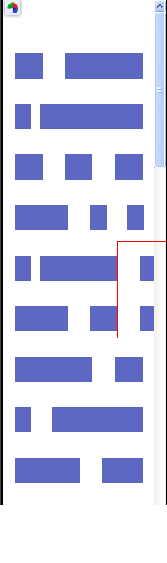
<div class="col-mb-2 col-2 col-dt-8"><p> </p></div>更新:添加了一张图片来查看问题的部分
回答 2
Stack Overflow用户
回答已采纳
发布于 2013-10-12 08:29:35
我认为问题在于这门课:
.testgrid p {
background: #5d68c2;
margin-bottom: 2em;
font-size: 0.75em;
line-height: 1em;
padding: 1em;    /*   <--- this is the problem   */
color: #ffffff;
text-transform: uppercase;
font-weight: 800;
font-family: "Open Sans", Helvetica, Arial, Sans-serif
}您需要删除左边和右边的padding
.testgrid p {
  background: #5d68c2;
  margin-bottom: 2em;
  font-size: 0.75em;
  line-height: 1em;
  padding: 1em 0px;   /*   updated   */
  color: #ffffff;
  text-transform: uppercase;
  font-weight: 800;
  font-family: "Open Sans", Helvetica, Arial, Sans-serif;
}我试过box-sizing,但没有起作用。
查看此:演示
Stack Overflow用户
发布于 2013-10-12 08:29:18
所以你需要写媒体查询
@media (max-width:312px) {

.col-dt-5, .col-dt-8{padding:0px 2px !important}


}
(最大宽度:312 is )指的是,屏幕的宽度为312 is或更小。
页面原文内容由Stack Overflow提供。腾讯云小微IT领域专用引擎提供翻译支持
原文链接:
https://stackoverflow.com/questions/19332032
复制相关文章
相似问题
腾讯云开发者
