
css列/挠性框,没有项目之间的间隙
css列/挠性框,没有项目之间的间隙
提问于 2014-04-11 00:53:20
我需要消除列布局中元素之间的空白。我可以使用最新的css3,因为站点是针对现代浏览器/设备的,但我需要避免使用javascript解决方案,这样从服务器交付的页面就不需要根据客户端的宽度重新呈现。
使用flexbox、css列和其他技巧,我需要引导类似于pinterest的布局。(Pinterest使用javascript和绝对定位来进行布局,它甚至不关闭js。)该站点有已知宽度但高度可变的框。列数需要根据浏览器宽度而变化。(如果我知道要更改哪个css属性,我就可以通过媒体查询来做到这一点。)如下所示:via
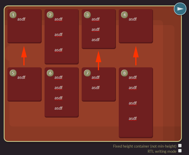
还要注意的是,我不能仅仅增加容器的高度来填充空空间。我想把它放在下面,而不是让所有的高度都匹配。(因此,上面图片中的第1、3和4项并不是我想要的。)
我尝试过的事情:
- CSS 3列这看起来很棒,但项目的顺序是错误的,第二项在第一项之下。如果这可以改变成一个不同的顺序,使他们左向右,太好了!
- Flexbox的各种柔性盒配置,我已经尝试了几乎每一个设置,我能够改变。
- Javascript。是的,我知道我可以手动创建列并在调整大小后重新呈现它们。我希望避免昂贵的重呈现操作,它需要手动平衡列和显示。对于不支持css3解决方案的旧浏览器,我可以求助于此。我也想避免手动定位所有的项目。真恶心。
我已经把评论链接到JSFiddle,因为我不能把它放在这里,因为“链接到jsfiddle需要代码”。
回答 5
Stack Overflow用户
发布于 2016-05-20 10:57:43
看看这个演示。这是纯css3砌体效应。http://w3bits.com/labs/css-masonry/
从上面的链接
body {
    font: 1em/1.67 'Open Sans', Arial, Sans-serif;
    margin: 0;
    background: #e9e9e9;
}

.wrapper {
    width: 95%;
    margin: 3em auto;
}

.masonry {
    margin: 1.5em 0;
    padding: 0;
    -moz-column-gap: 1.5em;
    -webkit-column-gap: 1.5em;
    column-gap: 1.5em;
    font-size: .85em;
}

.item {
    display: inline-block;
    background: #fff;
    padding: 1em;
    margin: 0 0 1.5em;
    width: 100%;
    height: 150px;
    box-sizing: border-box;
    -moz-box-sizing: border-box;
    -webkit-box-sizing: border-box;
    box-shadow: 2px 2px 4px 0 #ccc;
}
.item.black{
background-color: #000; height:200px;}
.item.blue{
background-color:blue; height:250px;}
.item.green{
background-color:green; height:300px;}

@media only screen and (min-width: 400px) {
    .masonry {
        -moz-column-count: 2;
        -webkit-column-count: 2;
        column-count: 2;
    }
}

@media only screen and (min-width: 700px) {
    .masonry {
        -moz-column-count: 3;
        -webkit-column-count: 3;
        column-count: 3;
    }
}

@media only screen and (min-width: 900px) {
    .masonry {
        -moz-column-count: 4;
        -webkit-column-count: 4;
        column-count: 4;
    }
}

@media only screen and (min-width: 1100px) {
    .masonry {
        -moz-column-count: 5;
        -webkit-column-count: 5;
        column-count: 5;
    }
}

@media only screen and (min-width: 1280px) {
    .wrapper {
        width: 1260px;
    }
}<div class="masonry">
<div class="item">Lorem ipsum dolor sit amet, consectetur adipisicing elit.</div>
<div class="item black">...</div>
<div class="item blue">...</div>
<div class="item green">...</div>
<div class="item black">...</div>
<div class="item blue">...</div>
<div class="item green">...</div>
<div class="item black">...</div>
<div class="item blue">...</div>
<div class="item green">...</div>
</div>
希望这对你有帮助。
Stack Overflow用户
发布于 2016-10-16 10:27:43
您可以通过柔性盒实现这一目标:
HTML:
<div class="container">
  <div class="item">1</div>
  <div class="item">2</div>
  <div class="item">3</div>
  <div class="item">4</div>
  <div class="item">5</div>
  <div class="item">6</div>
</div>
CSS:
.container {
  max-width: 900px;
  height: 470px;
  display: flex;
  flex-flow: column wrap;
  align-items: flex-start;
}

.item {
  height: 150px;
}
http://codepen.io/asim-coder/pen/vXzKgg
Stack Overflow用户
发布于 2016-10-27 06:11:14
CSS3:将容纳所有8个下拉面板的主ul li设置为:0自动;
mainList li {
   margin: 0 auto; /*0 giving no margins on the top and bottom of the panels, and auto making the panels use all of the space within the parent, mainList. I hope this helps.*/
}页面原文内容由Stack Overflow提供。腾讯云小微IT领域专用引擎提供翻译支持
原文链接:
https://stackoverflow.com/questions/23001679
复制相关文章
相似问题
腾讯云开发者
