
奇怪的,浮动布局的额外边距
奇怪的,浮动布局的额外边距
提问于 2014-04-27 10:14:33
我试图设置一个由两列组成的简单布局,
一个漂浮在左边,就像一个侧边栏。另一个自然“漂浮”到右侧,通过设置一个左边框。
(我想水平对齐这两个元素)
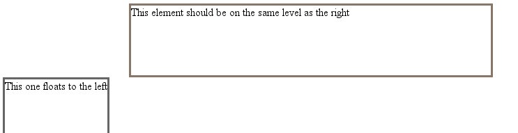
但我在左边元素的上方有一个额外的空白处,如图中所示:
附加源代码(或jsfiddle链接)
<html><head>
        <style>
        .leftbar {
            float: left;
        }
        .userinfo-meta {
            border: 3px solid #666;
            min-height: 300px;
        }
        .post {
            min-height: 100px;
            margin-left: 21%;
            width: 60%;
            border: 3px solid #876;
        }
    </style>
</head>
<body>
    <div class="post">This element should be on the same level as the right</div>
    <div class="userinfo-meta leftbar">This one floats to the left</div>
</body></html>
我不能对左边的元素使用负边距-顶部,其他元素的高度会变化.如果这种情况发生变化,保证金上限需要再次调整。
回答 4
Stack Overflow用户
回答已采纳
发布于 2014-04-27 10:25:16
您需要更改HTML标记中的顺序,如下所示:
<div class="userinfo-meta leftbar">This one floats to the left</div>
<div class="post">This element should be on the same level as the right</div>
小提琴
Stack Overflow用户
发布于 2014-04-27 10:19:40
加上保证金意味着div不会那样做。如果您向右float .post div --您不需要向左float .leftbar div --如果您愿意的话,可以这样做。
添加float:right并将margin-left移除到.post CSS:
    .post {
        min-height: 100px;
        width: 60%;
        border: 3px solid #876;
        float:right;
}看这把小提琴:http://jsfiddle.net/vagish/SXtz5/9/
Stack Overflow用户
发布于 2014-04-27 10:24:32
试试这段代码。
<div class="wrapper">
    <div class="post">
        This element should be on the same level as the right
    </div>
    <div class="leftbar">This one floats to the left</div>
</div>

* {
    box-sizing:border-box;
}

.wrapper:before, .wrapper:after{
    display:table;
    content:"";
}

.wrapper:after{
    clear:both;
}

.leftbar {
    border: 3px solid #876;
    width:40%;
    float:left;
}

.post {
    min-height: 100px;
    width: 60%;
    border: 3px solid #876;
    float:right;
}
如果您想要相同的高度,那么column.you可以尝试使用display:table类。
页面原文内容由Stack Overflow提供。腾讯云小微IT领域专用引擎提供翻译支持
原文链接:
https://stackoverflow.com/questions/23322080
复制相关文章
相似问题
腾讯云开发者
