
引导时间模板-删除空白
引导时间模板-删除空白
提问于 2014-07-05 06:49:18
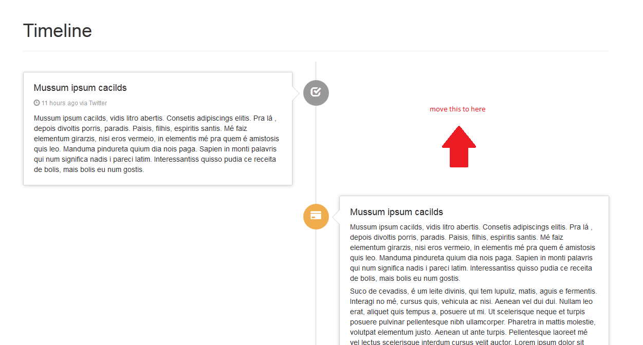
我得到了一个由betul引导的时间线模板。
意见:
http://codepen.io/betdream/full/Ifvbi/编辑:
http://codepen.io/betdream/pen/Ifvbi它的工作原理很好,但是这个版本在左项和右项之间有差距。
有可能消除它们之间的空白吗?
//只为提出问题:)
.timeline {
  list-style: none;
  padding: 20px 0 20px;
  position: relative;
}
或者,有没有人知道任何没有漏洞的版本,比如谷歌加什么的?
回答 1
Stack Overflow用户
发布于 2015-01-03 16:12:10
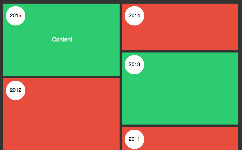
听起来,Bootstrap模板不是你最好的选择。如果您希望日期内容在它之前和之后与日期内容连锁,那么您将需要一些更动态的内容,比如砌体。
下面是我为你们编辑的一个例子。它显示了像这里这样的两个列,并且不管日期内容有多长,它也是相互锁的。所以不需要增加负值,等等。
http://codepen.io/emaildano/pen/LEbLeQ
<section class="grid-container">
  <div class="grid">
    <a href="#"><div class="item i1">
     <span class="date">2015</span>
     <p class="title">Content</p>
    </a>
  </div>
</section>

html, body {
  background: #333;
  font-family: Helvetica;
}

.grid-container {
  position: relative;
  width: 1000px;
  margin: 0 auto;
  overflow: hidden;
  transition: all 0.5s;
  -webkit-transition: all 0.5s;
}

.toggle {
  text-align: center;
  padding: 0;
  color: white;
}

.toggle li {
  display: inline;
  padding: 0 60px;
}

.toggle label {
  font-size: 1.2em;
  padding: 0 10px;
}

.grid {
  margin: 0 auto;
}

.item {
  color: white;
  display: table;
  font-size: 1.4em;
  text-align: center;
  margin: 5px;
  width: 450px;
}

.item:hover .title {
  opacity: 1;
}

.title {
  display: table-cell;
  vertical-align: middle;
  opacity: 0;
  transition: opacity 0.5s;
  -webkit-transition: opacity 0.5s;
}

.i1, .i3, .i6, .i7  {
  background: #2ecc71;
  height: 280px;
}

.i2, .i4, .i5, .i8 {
  background: #e74c3c;
  height: 180px;
}

.i9, .i10, .i11, .i12, .i13, .i14, .i15 {
  background: #e74c3c;
  height: 180px;
}

.i4 {
  height: 349px;
}

.expand {
  transition: width 0.5s, height 0.5s, left 0.5s, top 0.5s;
  -webkit-transition: width 0.5s, height 0.5s, left 0.5s, top 0.5s;
  height: 100%;
  width: 100%;
  left: 0 !important;
  top: 0 !important;
  z-index: 99;
  text-indent: -9999px;
}

.date {
  position: absolute;
  top: 10px;
  left: 10px;
  background: #fff;
  border-radius: 50%;
  height: 75px;
  width: 75px;
  color: #000;
  display: block;
  line-height: 3.7;
  font-size: 20px
}

jQuery(document).ready(function ($) {

  var $container = $('.grid').masonry({
    columnWidth: 10,
    itemSelector: '.item',
    isFitWidth: true
  });

  var arrGreen = new Array($('.i1'),$('.i3'),$('.i6'),$('.i7'));
  var arrRed = new Array($('.i2'),$('.i4'),$('.i5'),$('.i8'), $('.i9'),$('.i10'),$('.i11'),$('.i12'), $('.i13'),$('.i14'),$('.i15'));

  $('input').click(function () {
    $('.item').removeClass('expand');

    if ($('.green').is(':checked')) {
      $container.masonry('hide', arrRed);
      $(arrGreen).each(function (index, element) {
        element.show();
      });
      $container.masonry();
    } else if ($('.red').is(':checked')) {
      $container.masonry('hide', arrGreen);
      $(arrRed).each(function (index, element) {
        element.show();
      });
      $container.masonry();
    } else if ($('.all').is(':checked')) {
      $(arrGreen).each(function (index, element) {
        element.show();
      });
      $(arrRed).each(function (index, element) {
        element.show();
      });
      $container.masonry();
    }
  });

  $('.item').click(function () {
    $(this).toggleClass('expand');
  });

});
这也是一个伟大的选择,如果你想去移动,因为砖石将调整取决于浏览器的宽度。所以你的2列将变成1,它们仍然完美地排列在一起,没有重叠。
希望这能帮上忙!
页面原文内容由Stack Overflow提供。腾讯云小微IT领域专用引擎提供翻译支持
原文链接:
https://stackoverflow.com/questions/24583807
复制相关文章
相似问题
腾讯云开发者
