
使用CSS混合2个元素的背景色
使用CSS混合2个元素的背景色
提问于 2014-08-29 10:49:01
我需要混合使用CSS的两个元素的背景色,我一直在摆弄background-blend-mode:multiply,但只有当我在同一元素中有两个颜色时,这才有效。
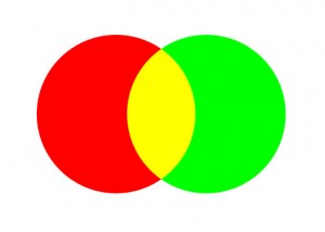
我要实现这样的目标-
我找了很多东西,但一直没能弄清楚。我找到的最有用的资源是CSS中新的混合功能,它展示了如何使用画布来完成它。使用CSS可以做同样的事情吗?
编辑
上面的圆圈只是一个例子来说明我需要什么。正如我提到的,我正在寻找两个不同元素的混合颜色。我创造了一个小提琴,我的实际形状,我需要混合。http://jsfiddle.net/fmgfsr4o/2/
回答 2
Stack Overflow用户
回答已采纳
发布于 2014-08-29 12:14:39
您可以将CSS多个背景与径向梯度组合起来,以实现此效果:
CSS
div {
  /* adjust the width of the container to adjust circle's
     overlap size and shape */
  width: 80px;
  height: 50px;
  /* for debug purpose only */
  border: solid blue 1px;

  background:
    /* draw the red circle */
    radial-gradient(red 0%, red 70%, transparent 70%, transparent 100%) 0 0,
    /* draw the green circle */
    radial-gradient(green 0%, green 70%, transparent 70%, transparent 100%) 0 0;
    /* the red on the left, the green on the right */
  background-position: top left, top right;

  /* you can make then bigger or smaller */
  /* but you have to change width size above too */
  background-size: 50px 50px;
  /* You want both circles to appears once only */
  background-repeat: no-repeat;

  /* you can try with other values too */
  /* https://developer.mozilla.org/en-US/docs/Web/CSS/background-blend-mode */
  background-blend-mode: multiply;
}
HTML
<div></div>我给你做了一个JSFiddle,让你试试:http://jsfiddle.net/pomeh/07nLpwwj/
这就是我使用Firefox 31得到的结果:

即使浏览器支持看起来“正确”(请参见这里的http://caniuse.com/#feat=css-backgroundblendmode),但请注意,background-blend-mode属性目前具有候选推荐状态,因此在使用它时要小心(感谢@Paulie_D指出了这一点)。
Stack Overflow用户
发布于 2014-08-29 12:02:28
尝试这个纯CSS3,尽管您需要弄清楚如何定位圆圈。
html {
height: 100%;
background:
    repeating-radial-gradient(
        circle,
        transparent,
        transparent 3.5em,
        tomato 1em,
        tomato 4.5em
    ),
    repeating-radial-gradient(
        circle,
        transparent,
        transparent 3.5em,
        dodgerblue 3.5em,
        dodgerblue 4.5em
    );

background-blend-mode: multiply;
background-size: 10em 10em;
background-position:
    0 0,
    5em 5em,
    10em 5em;
}
JSFiddle
页面原文内容由Stack Overflow提供。腾讯云小微IT领域专用引擎提供翻译支持
原文链接:
https://stackoverflow.com/questions/25566775
复制相关文章
相似问题
腾讯云开发者
