
iOS 8 web应用程序在加载相机应用程序后会缩小屏幕
我正在构建一个web应用程序,在iOS 8中遇到了一个问题。请注意,这是iOS 8特有的,因为它在以前的版本中运行得很好。
我有一个网页,可以直接上传手机或平板电脑上的图片。我使用以下链接调用相机应用程序:
<input type="file" accept="image/*" capture="camera" name="files[]">相机应用程序按预期打开,拍摄照片时没有问题。然而,当相机应用程序关闭并返回到web应用程序时,屏幕高度降低了一半以上。没有办法纠正预期关闭和重新启动应用程序。
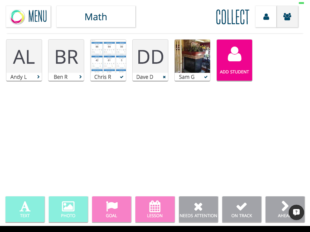
你可以在这里看到照片后的样子:屏风
看上去屏幕似乎还在风景中。然而,旋转设备只会使情况变得更糟。
我假设这是一个iOS 8错误,但想知道是否有人对如何纠正或解决这个问题有任何想法。
最后一个注意事项,这个问题仅在作为web应用程序运行时才会出现。当使用safari时,它是有效的。
FYI -以下是我使用的元标记:
        <!-- Run in full-screen mode. -->
        <meta name="apple-mobile-web-app-capable" content="yes">
        <meta name="mobile-web-app-capable" content="yes">

        <!-- Make the status bar black with white text. -->
        <meta name="apple-mobile-web-app-status-bar-style" content="black">

        <!-- Customize home screen title. -->
        <meta name="apple-mobile-web-app-title" content="DigiSite">

        <!-- Disable phone number detection. -->
        <meta name="format-detection" content="telephone=no">

        <!-- Set viewport. -->
        <meta name="viewport" content="width=device-width, initial-scale=1.0, maximum-scale=1.0, user-scalable=0">

        <!-- Startup images -->

        <!-- iOS 6 & 7 iPad (retina, portrait) -->
        <link href="http://img.digisite.us/splash.png?w=1536&h=2008&c=<br />
<b>Notice</b>:  Undefined index: background in <b>/home5/digisite/public_html/mobile/mobileHeader.php</b> on line <b>22</b><br />
&n=lumentum"
        media="(device-width: 768px) and (device-height: 1024px)
        and (orientation: portrait)
        and (-webkit-device-pixel-ratio: 2)"
        rel="apple-touch-startup-image">

        <!-- iOS 6 & 7 iPad (retina, landscape) -->
        <link href="http://img.digisite.us/splash.png?w=1496&h=2048&c=&n=lumentum"
        media="(device-width: 768px) and (device-height: 1024px)
        and (orientation: landscape)
        and (-webkit-device-pixel-ratio: 2)"
        rel="apple-touch-startup-image">

        <!-- iOS 6 iPad (portrait) -->
        <link href="http://img.digisite.us/splash.png?w=768&h=1004&c=&n=lumentum"
        media="(device-width: 768px) and (device-height: 1024px)
        and (orientation: portrait)
        and (-webkit-device-pixel-ratio: 1)"
        rel="apple-touch-startup-image">

        <!-- iOS 6 iPad (landscape) -->
        <link href="http://img.digisite.us/splash.png?w=748&h=1024&c=&n=lumentum"
        media="(device-width: 768px) and (device-height: 1024px)
        and (orientation: landscape)
        and (-webkit-device-pixel-ratio: 1)"
        rel="apple-touch-startup-image">

        <!-- iOS 6 & 7 iPhone 5 -->
        <link href="http://img.digisite.us/splash.png?w=640&h=1096&c=&n=lumentum"
        media="(device-width: 320px) and (device-height: 568px)
        and (-webkit-device-pixel-ratio: 2)"
        rel="apple-touch-startup-image">

        <!-- iOS 6 & 7 iPhone (retina) -->
        <link href="http://img.digisite.us/splash.png?w=640&h=920&c=&n=lumentum"
        media="(device-width: 320px) and (device-height: 480px)
        and (-webkit-device-pixel-ratio: 2)"
        rel="apple-touch-startup-image">
谢谢你的进阶。
回答 4
Stack Overflow用户
发布于 2014-09-24 19:51:03
在运行iPad 2的iOS8上,我也看到了同样的问题。这似乎与你打开应用程序的方向有关。如果我们打开的应用程序在纵向(垂直)模式,然后切换到景观(水平),它的工作很好。只有当应用程序在景观中打开时,视口才会缩小。
我还没能在iOS7上复制这个问题。
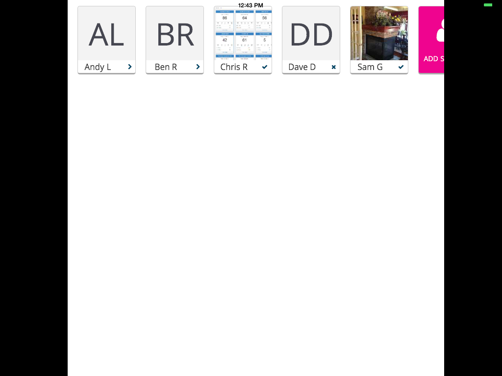
拍照前:
照片拍摄后:
Stack Overflow用户
发布于 2014-09-25 03:57:08
本,你是绝对正确的--这是一个iOS 8错误。我无法确定如何以编程方式解决这个问题。如果其他人有任何想法,请随意分享。但是有一种方法可以手动修正。
这个问题似乎是围绕着摄像头应用程序而产生的,没有正确地识别正确的位置。在我的iPhone上,相机应用程序总是以纵向模式打开,即使保持在景观位置。如果您检测到这一点,只需继续旋转设备,直到它自动纠正位置。我花了两次尝试才纠正了自己。一旦进入正确的模式,点击“使用照片”,一切都是好的。因此,正如Ben所说,只要网络应用程序和摄像头应用程序处于相同的方向,那么一切都是好的。如果它们不是您的web应用程序,那么视图端口就会被搞砸。一旦发生这种情况,你唯一的办法就是关闭应用程序,然后再试一次。另一个有趣的节点,只有在运行全屏应用程序时才会发生。如果像任何正常的网站一样通过狩猎旅行,就没有问题了。
我在这里记录了这些步骤,以确保我上面所说的是清楚的。http://screencast.com/t/1mwIur5Z8。
我希望这对其他人有帮助。希望苹果公司能纠正这一点。
感谢本将缺陷提交给苹果!
Stack Overflow用户
发布于 2014-09-30 13:46:00
我也有同样的问题。8月6日,我在Apple bugtracker中打开了一个bugreport,但没人在意:-/
这似乎与
<meta name="apple-mobile-web-app-status-bar-style" content="black">如果您不使用这个标签,您有一个重叠状态栏,但拍照不再调整您的视口大小。
编辑:
完整的例子:
<!DOCTYPE html>
<html>
  <head>
    <meta charset="utf-8">
    <meta name="apple-mobile-web-app-capable" content="yes">
    <meta name="viewport" content="initial-scale=1.0, maximum-scale=1.0, minimum-scale=1.0">
    <meta name="apple-touch-fullscreen" content="yes">
  </head>
  <body><h1>Test</h1>
    <p>Capture a photo using camera</p>
      <input type="file" capture="camera" accept="image/*">
  </body>
</html>https://stackoverflow.com/questions/26025003
复制相似问题
腾讯云开发者
