
如何创建镜像直方图
如何创建镜像直方图
提问于 2015-04-28 19:57:01
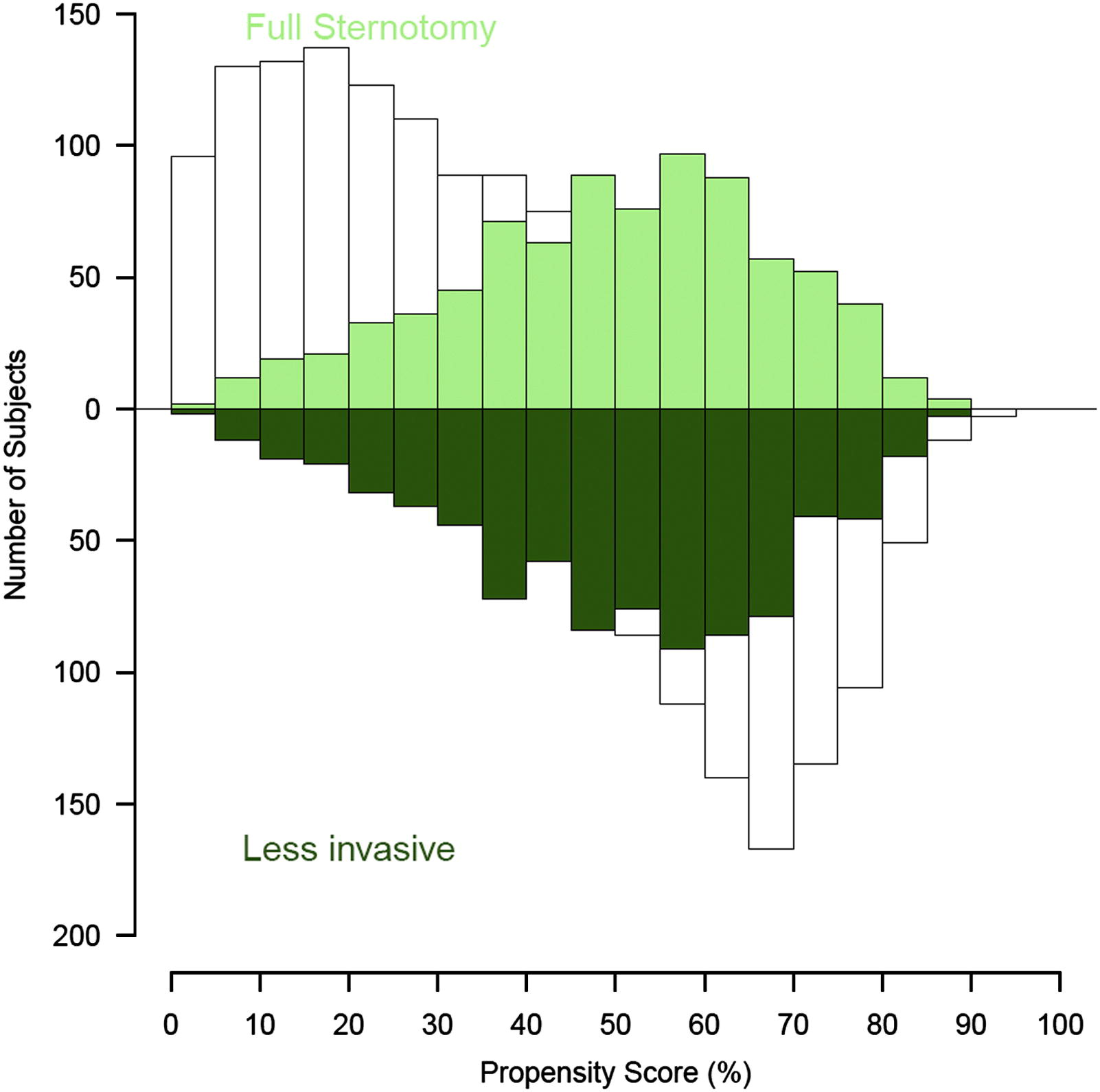
我想要目前的倾向分数匹配的两组统计数据(未匹配的体重,匹配的颜色),并希望使用镜像直方图,如下所示
是否可以在基数R中叠加4种不同的直方图?是否有提供此功能的包?
X轴为0,1有界(这是一个概率),BW列总是较大或等于有色列(也就是说,不能有BW列“后面”有色列)。
来自http://www.ncbi.nlm.nih.gov/pubmed/22244556的图像
回答 2
Stack Overflow用户
回答已采纳
发布于 2015-04-28 20:30:11
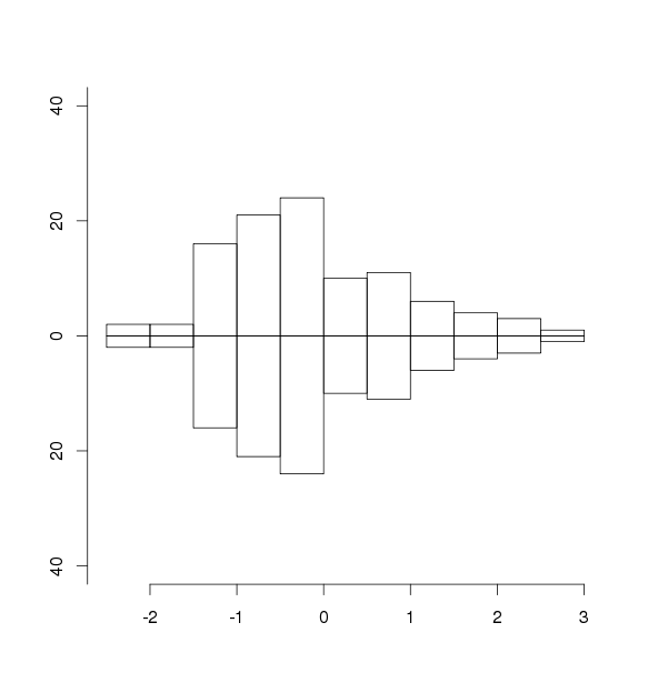
您可以使用以下内容。您可能希望预先计算hist对象以获得正确的ylim值,然后使用axis和mtext或title来正确标记图形。
set.seed(1234)
x <- rnorm(100, 0, 1)

plot.new()
plot.window(ylim = c(-40, 40), xlim = range(x))
p <- list(axes = FALSE, xlab = "", ylab = "", main = "")
par(new = TRUE)
do.call(hist, c(list(x = x, ylim = c(-40, 40)), p))
par(new = TRUE)
do.call(hist, c(list(x = x, ylim = c(40, -40)), p))
axis(side = 2,
     at = pretty(par()$usr[3:4]),
     labels = abs(pretty(par()$usr[3:4])))
axis(side = 1)
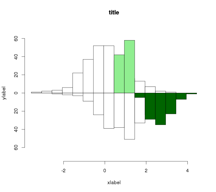
编辑
## Create some fake data
set.seed(1234)
d <- rnorm(250, 0, 1)
e <- rnorm(250, 1, 1)
f <- rlnorm(100, 0, .2)
g <- rlnorm(100, 1, .2)

## Function for plotting
multhist <- function(..., bin.width, col, dir, xlab = NULL, ylab = NULL,
                     main = NULL) {

  vals <- list(...)
  vrng <- range(vals)

  brks <- seq(vrng[1] - abs(vrng[1]*0.1),
              vrng[2] + abs(vrng[2]*0.1),
              by = bin.width)

  yrng <- max(sapply(lapply(vals, hist, breaks = brks), "[[", "counts"))
  yrng <- 1.2*c(-1*yrng, yrng)

  plot.new()
  plot.window(ylim = yrng, xlim = vrng)

  addhist <- function(x, col, dir) {
    par(new = TRUE)
    hist(x = x, ylim = dir*yrng, col = col, xlab = "", ylab = "",
         main = "", axes = FALSE, breaks = brks)
  }

  mapply(addhist, x = vals, col = col, dir = dir)

  py <- pretty(yrng)
  py <- py[py >= yrng[1] & py <= yrng[2]]
  axis(side = 2, at = py, labels = abs(py))
  axis(side = 1)
  title(main = main, xlab = xlab, ylab = ylab)

}
您可以给出函数的数字向量,以及对应的颜色和方向(1或-1)的向量。我没有做正式检查的长度,二,二,但它是相当直接的。
## Use the function
multhist(d, e, f, g, bin.width = 0.5,
         col = c("white", "white", "lightgreen", "darkgreen"),
         dir = c(1, -1, 1, -1), xlab = "xlabel", ylab = "ylabel",
         main = "title")
Stack Overflow用户
发布于 2015-04-28 20:39:53
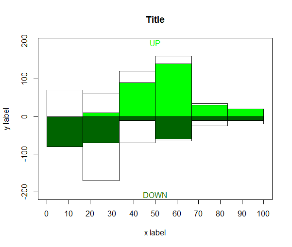
您可以使用基本的barplot两次,您只需要计算下图的负值,例如:
upvalues <- data.frame(Green=c(0,10,90,140,30, 20),White=c(70,50,30,20,5, 0))
downvalues <- data.frame(Green=c(-80,-70,-10,-60,-10,-10),White=c(0,-100,-60,-5,-15, -10))

# barplot accept only matrices
up <- t(as.matrix(upvalues))
down <- t(as.matrix(downvalues))

# empty plot to make room for everything
yspace <- 1.2 # it means 20% of space for the inside labels
plot(x=c(0,max(ncol(up))),
     y=c(min(colSums(down))*yspace ,max(colSums(up))*yspace),
     type='n', xaxt='n', yaxt='n', ann=FALSE)
a <- barplot(up,col=c('green','white'),space=0,add=T)
b <- barplot(down,col=c('darkgreen','white'),space=0,add=T,axes=F)

axis(side=1,at=seq.int(0,by=ncol(up)/10,length.out=11),
     labels=seq.int(0,by=10,length.out=11))
title(xlab = 'x label', ylab='y label', main = 'Title')
mtext('UP',line=-1,side=3,col='green')
mtext('DOWN',line=-1,side=1,col='darkgreen')
页面原文内容由Stack Overflow提供。腾讯云小微IT领域专用引擎提供翻译支持
原文链接:
https://stackoverflow.com/questions/29928712
复制相关文章
相似问题
腾讯云开发者
