
自举相关CI随样本量的增加
自举相关CI随样本量的增加
提问于 2015-05-21 17:32:44
我想演示95%置信区间的宽度如何随着样本数量的增加而变化,从n= 10增加到n=100,每轮增加5个样本。我假设我们可以使用一个引导函数来完成这个任务,并重复每一轮1000次。如何在R中做到这一点?请参阅:http://www.nicebread.de/at-what-sample-size-do-correlations-stabilize/
我们可以使用钻石数据:
data(diamonds)
x <- diamonds$price
y <- diamonds$carat回答 2
Stack Overflow用户
回答已采纳
发布于 2015-05-21 18:34:37
您可以自己添加图表和轴标题,但这段代码完成了我认为您需要使用ggplot2和“心理测量”包的功能:
library(ggplot2)
library(psychometric)

corSamp <- function(x) {
# return the correlation between price and carat on diamonds for a given sample size
  index <- sample(1:nrow(diamonds), x)
  carat <- diamonds$carat[index]
  price <- diamonds$price[index]
  return(cor(carat, price))
}

cors <- sapply(seq(5,100,5), corSamp)
lower <- sapply(1:20, function(i) return(CIr(r = cors[i], n = seq(5,100,5)[i], level = 0.95)[1]))
upper <- sapply(1:20, function(i) return(CIr(r = cors[i], n = seq(5,100,5)[i], level = 0.95)[2]))

myData <- data.frame(cbind(cors, lower, upper, seq(5,100,5)))

myPlot <- ggplot(myData, aes(x = V4, y = cors)) + geom_line() + geom_ribbon(aes(ymin = lower, ymax = upper), alpha = 0.5)
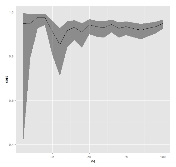
这里V4是样本大小。
Stack Overflow用户
发布于 2015-05-21 18:22:18
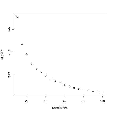
您可以使用sapply循环遍历您的样本大小,对于每个样本大小绘制1000个适当大小的随机样本,报告置信区间的平均宽度:
set.seed(144)
ci.widths <- sapply(seq(10, 100, 5), function(x) mean(replicate(1000, {
  r <- sample(nrow(diamonds), x, replace=TRUE)
  diff(cor.test(diamonds$price[r], diamonds$carat[r])$conf.int)
})))
plot(seq(10, 100, 5), ci.widths, xlab="Sample size", ylab="CI width")
页面原文内容由Stack Overflow提供。腾讯云小微IT领域专用引擎提供翻译支持
原文链接:
https://stackoverflow.com/questions/30380627
复制相关文章
相似问题
腾讯云开发者
