
使引导表列与内容相匹配
使引导表列与内容相匹配
提问于 2015-07-02 11:55:46
我用的是鞋带,画一张桌子。最右边的列中有一个按钮,我希望它降到它需要的最小大小,以适应上述按钮。
<link href="https://maxcdn.bootstrapcdn.com/bootstrap/3.3.7/css/bootstrap.min.css" rel="stylesheet">
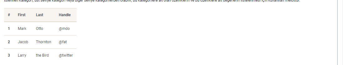
<table class="table table-responsive">
<tbody>
<tr>
<th>Name</th>
<th>Payment Method</th>
<th></th>
</tr>
<tr>
<td>Bart Foo</td>
<td>Visa</td>
<td><a role="button" class="btn btn-default btn-xs" href="/Payments/View/NnrN_8tMB0CkVXt06nkrYg">View</a></td>
</tr>
</tbody>
</table>
如下所示:

通过突出显示一些firebug,列的宽度显示得如此之宽:

该列与页面一起缩放,而页面处于较大的动态宽度模式。我知道如何在纯CSS中修复这个问题,但是大多数这些方法可能会导致站点的低宽度版本的问题。
我将如何使该列下降到其内容的宽度?
(一如既往地存在引导类>纯CSS > Javascript)
回答 9
Stack Overflow用户
回答已采纳
发布于 2015-07-02 12:09:07
创建一个将表格单元格宽度与内容相匹配的类。
.table td.fit,
.table th.fit {
    white-space: nowrap;
    width: 1%;
}Stack Overflow用户
发布于 2018-09-23 05:59:11
在Bootstrap 4.5和5.0上测试
所有的解决方案对我都没有用。td最后一列仍然采用完全宽度。所以这是解决办法。
CSS
将table-fit添加到table中
table.table-fit {
    width: auto !important;
    table-layout: auto !important;
}
table.table-fit thead th, table.table-fit tfoot th {
    width: auto !important;
}
table.table-fit tbody td, table.table-fit tfoot td {
    width: auto !important;
}
Scss
这是scss使用的一个。
@mixin width {
    width: auto !important;
}
table {
    &.table-fit {
        @include width;
        table-layout: auto !important;
        thead th, tfoot th  {
            @include width;
        }
        tbody td, tfoot td {
            @include width;
        }
    }
}Stack Overflow用户
发布于 2020-05-01 13:20:15
将w-auto本机引导4类添加到表元素中,您的表将适合其内容。
页面原文内容由Stack Overflow提供。腾讯云小微IT领域专用引擎提供翻译支持
原文链接:
https://stackoverflow.com/questions/31184000
复制相关文章
相似问题
腾讯云开发者
