
如何使用matplotlib使两个标记在图例中共享相同的标签?
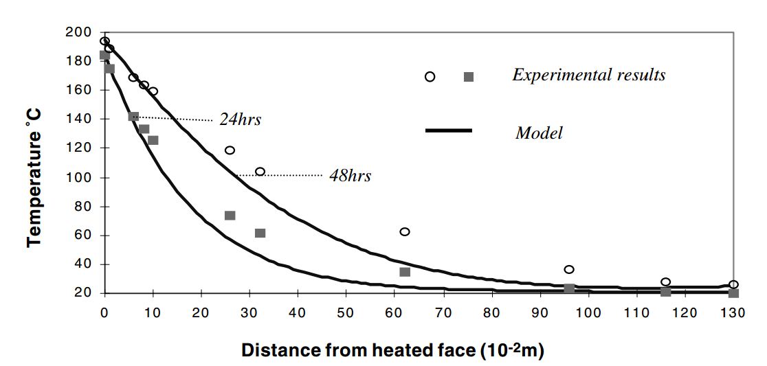
我想要的是这样
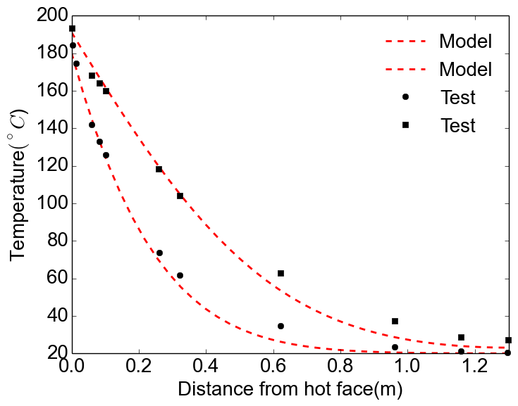
我得到的是:
那么如何将标记合并成一个标签呢?当然,对于线条,你可以通过在使用相同的线型时不给第二行指定标签来实现,但是对于标记,你不能,因为它们是不同的形状。
回答 5
Stack Overflow用户
发布于 2015-07-21 04:28:09
我认为最好使用一个完整的图例-否则,你的读者将如何知道两个模型,或两个数据集之间的区别?我会这样做:
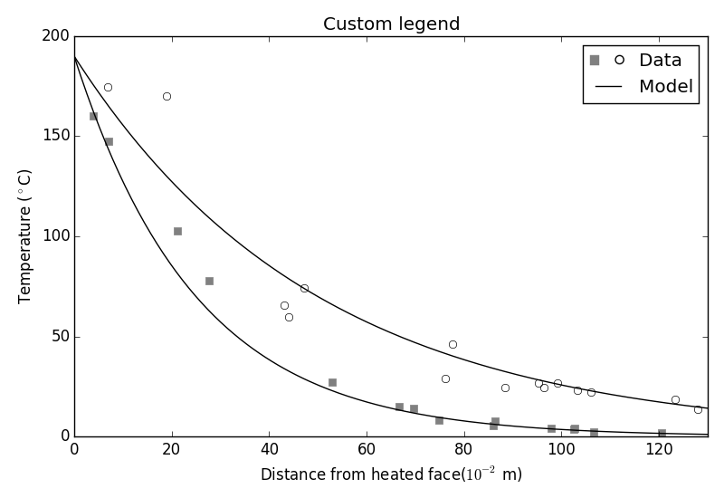
但是,如果您真的想这样做,您可以使用自定义图例,如本指南所示。您需要像他们一样创建自己的类,它定义了legend_artist方法,然后适当地添加方块和圆圈。下面是生成的图和用于生成它的代码:
#!/usr/bin/env python
import matplotlib.pyplot as plt
import matplotlib.patches as mpatches
import numpy as np
# ==================================
# Define the form of the function
# ==================================
def model(x, A=190, k=1):
return A * np.exp(-k*x/50)
# ==================================
# How many data points are generated
# ==================================
num_samples = 15
# ==================================
# Create data for plots
# ==================================
x_model = np.linspace(0, 130, 200)
x_data1 = np.random.rand(num_samples) * 130
x_data1.sort()
x_data2 = np.random.rand(num_samples) * 130
x_data2.sort()
data1 = model(x_data1, k=1) * (1 + np.random.randn(num_samples) * 0.2)
data2 = model(x_data2, k=2) * (1 + np.random.randn(num_samples) * 0.15)
model1 = model(x_model, k=1)
model2 = model(x_model, k=2)
# ==================================
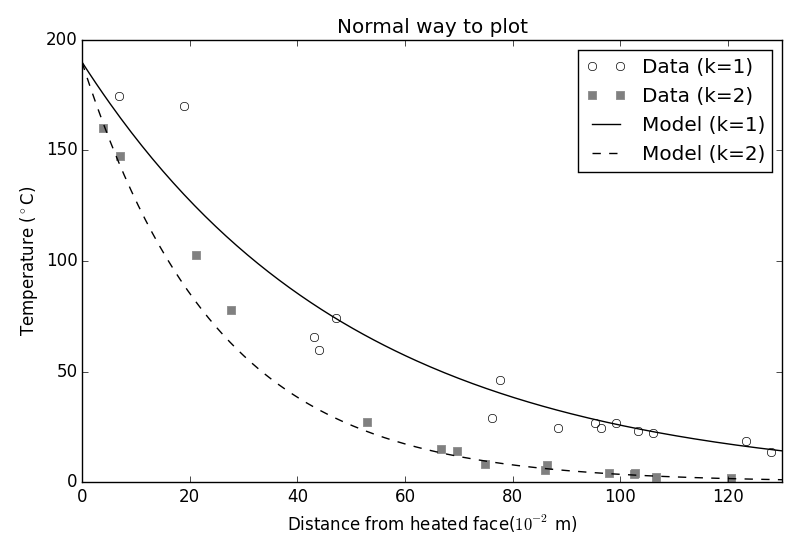
# Plot everything normally
# ==================================
fig = plt.figure()
ax = fig.add_subplot('111')
ax.plot(x_data1, data1, 'ok', markerfacecolor='none', label='Data (k=1)')
ax.plot(x_data2, data2, 'sk', markeredgecolor='0.5', markerfacecolor='0.5', label='Data (k=2)')
ax.plot(x_model, model1, '-k', label='Model (k=1)')
ax.plot(x_model, model2, '--k', label='Model (k=2)')
# ==================================
# Format plot
# ==================================
ax.set_xlabel('Distance from heated face($10^{-2}$ m)')
ax.set_ylabel('Temperature ($^\circ$C)')
ax.set_xlim((0, 130))
ax.set_title('Normal way to plot')
ax.legend()
fig.tight_layout()
plt.show()
# ==================================
# ==================================
# Do it again, but with custom
# legend
# ==================================
# ==================================
class AnyObject(object):
pass
class data_handler(object):
def legend_artist(self, legend, orig_handle, fontsize, handlebox):
scale = fontsize / 22
x0, y0 = handlebox.xdescent, handlebox.ydescent
width, height = handlebox.width, handlebox.height
patch_sq = mpatches.Rectangle([x0, y0 + height/2 * (1 - scale) ], height * scale, height * scale, facecolor='0.5',
edgecolor='0.5', transform=handlebox.get_transform())
patch_circ = mpatches.Circle([x0 + width - height/2, y0 + height/2], height/2 * scale, facecolor='none',
edgecolor='black', transform=handlebox.get_transform())
handlebox.add_artist(patch_sq)
handlebox.add_artist(patch_circ)
return patch_sq
# ==================================
# Plot everything
# ==================================
fig = plt.figure()
ax = fig.add_subplot('111')
d1 = ax.plot(x_data1, data1, 'ok', markerfacecolor='none', label='Data (k=2)')
d2 = ax.plot(x_data2, data2, 'sk', markeredgecolor='0.5', markerfacecolor='0.5', label='Data (k=1)')
m1 = ax.plot(x_model, model1, '-k', label='Model (k=1)')
m2 = ax.plot(x_model, model2, '-k', label='Model (k=2)')
# ax.legend([d1], handler_map={ax.plot: data_handler()})
ax.legend([AnyObject(), m1[0]], ['Data', 'Model'], handler_map={AnyObject: data_handler()})
# ==================================
# Format plot
# ==================================
ax.set_xlabel('Distance from heated face($10^{-2}$ m)')
ax.set_ylabel('Temperature ($^\circ$C)')
ax.set_xlim((0, 130))
ax.set_title('Custom legend')
fig.tight_layout()
plt.show()Stack Overflow用户
发布于 2019-03-04 09:51:10
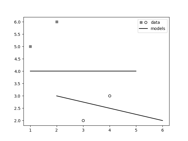
注意,在matplotlib的最新版本中,您可以使用class matplotlib.legend_handler.HandlerTuple实现这一点,如本回答和本指南所示。
import matplotlib.pyplot as plt
from matplotlib.legend_handler import HandlerTuple
fig, ax1 = plt.subplots(1, 1)

# First plot: two legend keys for a single entry
p2, = ax1.plot([3, 4], [2, 3], 'o', mfc="white", mec="k")
p1, = ax1.plot([1, 2], [5, 6], 's', mfc="gray", mec="gray")
# `plot` returns a list, but we want the handle - thus the comma on the left
p3, = ax1.plot([1, 5], [4, 4], "-k")
p4, = ax1.plot([2, 6], [3, 2], "-k")

# Assign two of the handles to the same legend entry by putting them in a tuple
# and using a generic handler map (which would be used for any additional
# tuples of handles like (p1, p3)).
l = ax1.legend([(p1, p2), p3], ['data', 'models'],
               handler_map={tuple: HandlerTuple(ndivide=None)})

plt.savefig("demo.png")
Stack Overflow用户
发布于 2016-07-06 19:53:42
我还发现此链接非常有用(下面的代码),这是一个更容易处理这个问题的方法。它基本上使用一个图例句柄列表,使第一个句柄的标记之一不可见,并将其与第二个句柄的标记重叠。这样,你就有两个标记相邻一个标签。
图,ax = plt.subplots() p1 = ax.scatter(0.1,0.5,c='r',ax.scatter=‘s’) p2 = ax.scatter(0.3,0.2,c='b',标记=‘o’)l=ax.legend(p1,p2,'points',scatterpoints=2)
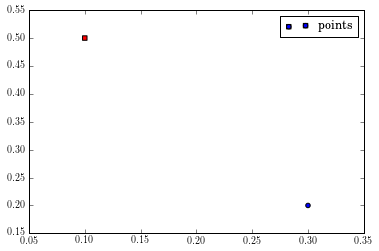
使用上面的代码,一个TupleHandler用于创建图例句柄,它简单地超出了两个句柄(如果你仔细地看,蓝色圆圈后面有红色的方块)。您要做的是使第一个句柄的第二个标记和第二个句柄的第一个标记不可见。不幸的是,TupleHandler是最近添加的,您需要一个特殊的函数来获得所有的句柄。否则,您可以使用Legend.legendHandles属性(它只显示TupleHandler的第一个句柄)。
def get_handle_lists(l):“返回句柄列表。”tree = l._legend_box.get_children()1,用于tree.get_children()中的列:column.get_children()中的行: row.get_children().get_children()
handles_list = list(get_handle_lists(l)) handles = handles_list # handles是一个包含两个PathCollection的列表。#第一个代表红色方块,第二个#代表蓝色圆圈。handles.set_facecolors("r","none") #用于第一个# PathCollection,通过#设置其面部颜色和# edgecolor为“none”使#第二个标记不可见。handles.set_edgecolors("k","none") handles1.set_facecolors(“无”,"b") handles1.set_edgecolors(“无”,"k")
https://stackoverflow.com/questions/31478077
复制相似问题
腾讯云开发者

Copyright © 2013 - 2026 Tencent Cloud. All Rights Reserved. 腾讯云 版权所有
深圳市腾讯计算机系统有限公司 ICP备案/许可证号:粤B2-20090059 ![]() 粤公网安备44030502008569号
粤公网安备44030502008569号
腾讯云计算(北京)有限责任公司 京ICP证150476号 | 京ICP备11018762号