
如何绘制叠加事件持续时间(甘特图)
如何绘制叠加事件持续时间(甘特图)
提问于 2015-08-04 22:38:37
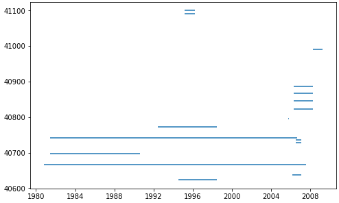
我有一个Pandas DataFrame,它包含一个流规开始测量流量的日期和空间站退役的日期。我想要生成一个以图形方式显示这些日期的图表。下面是我的DataFrame示例:
import pandas as pd

data = {'index': [40623, 40637, 40666, 40697, 40728, 40735, 40742, 40773, 40796, 40819, 40823, 40845, 40867, 40887, 40945, 40964, 40990, 41040, 41091, 41100],
        'StationId': ['UTAHDWQ-5932100', 'UTAHDWQ-5932230', 'UTAHDWQ-5932240', 'UTAHDWQ-5932250', 'UTAHDWQ-5932253', 'UTAHDWQ-5932254', 'UTAHDWQ-5932280', 'UTAHDWQ-5932290', 'UTAHDWQ-5932750', 'UTAHDWQ-5983753', 'UTAHDWQ-5983754', 'UTAHDWQ-5983755', 'UTAHDWQ-5983756', 'UTAHDWQ-5983757', 'UTAHDWQ-5983759', 'UTAHDWQ-5983760', 'UTAHDWQ-5983775', 'UTAHDWQ-5989066', 'UTAHDWQ-5996780', 'UTAHDWQ-5996800'],
        'amin': ['1994-07-19 13:15:00', '2006-03-16 13:55:00', '1980-10-31 16:00:00', '1981-06-11 17:45:00', '2006-06-28 13:15:00', '2006-06-28 13:55:00', '1981-06-11 15:30:00', '1992-06-10 15:45:00', '2005-10-03 16:30:00', '2006-04-25 09:56:00', '2006-04-25 11:05:00', '2006-04-25 13:50:00', '2006-04-25 14:20:00', '2006-04-25 12:45:00', '2008-04-08 13:03:00', '2008-04-08 13:15:00', '2008-04-15 12:47:00', '2005-10-04 10:15:00', '1995-03-09 13:59:00', '1995-03-09 15:13:00'],
        'amax': ['1998-06-30 14:51:00', '2007-01-24 12:55:00', '2007-07-31 11:35:00', '1990-08-01 08:30:00', '2007-01-24 13:35:00', '2007-01-24 14:05:00', '2006-08-22 16:00:00', '1998-06-30 11:33:00', '2005-10-22 15:00:00', '2006-04-25 10:00:00', '2008-04-08 12:16:00', '2008-04-08 09:10:00', '2008-04-08 09:30:00', '2008-04-08 11:27:00', '2008-04-08 13:05:00', '2008-04-08 13:23:00', '2009-04-07 13:15:00', '2005-10-05 11:40:00', '1996-03-14 10:40:00', '1996-03-14 11:05:00']}
df = pd.DataFrame(data)
df.set_index('index', inplace=True)

# display(df.head())

             StationId                 amin                 amax
index
40623  UTAHDWQ-5932100  1994-07-19 13:15:00  1998-06-30 14:51:00
40637  UTAHDWQ-5932230  2006-03-16 13:55:00  2007-01-24 12:55:00
40666  UTAHDWQ-5932240  1980-10-31 16:00:00  2007-07-31 11:35:00
40697  UTAHDWQ-5932250  1981-06-11 17:45:00  1990-08-01 08:30:00
40728  UTAHDWQ-5932253  2006-06-28 13:15:00  2007-01-24 13:35:00
我想创建一个类似于此的图(请注意,我没有使用上面的数据绘制此图):
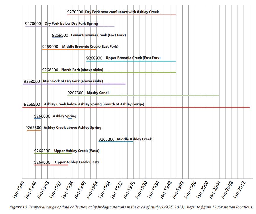
图中不需要在每条线上显示文本,只要y轴有站名。
虽然这看起来像是熊猫的利基应用,但我知道有几个科学家会从这种绘图能力中受益。
我能找到的最接近的答案是:
最后的答案最接近于满足我的需要。
虽然我更喜欢通过Pandas包装器来完成这个任务,但是我会对一个直接的matplotlib解决方案表示感谢。
回答 4
Stack Overflow用户
回答已采纳
发布于 2015-08-04 23:34:36
import pandas as pd
import matplotlib.pyplot as plt
import matplotlib.dates as dt

# using df from the OP

# convert columns to a datetime dtype
df.amin = pd.to_datetime(df.amin)
df.amax = pd.to_datetime(df.amax)

fig, ax = plt.subplots(figsize=(8, 5))
ax = ax.xaxis_date()
ax = plt.hlines(df.index, dt.date2num(df.amin), dt.date2num(df.amax))
- 下面的代码也可以工作
# using df from the OP

df.amin = pd.to_datetime(df.amin)
df.amax = pd.to_datetime(df.amax)

fig, ax = plt.subplots(figsize=(8, 5))
ax = plt.hlines(df.index, df.amin, df.amax)Stack Overflow用户
发布于 2017-07-01 07:47:12
您可以使用Bokeh制作甘特图。
下面是取自这个记事本的代码。它已经被更新,以删除不推荐的方法,并使用标准别名。
为了有正确的悬停注释,'Start'和'End'必须保持字符串,因此为x轴添加了单独的列(如datetime64[ns] Dtype )。
进口和样本DataFrame
import pandas as pd
from bokeh.plotting import figure, show, output_notebook, output_file
from bokeh.models import ColumnDataSource, Range1d
from bokeh.models.tools import HoverTool
output_notebook()
#output_file('GanntChart.html') #use this to create a standalone html file to send to others

# create sample dataframe
items =\
[['Completion of Project', '2016-11-1', '2016-11-30', 'red'],
 ['Stakeholder Meeting', '2016-10-20', '2016-10-21', 'blue'],
 ['Finalize Improvement Concepts', '2016-10-1', '2016-10-31', 'gray'],
 ['Determine Passability', '2016-9-15', '2016-10-1', 'gray'],
 ['Finalize Hydrodynamic Models', '2016-9-15', '2016-10-15', 'gray'],
 ['Retrieve Water Level Data', '2016-8-15', '2016-9-15', 'gray'],
 ['Improvement Conceptual Designs', '2016-5-1', '2016-6-1', 'gray'],
 ['Prepare Suitability Curves', '2016-2-1', '2016-3-1', 'gray'],
 ['Init. Hydrodynamic Modeling', '2016-1-2', '2016-3-15', 'gray'],
 ['Topographic Procesing', '2015-9-1', '2016-6-1', 'gray'],
 ['Initial Field Study', '2015-8-17', '2015-8-21', 'gray'],
 ['Submit SOW', '2015-8-10', '2015-8-14', 'gray'],
 ['Contract Review & Award', '2015-7-22', '2015-8-7', 'red']]

df = pd.DataFrame(data=items, columns=['Item', 'Start', 'End', 'Color'])

# add separate columns with the Start and End with a datetime dtype
df[['Start_dt', 'End_dt']] = df[['Start', 'End']].apply(pd.to_datetime)

# add id columns for plotting
df['ID'] = df.index + 0.8
df['ID1'] = df.index + 1.2
df
                              Item       Start         End Color   Start_dt     End_dt    ID   ID1
0            Completion of Project   2016-11-1  2016-11-30   red 2016-11-01 2016-11-30   0.8   1.2
1              Stakeholder Meeting  2016-10-20  2016-10-21  blue 2016-10-20 2016-10-21   1.8   2.2
2    Finalize Improvement Concepts   2016-10-1  2016-10-31  gray 2016-10-01 2016-10-31   2.8   3.2
3            Determine Passability   2016-9-15   2016-10-1  gray 2016-09-15 2016-10-01   3.8   4.2
4     Finalize Hydrodynamic Models   2016-9-15  2016-10-15  gray 2016-09-15 2016-10-15   4.8   5.2
5        Retrieve Water Level Data   2016-8-15   2016-9-15  gray 2016-08-15 2016-09-15   5.8   6.2
6   Improvement Conceptual Designs    2016-5-1    2016-6-1  gray 2016-05-01 2016-06-01   6.8   7.2
7       Prepare Suitability Curves    2016-2-1    2016-3-1  gray 2016-02-01 2016-03-01   7.8   8.2
8      Init. Hydrodynamic Modeling    2016-1-2   2016-3-15  gray 2016-01-02 2016-03-15   8.8   9.2
9            Topographic Procesing    2015-9-1    2016-6-1  gray 2015-09-01 2016-06-01   9.8  10.2
10             Initial Field Study   2015-8-17   2015-8-21  gray 2015-08-17 2015-08-21  10.8  11.2
11                      Submit SOW   2015-8-10   2015-8-14  gray 2015-08-10 2015-08-14  11.8  12.2
12         Contract Review & Award   2015-7-22    2015-8-7   red 2015-07-22 2015-08-07  12.8  13.2
标绘
G = figure(title='Project Schedule', x_axis_type='datetime', width=800, height=400, y_range=df.Item,
           x_range=Range1d(df.Start_dt.min(), df.End_dt.max()), tools='save')

hover = HoverTool(tooltips="Task: @Item<br>\
Start: @Start<br>\
End: @End")
G.add_tools(hover)

CDS = ColumnDataSource(df)
G.quad(left='Start_dt', right='End_dt', bottom='ID', top='ID1', source=CDS, color="Color")
#G.rect(,"Item",source=CDS)
show(G)
该情节的实时版本具有交互式的悬停注释。

Stack Overflow用户
发布于 2016-11-13 05:30:38
用水平条也可以做到这一点:broken_barh(xranges, yrange, **kwargs)
页面原文内容由Stack Overflow提供。腾讯云小微IT领域专用引擎提供翻译支持
原文链接:
https://stackoverflow.com/questions/31820578
复制相关文章
相似问题
腾讯云开发者
