
如果我想要三维样条/随机非结构化数据的平滑插值,该怎么办?
我受到@James这个answer的启发,想看看如何使用griddata和map_coordinates。在下面的例子中,我展示了2D数据,但我感兴趣的是3D。我注意到griddata只为一维和二维提供样条,并且仅限于3D和更高的线性插值(可能是出于非常好的原因)。然而,map_coordinates似乎是好的3D使用更高的阶(平滑比分段线性)插值。
我的主要问题是:如果我在3D中有随机的、非结构化的数据(在这里我不能使用map_coordinates),那么有什么方法比NumPy SciPy宇宙中的分段线性插值更平滑,或者至少在附近?
我的第二个问题是:griddata中没有3D样条是因为实现起来很困难或繁琐,还是存在根本的困难?
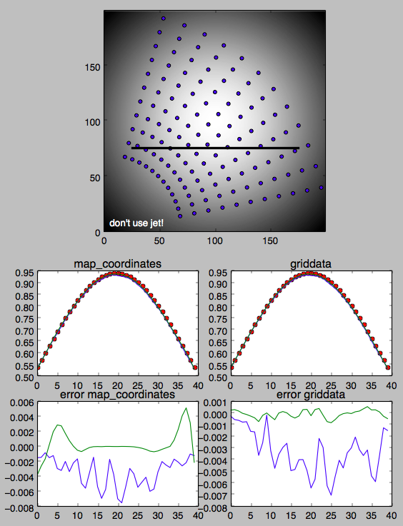
下面的图片和可怕的python显示了我目前对如何使用网格数据和map_coordinates的理解。插值沿厚的黑线进行。
结构化数据:
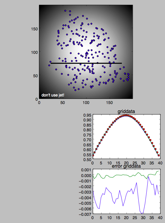
UNSTRUCTURED数据:
恐怖蟒蛇:
import numpy as np
import matplotlib.pyplot as plt

def g(x, y):
    return np.exp(-((x-1.0)**2 + (y-1.0)**2))

def findit(x, X):  # or could use some 1D interpolation
    fraction = (x - X[0]) / (X[-1]-X[0])
    return fraction * float(X.shape[0]-1)

nth, nr = 12, 11
theta_min, theta_max = 0.2, 1.3
r_min,     r_max     = 0.7, 2.0

theta = np.linspace(theta_min, theta_max, nth)
r     = np.linspace(r_min,     r_max,     nr)

R, TH = np.meshgrid(r, theta)
Xp, Yp  = R*np.cos(TH), R*np.sin(TH)
array = g(Xp, Yp)

x, y = np.linspace(0.0, 2.0, 200), np.linspace(0.0, 2.0, 200)
X, Y = np.meshgrid(x, y)
blob = g(X, Y)

xtest = np.linspace(0.25, 1.75, 40)
ytest = np.zeros_like(xtest) + 0.75

rtest = np.sqrt(xtest**2 + ytest**2)
thetatest = np.arctan2(xtest, ytest)

ir = findit(rtest, r)
it = findit(thetatest, theta)

plt.figure()

plt.subplot(2,1,1)

plt.scatter(100.0*Xp.flatten(), 100.0*Yp.flatten())
plt.plot(100.0*xtest, 100.0*ytest, '-k', linewidth=3)
plt.hold
plt.imshow(blob, origin='lower', cmap='gray')

plt.text(5, 5, "don't use jet!", color='white')


exact = g(xtest, ytest)

import scipy.ndimage.interpolation as spndint
ndint0 = spndint.map_coordinates(array, [it, ir], order=0)
ndint1 = spndint.map_coordinates(array, [it, ir], order=1)
ndint2 = spndint.map_coordinates(array, [it, ir], order=2)

import scipy.interpolate as spint
points = np.vstack((Xp.flatten(), Yp.flatten())).T   # could use np.array(zip(...))
grid_x = xtest
grid_y = np.array([0.75])

g0 = spint.griddata(points, array.flatten(), (grid_x, grid_y), method='nearest')
g1 = spint.griddata(points, array.flatten(), (grid_x, grid_y), method='linear')
g2 = spint.griddata(points, array.flatten(), (grid_x, grid_y), method='cubic')


plt.subplot(4,2,5)

plt.plot(exact, 'or')
#plt.plot(ndint0)
plt.plot(ndint1)
plt.plot(ndint2)
plt.title("map_coordinates")

plt.subplot(4,2,6)

plt.plot(exact, 'or')
#plt.plot(g0)
plt.plot(g1)
plt.plot(g2)
plt.title("griddata")

plt.subplot(4,2,7)

#plt.plot(ndint0 - exact)
plt.plot(ndint1 - exact)
plt.plot(ndint2 - exact)
plt.title("error map_coordinates")

plt.subplot(4,2,8)

#plt.plot(g0 - exact)
plt.plot(g1 - exact)
plt.plot(g2 - exact)
plt.title("error griddata")

plt.show()


seed_points_rand = 2.0 * np.random.random((400, 2))
rr = np.sqrt((seed_points_rand**2).sum(axis=-1))
thth = np.arctan2(seed_points_rand[...,1], seed_points_rand[...,0])
isinside = (rr>r_min) * (rr<r_max) * (thth>theta_min) * (thth<theta_max)
points_rand = seed_points_rand[isinside]

Xprand, Yprand = points_rand.T  # unpack
array_rand = g(Xprand, Yprand)

grid_x = xtest
grid_y = np.array([0.75])

plt.figure()

plt.subplot(2,1,1)

plt.scatter(100.0*Xprand.flatten(), 100.0*Yprand.flatten())
plt.plot(100.0*xtest, 100.0*ytest, '-k', linewidth=3)
plt.hold
plt.imshow(blob, origin='lower', cmap='gray')
plt.text(5, 5, "don't use jet!", color='white')


g0rand = spint.griddata(points_rand, array_rand.flatten(), (grid_x, grid_y), method='nearest')
g1rand = spint.griddata(points_rand, array_rand.flatten(), (grid_x, grid_y), method='linear')
g2rand = spint.griddata(points_rand, array_rand.flatten(), (grid_x, grid_y), method='cubic')

plt.subplot(4,2,6)

plt.plot(exact, 'or')
#plt.plot(g0rand)
plt.plot(g1rand)
plt.plot(g2rand)
plt.title("griddata")


plt.subplot(4,2,8)

#plt.plot(g0rand - exact)
plt.plot(g1rand - exact)
plt.plot(g2rand - exact)
plt.title("error griddata")

plt.show()回答 1
Stack Overflow用户
发布于 2015-09-24 14:12:29
问得好!(情节不错!)
对于非结构化数据,您需要切换回用于非结构化数据的函数。griddata是一种选择,但在两者之间采用三角剖分和线性插值。这将导致三角形边界上的“硬”边。
样条是径向基函数。在经济上,你想要scipy.interpolate.Rbf。我建议在三次样条上使用function="linear"或function="thin_plate",但是立方体也是可用的。(与线性或薄板样条相比,三次样条将加剧“超调”问题。)
一个注意事项是,径向基函数的这种特殊实现将始终使用数据集中的所有点。这是最精确、最平滑的方法,但随着输入观测点的增加,它的规模很差。有几种方法可以解决这个问题,但是事情会变得更加复杂。我把这个留到另一个问题上。
无论如何,这里有一个简化的例子。我们将生成随机数据,然后在规则网格上的点进行插值。(请注意,输入不是在规则网格上,插值点也不需要。)
import numpy as np
import scipy.interpolate
import matplotlib.pyplot as plt
np.random.seed(1977)

x, y, z = np.random.random((3, 10))

interp = scipy.interpolate.Rbf(x, y, z, function='thin_plate')

yi, xi = np.mgrid[0:1:100j, 0:1:100j]

zi = interp(xi, yi)

plt.plot(x, y, 'ko')
plt.imshow(zi, extent=[0, 1, 1, 0], cmap='gist_earth')
plt.colorbar()

plt.show()
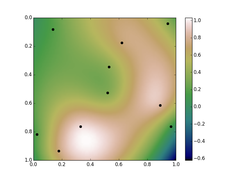
样条类型选择
我选择"thin_plate"作为样条的类型。我们的输入观测点从0到1不等(它们是由np.random.random创建的)。注意,我们的插值值略高于1,远低于零。这是“过度”。
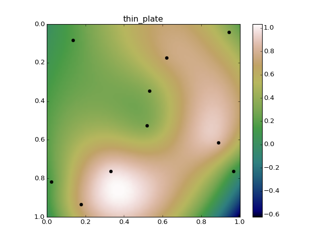
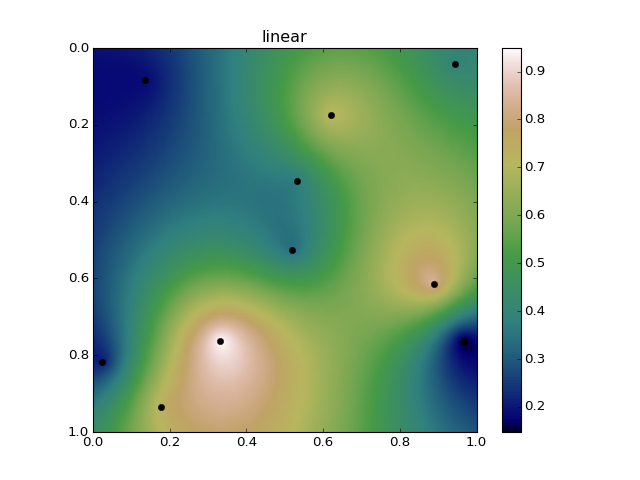
线性样条将完全避免过度,但你最终会出现“斗牛眼”模式(不过,远不及IDW方法那么严重)。例如,这是与线性径向基函数插值的完全相同的数据。请注意,我们的插值值永远不会超过1或低于0:
高阶样条将使数据中的趋势更加连续,但会超调更多。默认的"multiquadric"非常类似于薄板样条,但是会使事情变得更加连续,并且会变得更糟糕:

但是,当您进入更高的样条时,例如"cubic" (三阶):

和"quintic" (五阶)
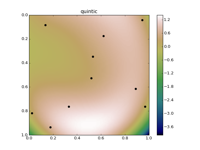
一旦你稍微超出你的输入数据,你真的可以得到不合理的结果。
无论如何,下面是一个比较随机数据上不同径向基函数的简单例子:
import numpy as np
import scipy.interpolate
import matplotlib.pyplot as plt
np.random.seed(1977)

x, y, z = np.random.random((3, 10))
yi, xi = np.mgrid[0:1:100j, 0:1:100j]

interp_types = ['multiquadric', 'inverse', 'gaussian', 'linear', 'cubic',
                'quintic', 'thin_plate']

for kind in interp_types:
    interp = scipy.interpolate.Rbf(x, y, z, function=kind)
    zi = interp(xi, yi)

    fig, ax = plt.subplots()
    ax.plot(x, y, 'ko')
    im = ax.imshow(zi, extent=[0, 1, 1, 0], cmap='gist_earth')
    fig.colorbar(im)
    ax.set(title=kind)
    fig.savefig(kind + '.png', dpi=80)

plt.show()https://stackoverflow.com/questions/32753449
复制相似问题
腾讯云开发者
