
css中的笔荧光效应
css中的笔荧光效应
提问于 2015-10-31 12:39:56
我想要创造一个突出效果,类似于一个高亮用钢笔。也就是说,它有波浪的顶部和底部和粗糙的开始和结束,就像在这张图片。

在CSS中,最好的方法是什么?有没有一种不使用背景图像的方法?同时,它也能很好地与线包装一起工作。
理想情况下,解决方案应该像下面这样采用HTML,并使其看起来像图像。
<p>
  <span class='green-highlight'>So write with a combination of short, medium, and long sentences. Create a sound that pleases the reader's ear. </span>
  <span class='pink-highlight'>Don't just write words. </span>
  <span class='yellow-highlight'>Write music. </span
</p>回答 6
Stack Overflow用户
回答已采纳
发布于 2015-10-31 13:17:47
不使用背景color..no。
背景延伸到总是矩形的元素的边缘(不包括border-radius)。
在这种情况下,背景图像可能是最佳选择.但
您可以使用多个text-shadow实现类似的效果。
一个简单的例子。
.green-highlight {
  text-shadow:
     3px 0px 3px green,
    -3px 0px 3px green,
     6px 0px 6px green,
    -6px 0px 6px green;

}

.red-highlight {
  text-shadow:
     3px 0px 3px red,
    -3px 0px 3px red,
     6px 0px 6px red,
    -6px 0px 6px red;
}

.yellow-highlight {
  text-shadow:
    -3px 0px 3px yellow,
     3px 0px 3px yellow,
     6px 0px 6px yellow,
    -6px 0px 6px yellow;
}<p>
<span class="green-highlight">So write with a combination of short, medium, and long sentences. Create a sound that pleases the reader's ear. </span>
<span class="red-highlight">Don't just write words. </span>
<span class="yellow-highlight">Write music. </span
</p>
你只要用多少阴影就能得到你想要的效果,
Stack Overflow用户
发布于 2020-06-20 09:41:14
一个超逼真的笔荧光笔!播放背景梯度的强度和文本阴影,以给予它一个清洗的效果。
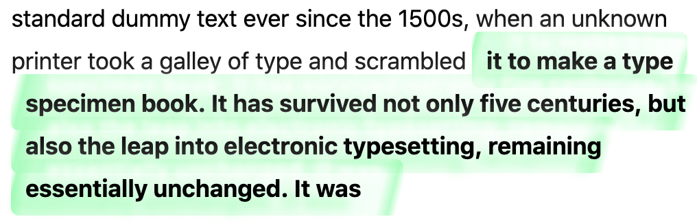
span {
    padding: 0.6em 13.7px;
    line-height: 1.8em;
    font-size: 23px;
    font-family: -apple-system,BlinkMacSystemFont,"Segoe UI",Roboto,"Helvetica Neue",Arial;
}
span.highlight {
font-weight: bolder;
background: linear-gradient(104deg, rgba(130, 255, 173,0) 0.9%, rgba(130, 255, 173,1.25) 2.4%, rgba(130, 255, 173,0.5) 5.8%, rgba(130, 255, 173,0.1) 93%, rgba(130, 255, 173,0.7) 96%, rgba(130, 255, 1732,0) 98%), linear-gradient(183deg, rgba(130, 255, 173,0) 0%, rgba(130, 255, 173,0.3) 7.9%, rgba(130, 255, 173,0) 15%);
padding: 0.6em 13.7px;
-webkit-box-decoration-break: clone;
margin: 0;
border-radius: 7.5px;
text-shadow: -12px 12px 9.8px rgba(130, 255, 173,0.7), 21px -18.1px 7.3px rgba(255, 255, 255,1), -18.1px -27.3px 30px rgba(255, 255, 255,1);
}<span class="highlight">Lorem Ipsum is simply dummy text of the printing and</span> <span>typesetting industry. Lorem Ipsum has been the industry's standard dummy text ever since the 1500s, when an unknown printer took a galley of type and scrambled <span class="highlight">it to make a type specimen book. It has survived not only five centuries, but also the leap into electronic typesetting, remaining essentially unchanged. It was<span>
Stack Overflow用户
发布于 2020-09-29 21:01:58
我在寻找最好的效果与纯CSS,并发现一个Basecamp使用相当引人注目。不过,仍有改进的余地。
以下是我的改进版本:

这是密码:
mark {
  margin: 0 -0.4em;
  padding: 0.1em 0.4em;
  border-radius: 0.8em 0.3em;
  background: transparent;
  background-image: linear-gradient(
    to right,
    rgba(255, 225, 0, 0.1),
    rgba(255, 225, 0, 0.7) 4%,
    rgba(255, 225, 0, 0.3)
  );
  -webkit-box-decoration-break: clone;
  box-decoration-break: clone;
}Inside this text some words <mark>are highlighted</mark> and some aren’t.
如果您对此如何工作感兴趣:
我写了一个tutorial about how the marker pen highlighter effect is achieved。
页面原文内容由Stack Overflow提供。腾讯云小微IT领域专用引擎提供翻译支持
原文链接:
https://stackoverflow.com/questions/33451683
复制相关文章
相似问题
腾讯云开发者

Copyright © 2013 - 2026 Tencent Cloud. All Rights Reserved. 腾讯云 版权所有
深圳市腾讯计算机系统有限公司 ICP备案/许可证号:粤B2-20090059  粤公网安备44030502008569号
腾讯云计算(北京)有限责任公司 京ICP证150476号 | 京ICP备11018762号