
位于响应图像之上的响应图像
位于响应图像之上的响应图像
提问于 2015-12-12 00:31:18
我看过所有其他类似的线程,没有一个与我想要做的相关。请看这张照片。
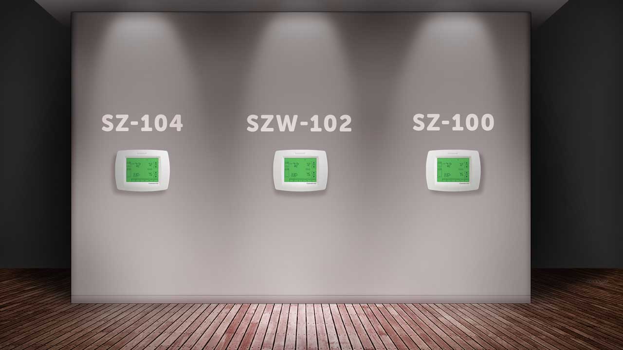
这里有四个部分。背景和墙上的3个恒温器。我想用css将每个恒温器放置在墙上,就像你在这张图片中看到它们一样,在<a>标签中,它们是可点击的,并且随着背景图像变得更大或更小,它们保持在相同的位置,这取决于视口大小(响应)。
对于我的生活,我不知道如何缩放和保持位置,这些恒温器与背景相对应的方式作出反应。有什么想法吗?
以下是背景图像:http://i.imgur.com/OXsviSl.jpg
回答 2
Stack Overflow用户
回答已采纳
发布于 2015-12-12 00:50:04
像这样的东西应该管用。只要你是比例缩放,你可以使用绝对定位和设置所有的百分比,以便它很好地缩放。
HTML
<div class="container">
    <img src="http://i.imgur.com/OXsviSl.jpg">
    <a class="left" href="#"></a>
    <a class="center"></a>
    <a class="right" href="#"></a>
</div>
CSS
.container {
    position: relative;
    margin: 20px;
}
img {
    width: 100%;
}
.left, .right, .center {
    display: block;
    position: absolute;
    background-color: blue;
    top: 42%;
    width: 10%;
    height: 17%;
}
.left {
    left: 18%;
}
.center {
    left: 43%;
}
.right {
    left: 68%;
}这里是一个jsFiddle
Stack Overflow用户
发布于 2015-12-12 00:54:43
这不是很精确,但是非常接近https://jsfiddle.net/nweotw86/
CSS
body{
    background: url("http://lorempixel.com/1200/1200/sports/1/");
    background-size: cover;
    background-repeat: no-repeat;
}
.small{width: 50px; height: 50px; background-color: red;}
.s1{ margin-left: 25%; margin-top: 10%; float: left}
.s2{ margin-left: 25%; margin-top: 10%; float: left}
.s3{ margin-left: 25%; margin-top: 10%; float: left}
HTML
  <div class="small s1">
  </div>
  <div class="small s2">
  </div>
  <div class="small s3">
</div>要使它们可点击,只需用这样的<a>包装:
<a href="#"><div class="small s1"></div></a>
页面原文内容由Stack Overflow提供。腾讯云小微IT领域专用引擎提供翻译支持
原文链接:
https://stackoverflow.com/questions/34234766
复制相关文章
相似问题
腾讯云开发者
