
TensorBoard -在同一图上绘制训练和验证损失?
有没有一种方法可以在同一张图上同时绘制训练损失和验证损失?
很容易为每个标量摘要分别生成两个单独的标量摘要,但这会将它们放在不同的图上。如果两者都显示在相同的图表中,那么就更容易看出它们之间的差距,以及它们是否由于过度拟合而开始发散。
有建好的路来做这个吗?如果不是的话,一个工作的方式?非常感谢!
回答 9
Stack Overflow用户
发布于 2016-05-11 08:02:12
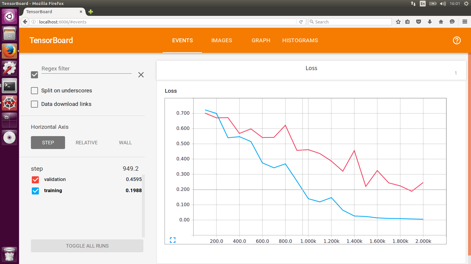
我一直在做的工作是使用两个具有不同日志dir的SummaryWriter分别用于训练集和交叉验证集。你会看到这样的东西:
Stack Overflow用户
发布于 2016-05-11 14:06:55
与其单独显示这两行,不如将验证和培训损失之间的差异绘制为自己的标量汇总,以跟踪差异。
与添加两个摘要相比,这并不能提供更多关于单个地块的信息,但它有助于比较多次运行(而不是每次运行添加多个摘要)。
Stack Overflow用户
发布于 2019-03-17 21:48:51
非常感谢niko在自定义标量上的提示。
我被官方的custom_scalar_demo.py弄糊涂了,因为有太多事情发生了,我不得不研究了很长一段时间,才弄清楚它是如何工作的。
为了准确地展示为现有模型创建自定义标量图所需做的工作,我将下面的完整示例组合在一起:
# + <
# We need these to make a custom protocol buffer to display custom scalars.
# See https://developers.google.com/protocol-buffers/
from tensorboard.plugins.custom_scalar import layout_pb2
from tensorboard.summary.v1 import custom_scalar_pb
# >
import tensorflow as tf
from time import time
import re
# Initial values
(x0, y0) = (-1, 1)
# This is useful only when re-running code (e.g. Jupyter).
tf.reset_default_graph()
# Set up variables.
x = tf.Variable(x0, name="X", dtype=tf.float64)
y = tf.Variable(y0, name="Y", dtype=tf.float64)
# Define loss function and give it a name.
loss = tf.square(x - 3*y) + tf.square(x+y)
loss = tf.identity(loss, name='my_loss')
# Define the op for performing gradient descent.
minimize_step_op = tf.train.GradientDescentOptimizer(0.092).minimize(loss)
# List quantities to summarize in a dictionary
# with (key, value) = (name, Tensor).
to_summarize = dict(
X = x,
Y_plus_2 = y + 2,
)
# Build scalar summaries corresponding to to_summarize.
# This should be done in a separate name scope to avoid name collisions
# between summaries and their respective tensors. The name scope also
# gives a title to a group of scalars in TensorBoard.
with tf.name_scope('scalar_summaries'):
my_var_summary_op = tf.summary.merge(
[tf.summary.scalar(name, var)
for name, var in to_summarize.items()
]
)
# + <
# This constructs the layout for the custom scalar, and specifies
# which scalars to plot.
layout_summary = custom_scalar_pb(
layout_pb2.Layout(category=[
layout_pb2.Category(
title='Custom scalar summary group',
chart=[
layout_pb2.Chart(
title='Custom scalar summary chart',
multiline=layout_pb2.MultilineChartContent(
# regex to select only summaries which
# are in "scalar_summaries" name scope:
tag=[r'^scalar_summaries\/']
)
)
])
])
)
# >
# Create session.
with tf.Session() as sess:
# Initialize session.
sess.run(tf.global_variables_initializer())
# Create writer.
with tf.summary.FileWriter(f'./logs/session_{int(time())}') as writer:
# Write the session graph.
writer.add_graph(sess.graph) # (not necessary for scalars)
# + <
# Define the layout for creating custom scalars in terms
# of the scalars.
writer.add_summary(layout_summary)
# >
# Main iteration loop.
for i in range(50):
current_summary = sess.run(my_var_summary_op)
writer.add_summary(current_summary, global_step=i)
writer.flush()
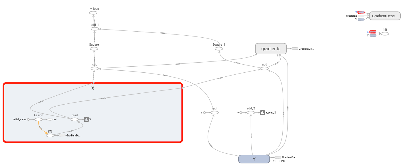
sess.run(minimize_step_op) 上面的代码由一个“原始模型”组成,三个代码块由
# + <
        [code to add custom scalars goes here]
#   >
我的“原始模型”有这些标量:
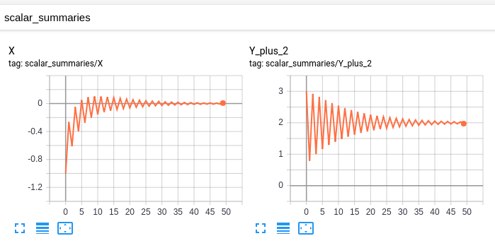
这张图是:
修改后的模型具有相同的标量和图形,以及以下自定义标量:
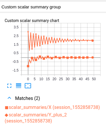
这个自定义标量图只是一个布局,它结合了原始的两个标量图。
不幸的是,生成的图形很难读懂,因为这两个值的颜色相同。(它们只通过标记来区别。)然而,这与TensorBoard关于每个日志只有一种颜色的约定是一致的。
解释
其想法如下。您有一些变量组,您想要绘制在一个图表中。作为先决条件,TensorBoard应该在“标量”标题下单独绘制每个变量。(这是通过为每个变量创建一个标量摘要,然后将这些摘要写入日志来实现的。(这里没有什么新鲜事。)
为了在相同的图表中绘制多个变量,我们告诉TensorBoard将这些摘要中的哪一个组合在一起。然后将指定的摘要合并成“自定义标量”标题下的单个图表。我们通过在日志开头写一次“布局”来实现这一点。一旦TensorBoard接收到布局,它就会在“自定义标量”下自动生成一个组合图表,因为普通的“标量”会被更新。
假设您的“原始模型”已经将变量(作为标量摘要)发送到TensorBoard,唯一需要的修改是在主迭代循环开始之前注入布局。每个自定义标量图通过正则表达式选择要绘制的摘要。因此,对于要绘制在一起的每一组变量,将变量各自的摘要放在单独的名称范围中是有用的。(这样,regex就可以简单地选择名称范围下的所有摘要。)
重要注意事项:(生成变量摘要的op )与变量本身不同。例如,如果我有一个变量ns1/my_var,我可以创建一个摘要ns2/summary_op_for_myvar。自定义标量图表布局只关心汇总操作,而不关心原始变量的名称或范围。
https://stackoverflow.com/questions/37146614
复制相似问题
腾讯云开发者

Copyright © 2013 - 2026 Tencent Cloud. All Rights Reserved. 腾讯云 版权所有
深圳市腾讯计算机系统有限公司 ICP备案/许可证号:粤B2-20090059 ![]() 粤公网安备44030502008569号
粤公网安备44030502008569号
腾讯云计算(北京)有限责任公司 京ICP证150476号 | 京ICP备11018762号