
css:让div脱颖而出
css:让div脱颖而出
提问于 2016-05-15 13:16:00
我想要看上去和附图一样
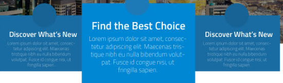
你可以看到居中的div看起来像它的焦点,其余的看起来不一样。
我用引导程序,这是用来做块的
<div class="row" id="about-blocks">
    <div class="col-md-3 col-sm-3 col-xs-12 col-md-offset-1 col-sm-offset-1">
        <span class='round-corner'>Heading</span>
        <h2>Discover What's new</h2>
        <p>
           Lorem Ipsum is simply dummy text of the printing and typesetting industry. Lorem Ipsum has been the industry's standard dummy text ever since the 1500s,
        </p>
    </div>
    <div class="col-md-3 col-sm-3 col-xs-12" id='two'>
        <span class='round-corner'>Heading</span>
        <h2>Discover What's new</h2>
        <p>
           Lorem Ipsum is simply dummy text of the printing and typesetting industry. Lorem Ipsum has been the industry's standard dummy text ever since the 1500s,
        </p>
    </div>
    <div class="col-md-3 col-sm-3 col-xs-12">
          <span class='round-corner'>Heading</span>
        <h2>Discover What's new</h2>
        <p>
           Lorem Ipsum is simply dummy text of the printing and typesetting industry. Lorem Ipsum has been the industry's standard dummy text ever since the 1500s,
        </p>
    </div>
</div>


#about-blocks {
    margin-top:20px;
}
#about-blocks h2 {
    font-size: 16px;
    font-weight: bold;
    margin-top:10px;
}
.round-corner {
    display: block;
    margin-left: auto;
    margin-right: auto;
    width: 100px;
    height: 100px;
    border-radius: 50%;
    background: #1D7AB7;
    margin-top: -53px;
    padding-top: 36px;
    font-weight: bold;
}
这让他们看上去就像你在附图中看到的一样,但我的问题是如何将它作为图像中的焦点视图(其中一个块被放大,rest似乎在背景中)。
需要你的帮助吗
回答 1
Stack Overflow用户
回答已采纳
发布于 2016-05-15 13:40:52
您可以使用transform属性使其具有放大效果:
#about-blocks {
  margin-top: 100px;
}
#about-blocks h2 {
  font-size: 16px;
  font-weight: bold;
  margin-top: 10px;
}
.round-corner {
  display: block;
  margin-left: auto;
  margin-right: auto;
  text-align: center;
  width: 100px;
  height: 100px;
  border-radius: 50%;
  background: #1D7AB7;
  margin-top: -53px;
  padding-top: 36px;
  font-weight: bold;
}
@media only screen and (min-width: 768px) {
  #two {
    transform: scale(1.3) translateY(30px);
    background: #ababab;
    z-index: 1;
    box-shadow: 0 0 5px #bbb;
  }
}<link href="https://maxcdn.bootstrapcdn.com/bootstrap/3.3.6/css/bootstrap.min.css" rel="stylesheet" />
<div class="row" id="about-blocks">
<div class="col-md-3 col-sm-3 col-xs-12 col-md-offset-1 col-sm-offset-1">
<span class='round-corner'>Heading</span>
<h2>Discover What's new</h2>
<p>
Lorem Ipsum is simply dummy text of the printing and typesetting industry. Lorem Ipsum has been the industry's standard dummy text ever since the 1500s,
</p>
</div>
<div class="col-md-3 col-sm-3 col-xs-12" id='two'>
<span class='round-corner'>Heading</span>
<h2>Discover What's new</h2>
<p>
Lorem Ipsum is simply dummy text of the printing and typesetting industry. Lorem Ipsum has been the industry's standard dummy text ever since the 1500s,
</p>
</div>
<div class="col-md-3 col-sm-3 col-xs-12">
<span class='round-corner'>Heading</span>
<h2>Discover What's new</h2>
<p>
Lorem Ipsum is simply dummy text of the printing and typesetting industry. Lorem Ipsum has been the industry's standard dummy text ever since the 1500s,
</p>
</div>
</div>
见整页效果
页面原文内容由Stack Overflow提供。腾讯云小微IT领域专用引擎提供翻译支持
原文链接:
https://stackoverflow.com/questions/37238771
复制相关文章
相似问题
腾讯云开发者
