
如何使用CSS & Bootstrap在内容块之间创建大小相等的空间
如何使用CSS & Bootstrap在内容块之间创建大小相等的空间
提问于 2016-07-18 23:08:59
我在这里做了一个小提琴:https://jsfiddle.net/ks4yg1h8/2/。我想要两个效果:
移动-目前正在工作的
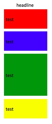
所有4个框应垂直堆叠,中间距离为20 in。
桌面/大屏幕上的--目前无法工作
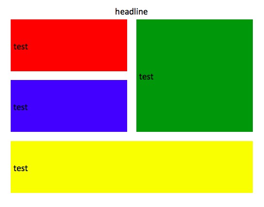
所有框之间的垂直20 or,无论是垂直的还是水平的
问题
在大屏幕/桌面上,不确定如何在左上角的2个框和右上的1个框之间创建间隔。已尝试:
- 负面的利润率,但遗憾的是,我刚刚读到了这个问题的负利润率
- 在主块内嵌套另一组div(当前使用
background-color)。也不能让它起作用
码
<div class="container home-block" id="protips-container">
  <div class="row">
    <div style="text-align:center;"class="col-xs-10 col-xs-offset-1 col-md-8 col-md-offset-2">
      <h1>
       headline
      </h1>
    </div>
  </div>
  <div class="row">
    <div class="col-xs-12 col-sm-6" style="margin-bottom:20px">
      <!-- the 2 boxes -->
      <div class="row">
        <div class="col-xs-12" style="background-color:red;height:140px;margin-bottom:20px">
          <h2 class="table-cell-display">test</h2>
        </div>
        <div class="col-xs-12" style="background-color:blue;height:140px">
          <h2 class="table-cell-display">test</h2>
        </div>
      </div>
    </div>
    <div class="col-xs-12 col-sm-6" style="background-color:green;height:300px;margin-bottom:20px">
      <!-- the single box -->
      <h2 class="table-cell-display">test</h2>
    </div>
  </div>
  <div class="row">
    <div class="col-xs-12" style="background-color:yellow;height:200px">
      <!-- the last box -->
      <h2 style="width:100%;" class="table-cell-display">test</h2>
    </div>
  </div>
</div>回答 1
Stack Overflow用户
发布于 2016-07-19 01:39:05
向绿色div添加一个类,然后告诉它根据媒体查询添加一些空白:
@media(min-width: 750px){
  .green-div {
    margin-left: 20px;
    width: calc(50% - 20px);
  }
}
更新的jsfiddle = https://jsfiddle.net/ks4yg1h8/4/
UPDATE -为了保持所有的大小均匀,还在左div中添加一个类,并调整它们的宽度减去边距的一半。
@media(min-width: 750px){
  .green-div {
    margin-left: 20px;
    width: calc(50% - 10px);
  }
  .left-div {
    width: calc(50% - 10px);
}页面原文内容由Stack Overflow提供。腾讯云小微IT领域专用引擎提供翻译支持
原文链接:
https://stackoverflow.com/questions/38447271
复制相关文章
相似问题
腾讯云开发者

Copyright © 2013 - 2026 Tencent Cloud. All Rights Reserved. 腾讯云 版权所有
深圳市腾讯计算机系统有限公司 ICP备案/许可证号:粤B2-20090059  粤公网安备44030502008569号
腾讯云计算(北京)有限责任公司 京ICP证150476号 | 京ICP备11018762号