
完全对齐几个情节
完全对齐几个情节
提问于 2016-07-28 13:04:48
我的目标是一个复合地块,它结合了一个散点图和两个地块来估计密度。我面临的问题是,密度图与散点图不正确地对齐,这是由于密度图的轴标记和散点图的图例所致。它可以通过与plot.margin的周旋来调整。然而,这并不是一个更好的解决方案,因为如果情节发生变化,我将不得不一次又一次地调整它。是否有一种方法,以一种方式定位所有的情节,使实际绘图面板完美地对齐?
我尽量将代码保持在最低限度,但为了重现问题,它仍然相当多。
library(ggplot2)
library(gridExtra)

df <- data.frame(y     = c(rnorm(50, 1, 1), rnorm(50, -1, 1)),
                 x     = c(rnorm(50, 1, 1), rnorm(50, -1, 1)),
                 group = factor(c(rep(0, 50), rep(1,50))))


empty <- ggplot() +
              geom_point(aes(1,1), colour="white") +
              theme(
                plot.background = element_blank(),
                panel.grid.major = element_blank(),
                panel.grid.minor = element_blank(),
                panel.border = element_blank(),
                panel.background = element_blank(),
                axis.title.x = element_blank(),
                axis.title.y = element_blank(),
                axis.text.x = element_blank(),
                axis.text.y = element_blank(),
                axis.ticks = element_blank()
              )


scatter <-  ggplot(df, aes(x = x, y = y, color = group)) +
                geom_point() +
                theme(legend.position = "bottom")

top_plot <- ggplot(df, aes(x = y)) +
                geom_density(alpha=.5, mapping = aes(fill = group)) +
                theme(legend.position = "none") +
                theme(axis.title.y = element_blank(),
                      axis.title.x = element_blank(),
                      axis.text.y=element_blank(),
                      axis.text.x=element_blank(),
                      axis.ticks=element_blank() )

right_plot <- ggplot(df, aes(x = x)) +
                geom_density(alpha=.5, mapping = aes(fill = group)) +
                coord_flip() + theme(legend.position = "none") +
                theme(axis.title.y = element_blank(),
                      axis.title.x = element_blank(),
                      axis.text.y  = element_blank(),
                      axis.text.x=element_blank(),
                      axis.ticks=element_blank())
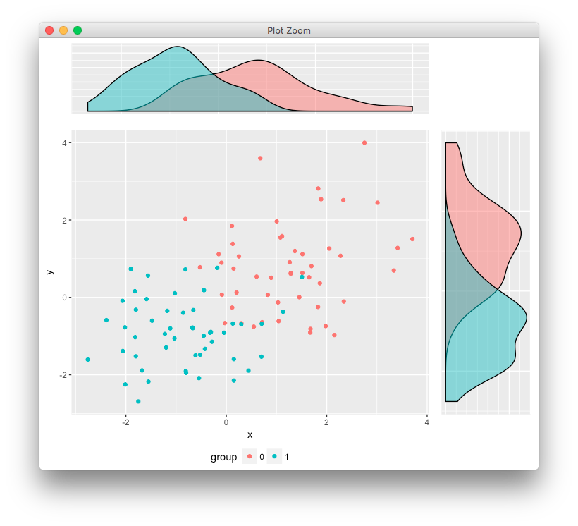
grid.arrange(top_plot, empty, scatter, right_plot, ncol=2, nrow=2, widths=c(4, 1), heights=c(1, 4))回答 5
Stack Overflow用户
回答已采纳
发布于 2016-07-28 15:33:39
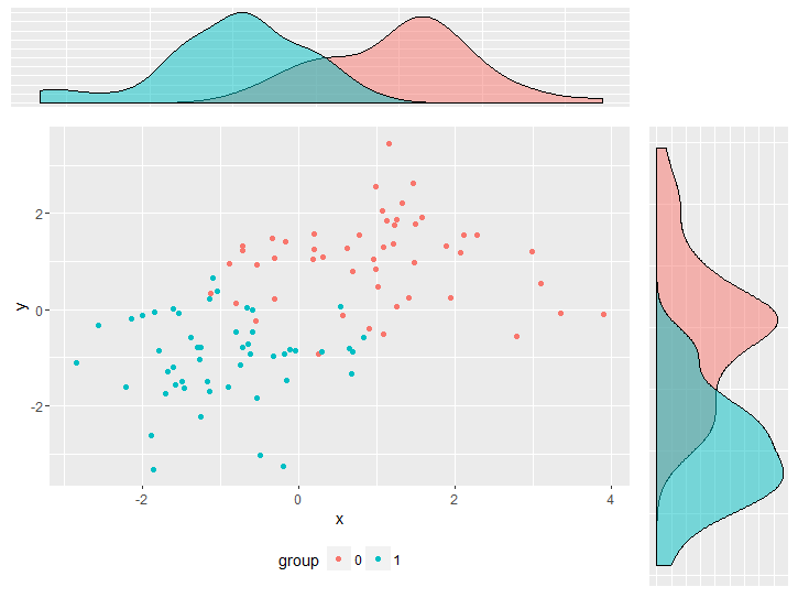
使用来自Align ggplot2 plots vertically的答案,通过添加到gtable中来对齐绘图(很可能会使这个问题复杂化!!)
library(ggplot2)
library(gtable)
library(grid)
你的数据和情节
set.seed(1)
df <- data.frame(y     = c(rnorm(50, 1, 1), rnorm(50, -1, 1)),
                 x     = c(rnorm(50, 1, 1), rnorm(50, -1, 1)),
                 group = factor(c(rep(0, 50), rep(1,50))))

scatter <-  ggplot(df, aes(x = x, y = y, color = group)) +
                geom_point() +  theme(legend.position = "bottom")

top_plot <- ggplot(df, aes(x = y)) +
                geom_density(alpha=.5, mapping = aes(fill = group))+
               theme(legend.position = "none")

right_plot <- ggplot(df, aes(x = x)) +
                geom_density(alpha=.5, mapping = aes(fill = group)) +
                coord_flip() + theme(legend.position = "none")
用巴浦斯的回答
g <- ggplotGrob(scatter)

g <- gtable_add_cols(g, unit(0.2,"npc"))
g <- gtable_add_grob(g, ggplotGrob(right_plot)$grobs[[4]], t = 2, l=ncol(g), b=3, r=ncol(g))

g <- gtable_add_rows(g, unit(0.2,"npc"), 0)
g <- gtable_add_grob(g, ggplotGrob(top_plot)$grobs[[4]], t = 1, l=4, b=1, r=4)

grid.newpage()
grid.draw(g)
产
我使用ggplotGrob(right_plot)$grobs[[4]]手动选择panel grob,但是您当然可以将其自动化。
Stack Overflow用户
发布于 2016-07-28 18:51:25
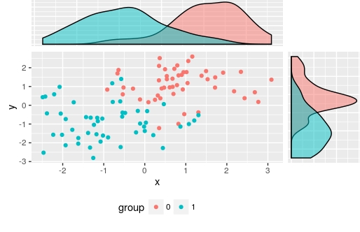
另一个选择,
library(egg)
ggarrange(top_plot, empty, scatter, right_plot,
          ncol=2, nrow=2, widths=c(4, 1), heights=c(1, 4))
Stack Overflow用户
发布于 2016-07-28 13:28:08
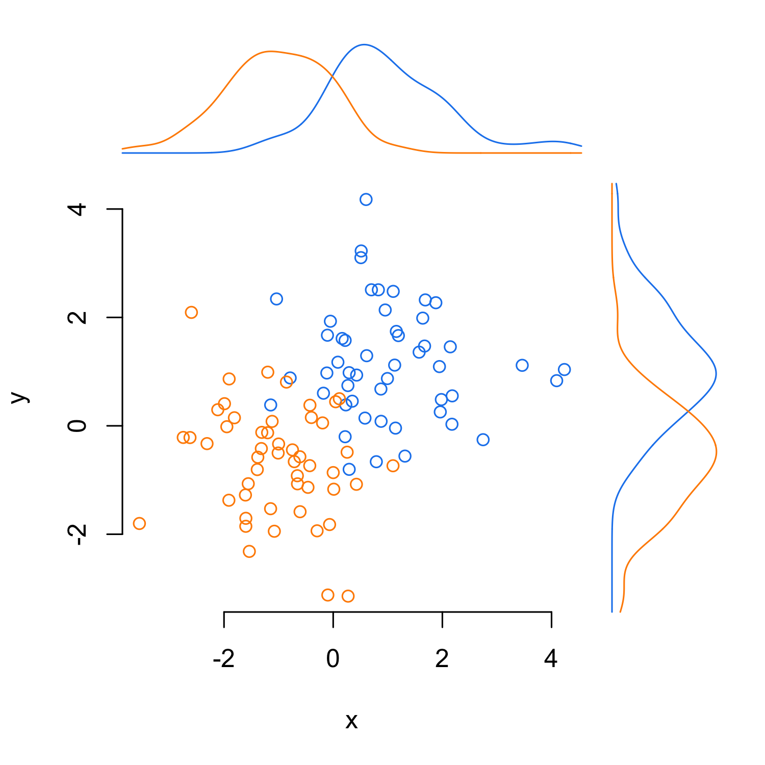
下面是基本R中的一个解决方案,它使用了在line2user中找到的this question函数。
par(mar = c(5, 4, 6, 6))
with(df, plot(y ~ x, bty = "n", type = "n"))
with(df[df$group == 0, ], points(y ~ x, col = "dodgerblue2"))
with(df[df$group == 1, ], points(y ~ x, col = "darkorange"))

x0_den <- with(df[df$group == 0, ],
               density(x, from = par()$usr[1], to = par()$usr[2]))
x1_den <- with(df[df$group == 1, ],
               density(x, from = par()$usr[1], to = par()$usr[2]))
y0_den <- with(df[df$group == 0, ],
               density(y, from = par()$usr[3], to = par()$usr[4]))
y1_den <- with(df[df$group == 1, ],
               density(y, from = par()$usr[3], to = par()$usr[4]))

x_scale <- max(c(x0_den$y, x1_den$y))
y_scale <- max(c(y0_den$y, y1_den$y))

lines(x = x0_den$x, y = x0_den$y/x_scale*2 + line2user(1, 3),
      col = "dodgerblue2", xpd = TRUE)
lines(x = x1_den$x, y = x1_den$y/x_scale*2 + line2user(1, 3),
      col = "darkorange", xpd = TRUE)

lines(y = y0_den$x, x = y0_den$y/x_scale*2 + line2user(1, 4),
      col = "dodgerblue2", xpd = TRUE)
lines(y = y1_den$x, x = y1_den$y/x_scale*2 + line2user(1, 4),
      col = "darkorange", xpd = TRUE)
页面原文内容由Stack Overflow提供。腾讯云小微IT领域专用引擎提供翻译支持
原文链接:
https://stackoverflow.com/questions/38637261
复制相关文章
相似问题
腾讯云开发者
