
在R中的饼图上添加百分比标签
在R中的饼图上添加百分比标签
提问于 2016-12-27 03:49:02
我的数据框架看起来
df
   Group   value
1 Positive    52
2 Negative   239
3 Neutral     9
我想要制作一个饼图的数据帧使用ggplot。
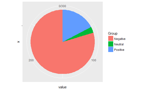
pie <- ggplot(df, aes(x="", y=value, fill=Group)) +
       geom_bar(width = 1, stat = "identity") +
       coord_polar("y", start=0)
这是我的派图。
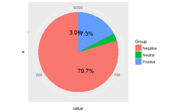
但是当我试图在图表上添加百分比标签时
pie <- ggplot(df, aes(x="", y=value, fill=Group)) +
       geom_bar(width = 1, stat = "identity") +
       coord_polar("y", start=0) +
       geom_text(aes(y = value/2 + c(0, cumsum(value)[-length(value)]),
                 label = percent(value/300 )), size=5)
这是我的结果。
我已经看到了许多与我的问题相同的问题,即R + ggplot2 => add labels on facet pie chart和解决方案没有帮助。
Stack Overflow用户
回答已采纳
发布于 2016-12-27 07:10:13
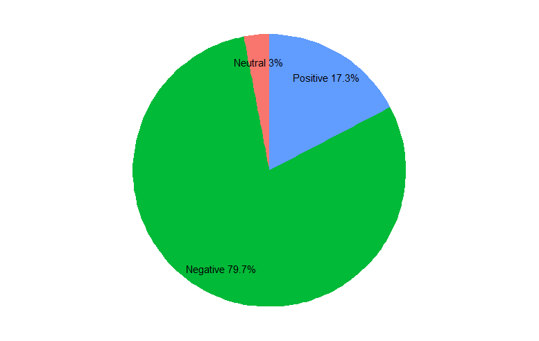
我同意@hrbrmstr,华夫饼图表会更好。但要回答最初的问题..。您的问题来自于绘制楔形的顺序,这将默认为字母顺序。当您根据数据框架中的顺序计算标签放置位置时,这是错误的。
作为可读性的一般原则,在绘制图形的实际代码之前,对标签和位置进行所有花哨的计算。
library(dplyr)
library(ggplot2)
library(ggmap) # for theme_nothing
df <- data.frame(value = c(52, 239, 9),
                 Group = c("Positive", "Negative", "Neutral")) %>%
   # factor levels need to be the opposite order of the cumulative sum of the values
   mutate(Group = factor(Group, levels = c("Neutral", "Negative", "Positive")),
          cumulative = cumsum(value),
          midpoint = cumulative - value / 2,
          label = paste0(Group, " ", round(value / sum(value) * 100, 1), "%"))

ggplot(df, aes(x = 1, weight = value, fill = Group)) +
   geom_bar(width = 1, position = "stack") +
   coord_polar(theta = "y") +
   geom_text(aes(x = 1.3, y = midpoint, label = label)) +
   theme_nothing()
页面原文内容由Stack Overflow提供。腾讯云小微IT领域专用引擎提供翻译支持
原文链接:
https://stackoverflow.com/questions/41338757
复制相关文章
相似问题
腾讯云开发者

Copyright © 2013 - 2026 Tencent Cloud. All Rights Reserved. 腾讯云 版权所有
深圳市腾讯计算机系统有限公司 ICP备案/许可证号:粤B2-20090059 ![]() 粤公网安备44030502008569号
粤公网安备44030502008569号
腾讯云计算(北京)有限责任公司 京ICP证150476号 | 京ICP备11018762号