
在ggplot2中反向标绘α值
在ggplot2中反向标绘α值
提问于 2016-12-31 17:22:39
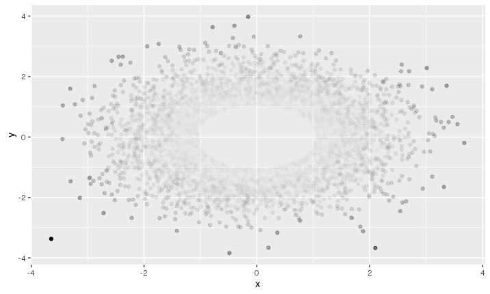
ggplot2中的alpha值通常用于在R中进行过度标绘。较深的颜色表示许多观测值下降的区域,而较浅的颜色则表示只有少数观察值下降的区域。有可能扭转这种局面吗?所以,异常值(通常很少有观测值)被强调为更暗,而大多数数据(通常有许多观测值)被强调为较轻?
以下是一份MWE:
myDat <- data.frame(x=rnorm(10000,0,1),y=rnorm(10000,0,1))
qplot(x=x, y=y, data=myDat, alpha=0.2)
离中心(0,0)较少的观测值较轻。我怎么才能逆转呢?谢谢你的任何想法。
回答 2
Stack Overflow用户
回答已采纳
发布于 2016-12-31 17:46:41
您可以尝试分别设置每个点的alpha值,在离中心更远的地方增加不透明度。就像这样
p = 2 # adjust this parameter to set how steeply opacity ncreases with distance
d = (myDat$x^2 + myDat$y^2)^p
al = d / max(d)
ggplot(myDat, aes(x=x, y=y))  + geom_point(alpha = al)
Stack Overflow用户
发布于 2016-12-31 21:48:24
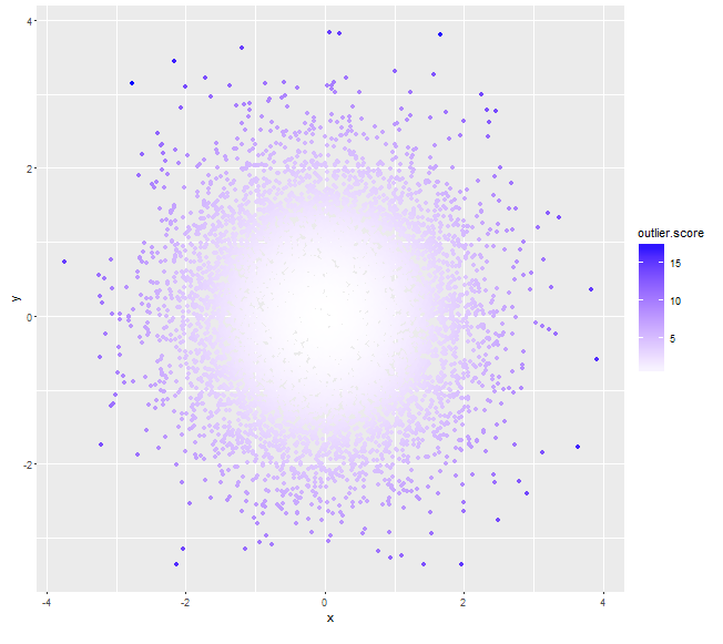
将Mahalanobis与质心的距离作为离群值(分数较高的可以指定更深的颜色,而不是使用alpha值):
myDat <- data.frame(x=rnorm(10000,0,1),y=rnorm(10000,0,1))
mu <- colMeans(myDat)

# assuming x, y independent, if not we can always calculate a non-zero cov(x,y)
sigma <- matrix(c(var(myDat$x), 0, 0, var(myDat$y)), nrow=2)
# use (squared) *Mahalanobis distance* as outlier score
myDat$outlier.score <- apply(myDat, 1, function(x) t(x-mu)%*%solve(sigma)%*%(x-mu))
qplot(x=x, y=y, data=myDat, col=outlier.score) +
     scale_color_gradient(low='white', high='blue')
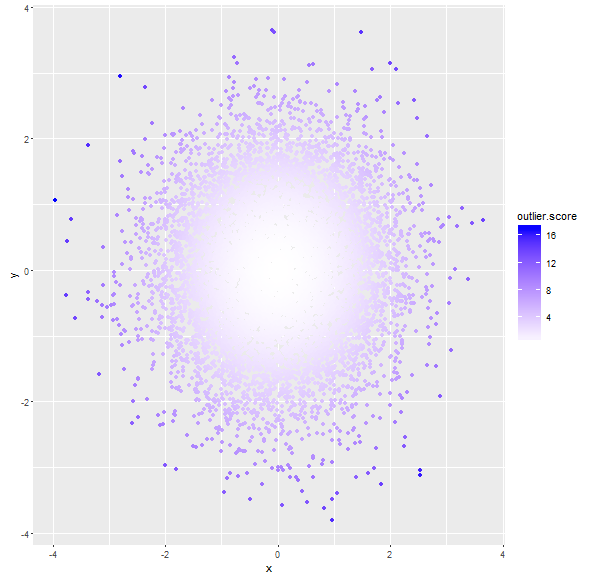
# assuming x, y are not independent
sigma <- matrix(c(var(myDat$x), cov(myDat$x, myDat$y), cov(myDat$x, myDat$y), var(myDat$y)), nrow=2)
# use (squared) *Mahalanobis distance* from centroid as outlier score
myDat$outlier.score <- apply(myDat, 1, function(x) t(x-mu)%*%solve(sigma)%*%(x-mu))
qplot(x=x, y=y, data=myDat, col=outlier.score) +
    scale_color_gradient(low='white', high='blue')
页面原文内容由Stack Overflow提供。腾讯云小微IT领域专用引擎提供翻译支持
原文链接:
https://stackoverflow.com/questions/41410403
复制相关文章
相似问题
腾讯云开发者
