
WPF自定义LED复选框
目前,我试图将一些控件从WindowsForms“移植”到WPF。我有这个时尚的复选框,并试图实现相同的视觉外观在wpf。但我做不到。
我找了很多东西,却找不到解决我的问题的办法。
winforms控件是这样的

有色圆圈大小取决于控件的大小。颜色是用户可定义的。颜色用于圆圈和文本。如果没有检查,它就会变暗/灰暗。diark和突出显示的颜色是根据控制颜色(较浅/更暗)计算的。
到目前为止,我在wpf中所做的所有尝试都失败了。-(我第一次尝试用一个用户控件来实现它,但是我决定让它更容易地从复选框中得到,只需要一个额外的选项来设置颜色。
<Window
    xmlns="http://schemas.microsoft.com/winfx/2006/xaml/presentation"
    xmlns:x="http://schemas.microsoft.com/winfx/2006/xaml"
    xmlns:test="clr-namespace:LedTest"
    xmlns:uc="clr-namespace:WPFTest;assembly=LedControl"
    xmlns:d="http://schemas.microsoft.com/expression/blend/2008"
    xmlns:mc="http://schemas.openxmlformats.org/markup-compatibility/2006"
    x:Class="LedTest.MainWindow"
    Title="MainWindow" Height="285" Width="566">
   <Window.Resources>
      <ResourceDictionary x:Key="ResDict2"  Source="Dictionary2.xaml"/>
   </Window.Resources>
   <Grid Margin="0">
      <Grid.RowDefinitions>
         <RowDefinition Height="Auto" MinHeight="27" />
         <RowDefinition Height="75"/>
      </Grid.RowDefinitions>
      <Grid.ColumnDefinitions>
         <ColumnDefinition Width="10*" />
         <ColumnDefinition Width="179*"/>
      </Grid.ColumnDefinitions>
      <uc:LedControl x:Name="led1"
            Color="ForestGreen" Text="Some Option"
         Grid.Column="1" Grid.Row="1" Height="39" VerticalAlignment="Bottom" Margin="0,0,0,36"/>
      <CheckBox Content="Some Option" Style="{DynamicResource TestStyle}" Margin="0,0,31,0" Grid.Column="1"/>
   </Grid>
</Window>
这是我的LedControl代码:
<UserControl x:Class="LedControl"
         xmlns="http://schemas.microsoft.com/winfx/2006/xaml/presentation"
         xmlns:x="http://schemas.microsoft.com/winfx/2006/xaml"
         xmlns:mc="http://schemas.openxmlformats.org/markup-compatibility/2006"
         xmlns:d="http://schemas.microsoft.com/expression/blend/2008"
         mc:Ignorable="d"
         d:DesignHeight="100" d:DesignWidth="300">
   <UserControl.Resources>
   </UserControl.Resources>
   <StackPanel x:Name="gridBigLed" Orientation="Horizontal" >
      <Border x:Name="border1"
                BorderThickness="1"
                Width="{Binding ActualHeight, ElementName=gridBigLed, Mode=OneWay}"
                CornerRadius="{Binding ActualWidth, ElementName=gridBigLed, Mode=OneWay}"
                HorizontalAlignment="Left">
         <Border.Background>
            <RadialGradientBrush GradientOrigin="0.2,0.2">
               <GradientStop Color="#FFFFAAAA"/>
               <GradientStop x:Name="backgroundColor" Color="Red" Offset="1.2"/>
            </RadialGradientBrush>
         </Border.Background>
         <Border.BorderBrush>
            <RadialGradientBrush>
               <GradientStop x:Name="GradientColorLow" Color="#FF660000" Offset="0.383"/>
               <GradientStop x:Name="GradientColorHigh" Color="#330000" Offset="0.5"/>
            </RadialGradientBrush>
         </Border.BorderBrush>
      </Border>
      <Label Content="{Binding Text}" x:Name="LEDText" Foreground="Red"    HorizontalContentAlignment="Left" VerticalContentAlignment="Center"/>
   </StackPanel>
</UserControl>
而背后的密码是:
       public partial class LedControl : UserControl
   {
      #region Dependency properties
      /// <summary>Dependency property to Get/Set the current IsActive (True/False)</summary>
      public static readonly DependencyProperty IsCheckedProperty =
          DependencyProperty.Register("IsChecked", typeof(bool?), typeof(LedControl),
              new PropertyMetadata(null, new PropertyChangedCallback(LedControl.IsCheckedPropertyChanced)));

      /// <summary>Dependency property to Get/Set Color when IsActive is true</summary>
      public static readonly DependencyProperty ColorProperty =
          DependencyProperty.Register("Color", typeof(Color), typeof(LedControl),
              new PropertyMetadata(Colors.Green, new PropertyChangedCallback(LedControl.OnColorPropertyChanged)));

        public static readonly DependencyProperty TextProperty =
          DependencyProperty.Register("Text", typeof(string), typeof(LedControl),
              new PropertyMetadata("ButtonText", new PropertyChangedCallback(LedControl.OnTextPropertyChanged)));
      #endregion

      #region Properties
      /// <summary>Gets/Sets Text Value</summary>
      public string Text { get { return (string)GetValue(TextProperty); } set { SetValue(TextProperty, value); } }
      /// <summary>Gets/Sets Value</summary>
      public bool? IsChecked { get { return (bool?)GetValue(IsCheckedProperty); } set { SetValue(IsCheckedProperty, value); } }
      /// <summary>Gets/Sets Color</summary>
      public Color Color { get { return (Color)GetValue(ColorProperty); } set { SetValue(ColorProperty, value); } }
      #endregion

      #region Constructor
      public LedControl()
      {
         InitializeComponent();
         if (this.IsChecked == true)
         {
            this.LEDColor.Color = this.Color;
            this.LEDText.Foreground = new SolidColorBrush(this.Color);
         }
         else if (this.IsChecked == false)
         {
            this.LEDColor.Color = Colors.Gray;
            this.LEDText.Foreground = new SolidColorBrush(Colors.Gray);
         }
      }

      #endregion

  #region Callbacks

  private static void IsCheckedPropertyChanced(DependencyObject d, DependencyPropertyChangedEventArgs e)
  {
     LedControl led = (LedControl)d;

     if (led.IsChecked == true)
     {
        led.LEDColor.Color = led.Color;
        led.LEDText.Foreground = new SolidColorBrush(led.Color);
     }
     else
     {
        led.LEDColor.Color = Colors.Gray;   // TODO calculate dark/gray color
        led.LEDText.Foreground = new SolidColorBrush(Colors.Gray);
     }
  }

  private static void OnColorPropertyChanged(DependencyObject d, DependencyPropertyChangedEventArgs e)
  {
     LedControl led = (LedControl)d;
     led.Color = (Color)e.NewValue;
     if (led.IsChecked == true)
     {
        led.LEDColor.Color = led.Color;
        led.LEDText.Foreground = new SolidColorBrush( led.Color );
     }
  }

  private static void OnTextPropertyChanged(DependencyObject d, DependencyPropertyChangedEventArgs e)
  {
     LedControl led = (LedControl)d;
     led.Text = (String)e.NewValue;
  }

  #endregion
}
问题是控件不起作用。我将颜色设置为forrestGreen,但在designer中显示红色,如果我执行程序:

文本“某些选项”也没有显示。
我还没有弄明白如何使渐变颜色变得更暗和更轻的颜色,我想。
led的外观也不像winforms那样酷,但我不知道如何将代码转换为wpf。
下面是代码中以双赢形式绘制led的部分:
private void drawControl(Graphics g, bool on) {
     // Is the bulb on or off
     Color lightColor = (on) ? this.Color : Color.FromArgb(100, this.Color);
     Color darkColor = (on) ? this.DarkColor : Color.Gray/*this.DarkDarkColor*/;

     // Calculate the dimensions of the bulb
     int width = this.Width - (this.Padding.Left + this.Padding.Right);
     int height = this.Height - (this.Padding.Top + this.Padding.Bottom);
     // Diameter is the lesser of width and height
     int diameter = Math.Min(width, height);
     // Subtract 1 pixel so ellipse doesn't get cut off
     diameter = Math.Max(diameter - 1, 1);

     SolidBrush br = new SolidBrush(BackColor);
     g.FillRectangle(br, ClientRectangle);

     // Draw the background ellipse
     var rectangle = new Rectangle(this.Padding.Left, this.Padding.Top, diameter, diameter);
     g.FillEllipse(new SolidBrush(darkColor), rectangle);

     // Draw the glow gradient
     var path = new GraphicsPath();
     path.AddEllipse(rectangle);
     var pathBrush = new PathGradientBrush(path);
     pathBrush.CenterColor = lightColor;
     pathBrush.SurroundColors = new Color[] { Color.FromArgb(0, lightColor) };
     g.FillEllipse(pathBrush, rectangle);

     // Draw the white reflection gradient
     var offset = Convert.ToInt32(diameter * .15F);
     var diameter1 = Convert.ToInt32(rectangle.Width * .8F);
     var whiteRect = new Rectangle(rectangle.X - offset, rectangle.Y - offset, diameter1, diameter1);
     var path1 = new GraphicsPath();
     path1.AddEllipse(whiteRect);
     var pathBrush1 = new PathGradientBrush(path);
     pathBrush1.CenterColor = _reflectionColor;
     pathBrush1.SurroundColors = _surroundColor;
     g.FillEllipse(pathBrush1, whiteRect);

     // Draw the border
     g.SetClip(this.ClientRectangle);
     if (this.On)
        g.DrawEllipse(new Pen(Color.FromArgb(85, Color.Black),1F), rectangle);

     if (this.Text != string.Empty)
     {
        RectangleF textArea = this.ClientRectangle;
        textArea.X += rectangle.Width + 6;
        textArea.Width -= (diameter + 6);
        Font fon = new Font(Font.FontFamily, Font.Size-1, FontStyle.Bold);

        StringFormat sf = new StringFormat();
        sf.Alignment = StringAlignment.Near;
        sf.LineAlignment = StringAlignment.Center;

        if (!this.On)
           g.DrawString(this.Text, fon, new SolidBrush(Color.Gray), textArea, sf);
        else
           g.DrawString(this.Text, fon, new SolidBrush(darkColor), textArea, sf);
     }

  }
我第二次尝试以复选框作为基础是没有什么用的,但也许有人热衷于用led代替复选框。
任何帮助都是非常感谢的!
回答 2
Stack Overflow用户
发布于 2017-03-17 12:44:06
下面是从LedControl派生出来的CheckBox。LedControl本身添加了OnColor和OffColor属性。
public class LedControl : CheckBox
{
    static LedControl()
    {
        DefaultStyleKeyProperty.OverrideMetadata(typeof(LedControl), new FrameworkPropertyMetadata(typeof(LedControl)));
    }

    public static readonly DependencyProperty OnColorProperty =
        DependencyProperty.Register("OnColor", typeof(Brush), typeof(LedControl), new PropertyMetadata(Brushes.Green));

    public Brush OnColor
    {
        get { return (Brush)GetValue(OnColorProperty); }
        set { SetValue(OnColorProperty, value); }
    }

    public static readonly DependencyProperty OffColorProperty =
        DependencyProperty.Register("OffColor", typeof(Brush), typeof(LedControl), new PropertyMetadata(Brushes.Red));

    public Brush OffColor
    {
        get { return (Brush)GetValue(OffColorProperty); }
        set { SetValue(OffColorProperty, value); }
    }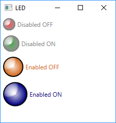
}并通过样式和模板定制视觉外观。主要模板部件有LedBorder椭圆、白色CenterGlow椭圆、白色CornerLight形状,当然还有ContentPresent。LedBorder适应LedControl的高度。取决于IsChecked,LedBorder是用OnColor或OffColor (以及前景)着色的。禁用控件是灰色的。
<Style TargetType="local:LedControl">
    <Setter Property="VerticalContentAlignment" Value="Center"/>
    <Setter Property="BorderBrush" Value="Black"/>
    <Setter Property="Margin" Value="5"/>
    <Setter Property="Template">
        <Setter.Value>
            <ControlTemplate TargetType="local:LedControl">
                <Grid>
                    <Grid.ColumnDefinitions>
                        <ColumnDefinition Width="Auto"/>
                        <ColumnDefinition/>
                    </Grid.ColumnDefinitions>

                    <Grid Background="Transparent" Name="grd"
                            Margin="{TemplateBinding Padding}"
                            VerticalAlignment="Stretch"
                            Width="{Binding Path=ActualHeight, Mode=OneWay, RelativeSource={RelativeSource Self}}">

                        <Ellipse x:Name="LedBorder"
                                    Fill="{TemplateBinding Background}"
                                    Stroke="{TemplateBinding BorderBrush}"
                                    StrokeThickness="2"
                                    Stretch="Uniform"/>

                        <Ellipse x:Name="CenterGlow" Stretch="Uniform">
                            <Ellipse.Fill>
                                <RadialGradientBrush>
                                    <GradientStop Color="White" Offset="-0.25"/>
                                    <GradientStop Color="Transparent" Offset="0.91"/>
                                </RadialGradientBrush>
                            </Ellipse.Fill>
                        </Ellipse>

                        <Ellipse x:Name="CornerLight" Stretch="Uniform" Margin="2">
                            <Ellipse.Fill>
                                <RadialGradientBrush Center="0.15 0.15" RadiusX="0.5" RadiusY="0.5">
                                    <GradientStop Color="White" Offset="0"/>
                                    <GradientStop Color="Transparent" Offset="1"/>
                                </RadialGradientBrush>
                            </Ellipse.Fill>
                        </Ellipse>
                    </Grid>

                    <ContentPresenter x:Name="content" Grid.Column="1" Margin="4,0,0,0"
                            VerticalAlignment="{TemplateBinding VerticalContentAlignment}"
                            HorizontalAlignment="{TemplateBinding HorizontalContentAlignment}"
                            RecognizesAccessKey="True"/>

                </Grid>
                <ControlTemplate.Triggers>
                    <Trigger Property="IsChecked" Value="true">
                        <Setter TargetName="LedBorder" Property="Fill" Value="{Binding Path=OnColor, RelativeSource={RelativeSource TemplatedParent}}"/>
                        <Setter TargetName="content" Property="TextElement.Foreground" Value="{Binding Path=OnColor, RelativeSource={RelativeSource TemplatedParent}}"/>
                    </Trigger>

                    <Trigger Property="IsChecked" Value="false">
                        <Setter TargetName="LedBorder" Property="Fill" Value="{Binding Path=OffColor, RelativeSource={RelativeSource TemplatedParent}}"/>
                        <Setter TargetName="content" Property="TextElement.Foreground" Value="{Binding Path=OffColor, RelativeSource={RelativeSource TemplatedParent}}"/>
                    </Trigger>

                    <Trigger Property="IsEnabled" Value="false">
                        <Setter TargetName="CenterGlow" Property="Fill">
                            <Setter.Value>
                                <RadialGradientBrush Opacity="1">
                                    <GradientStop Color="Transparent" Offset="-0.5" />
                                    <GradientStop Color="#888" Offset="1" />
                                </RadialGradientBrush>
                            </Setter.Value>
                        </Setter>
                        <Setter TargetName="content" Property="TextElement.Foreground" Value="#888"/>
                    </Trigger>
                </ControlTemplate.Triggers>
            </ControlTemplate>
        </Setter.Value>
    </Setter>
</Style>
这是一个样本:
<StackPanel>
    <local:LedControl Content="Disabled OFF" Height="24" IsChecked="False" IsEnabled="False" />
    <local:LedControl Content="Disabled ON" Height="32" IsChecked="True" IsEnabled="False" />
    <local:LedControl Content="Enabled OFF" OffColor="Chocolate" IsChecked="False" Height="40" />
    <local:LedControl Content="Enabled ON" OnColor="Navy" IsChecked="True" Height="48" />
</StackPanel>
Stack Overflow用户
发布于 2017-03-17 11:47:44
您可以使用PathGradientBrush绘制径向梯度。这是我编写的代码的结果。您可以使用任何颜色作为CheckedColor和UnCheckedColor,我使用Red和Green来获得这个结果:

码
using System;
using System.ComponentModel;
using System.Drawing;
using System.Drawing.Drawing2D;
using System.Windows.Forms;
public class MyCheckBox : CheckBox
{
    public MyCheckBox()
    {
        this.SetStyle(ControlStyles.AllPaintingInWmPaint, true);
        this.DoubleBuffered = true;
        this.ResizeRedraw = true;
        CheckedColor = Color.Green; ;
        UnCheckedColor = Color.Red; ;
    }
    [DefaultValue(typeof(Color), "Green")]
    public Color CheckedColor { get; set; }
    [DefaultValue(typeof(Color), "Red")]
    public Color UnCheckedColor { get; set; }
    protected override void OnPaint(PaintEventArgs e)
    {
        var darkColor = Color.Black;
        var lightColor = Color.FromArgb(200, Color.White);
        var cornerAlpha = 80;
        this.OnPaintBackground(e);
        using (var path = new GraphicsPath())
        {
            e.Graphics.SmoothingMode = SmoothingMode.AntiAlias;
            var rect = new Rectangle(0, 0, Height, Height);
            path.AddEllipse(rect);
            rect.Inflate(-1, -1);
            using (var bgBrush = new SolidBrush(darkColor))
            {
                e.Graphics.FillEllipse(bgBrush, rect);
            }
            using (var pathGrBrush = new PathGradientBrush(path))
            {
                var color = Checked ? CheckedColor : UnCheckedColor;
                pathGrBrush.CenterColor = color; ;
                Color[] colors = { Color.FromArgb(cornerAlpha, color) };
                pathGrBrush.SurroundColors = colors;
                e.Graphics.FillEllipse(pathGrBrush, rect);
            }
            using (var pathGrBrush = new PathGradientBrush(path))
            {
                pathGrBrush.CenterColor = lightColor; ;
                Color[] colors = { Color.Transparent };
                pathGrBrush.SurroundColors = colors;
                var r = (float)(Math.Sqrt(2) * Height / 2);
                var x = r / 8;
                e.Graphics.FillEllipse(pathGrBrush, new RectangleF(-x, -x, r, r));
                e.Graphics.ResetClip();
            }
        }
        TextRenderer.DrawText(e.Graphics, Text, Font,
                new Rectangle(Height, 0, Width - Height, Height), ForeColor,
                 TextFormatFlags.Left | TextFormatFlags.VerticalCenter);
    }
}https://stackoverflow.com/questions/42855236
复制相似问题
腾讯云开发者
