
在R编程中,是否有可能用属于“因子”类型的数据创建一个条形图?
在R编程中,是否有可能用属于“因子”类型的数据创建一个条形图?
提问于 2017-04-26 16:33:14
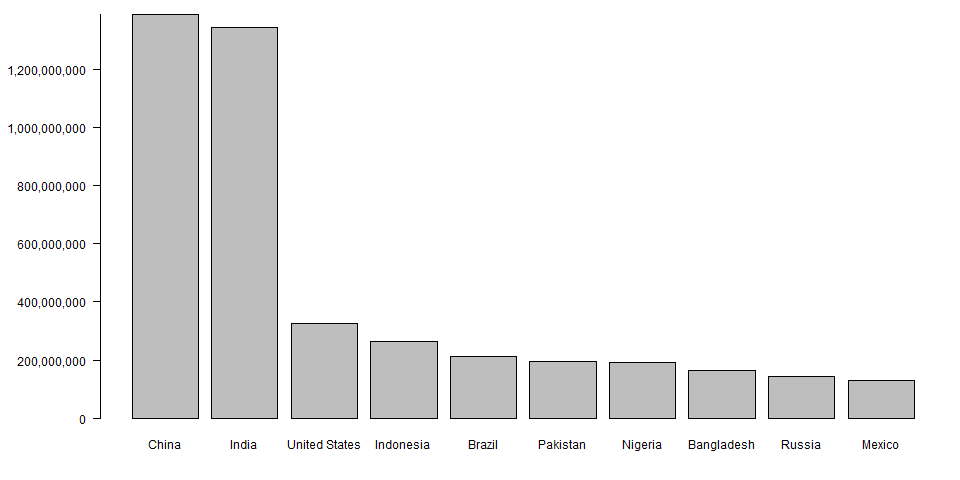
图像由数据集组成,其中包含前10位已填充countries.so的列表。它可以在x轴上创建一个国家图,在y轴上创建填充图,其中国家值和人口值的数据类型(即国家值和人口值的“因子”)是“.is”,可以在条形图上绘制这个值--任何人都可以在同一条上提供帮助。
Stack Overflow用户
回答已采纳
发布于 2017-04-26 20:49:54
我希望下面的内容能对你有所帮助。
以下是人口最多的10个国家的数据集:
df <- structure(list(Country = c("China", "India", "United States",
"Indonesia", "Brazil", "Pakistan", "Nigeria", "Bangladesh", "Russia",
"Mexico"), Population = structure(c(3L, 2L, 10L, 9L, 8L, 7L,
6L, 5L, 4L, 1L), .Label = c("130222815", "1342512706", "1388232693",
"143375006", "164827718", "191835936", "196744376", "211243220",
"263510146", "326474013"), class = "factor")), .Names = c("Country",
"Population"), row.names = 2:11, class = "data.frame")df$Population变量是一个factor,总体值存储在因子级别中:
str(df)
'data.frame':   10 obs. of  2 variables:
 $ Country   : chr  "China" "India" "United States" "Indonesia" ...
 $ Population: Factor w/ 10 levels "130222815","1342512706",..: 3 2 10 9 8 7 6 5 4 1
我们可以按以下方式绘制总体值。
首先,我们将df$Population的级别转换为一个数字数组:
Pop <- as.numeric(as.character(df$Population))
str(Pop)
num [1:10] 1388232693 1342512706 326474013 263510146 211243220 ...然后使用barplot绘制总体值。
par(mar=c(4,7,1,1))
options(scipen=9)
barplot(Pop, names=df$Country, yaxt = "n")
yticks <- pretty(Pop)
axis(2, yticks, las=2, labels = prettyNum(yticks, big.mark = ","))
页面原文内容由Stack Overflow提供。腾讯云小微IT领域专用引擎提供翻译支持
原文链接:
https://stackoverflow.com/questions/43639882
复制相关文章
相似问题
腾讯云开发者
