
在ggg图中使用并排的、有触点的图形时出错(facet_wrap和position_nudge)
在ggg图中使用并排的、有触点的图形时出错(facet_wrap和position_nudge)
提问于 2017-08-22 03:18:11
我试图创建并行的图表与推点数据点(优势比,95% CI错误栏)在R使用ggplot。每次我试图组合它们时,我都会得到一个错误。有人能帮我确定我应该做些什么来改变我的代码吗?这是我得到的错误:
(~surv) +scale_x_continuous中的错误(breaks= seq(0,4,1)):二进制运算符的非数值参数
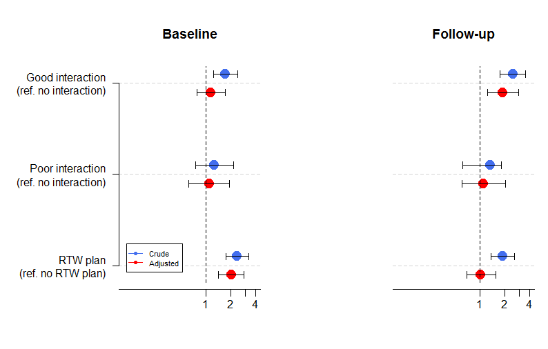
为了说明我要做的事情,请看下面我使用plot()创建的一个版本,您可以看到这个版本非常难看:
我尝试根据J斯图尔特卡尔顿博客中的指导将facet_wrap和position_nudge组合在一起,但没有能够添加一个position_nudge。上面的错误代码表明问题在于我的代码中的facet_wrap部分。
下面我包含了描述如何复制我的数据集的代码。
activity <- factor(rep(c("Good interaction", "Poor interaction",
                              "RTW plan"), times = 4))
surv <- factor(rep(c("T1", "T2"), each = 3, times = 2))
mod <- factor(rep(c("Crude", "Adjusted"), each = 6))
or <- c(1.72, 1.26, 2.39, 2.5, 1.34, 1.89, 1.14, 1.09, 2.02, 1.9, 1.1, 1.02)
low <- c(1.22, 0.74, 1.73, 1.74, 0.61, 1.35, 0.77, 0.61, 1.40, 1.22, 0.60, 0.68)
hi <- c(2.41, 2.16, 3.29, 3.6, 1.8, 2.64, 1.70, 1.94, 2.90, 2.95, 2.04, 1.54)
rtwc <- data.frame(activity, surv, mod, or, low, hi)
下面是我一直在使用的ggplot代码:
ggplot(rtwc, aes(x = or, y = activity, colour = mod)) +
  geom_vline(aes(xintercept = 1), size = 0.25, linetype = "dashed") +
  geom_errorbarh(data = filter(rtwc, mod == "crude"), aes(xmax = hi, xmin = low), size = 0.5, height = 0.1, colour = "gray50", position = position_nudge(y = fix)) +
  geom_point(data = filter(rtwc, mod == "crude"), aes(xmax = hi, xmin = low), size = 4, position_nudge(y = fix)) +
  geom_errorbarh(data = filter(rtwc, mod == "Adjusted"), aes(xmax = hi, xmin = low), size = 0.5, height = 0.1, colour = "gray50", position = position_nudge(y = -fix)) +
  geom_point(data = filter(rtwc, mod == "Adjusted"), size = 4, position = position_nudge(y = -fix)) +
  geom_errorbarh(data = filter(rtwc, mod = "Adjusted")) +
  facet_wrap = (~surv) +
  scale_x_continuous(breaks = seq(0, 4, 1)) +
  coord_trans(x = "log10") +
  theme_bw() +
  theme(panel.grid.minor = element_blank())
如果已经有关于这个问题的帖子,我很抱歉。
回答 1
Stack Overflow用户
回答已采纳
发布于 2017-08-30 07:34:49
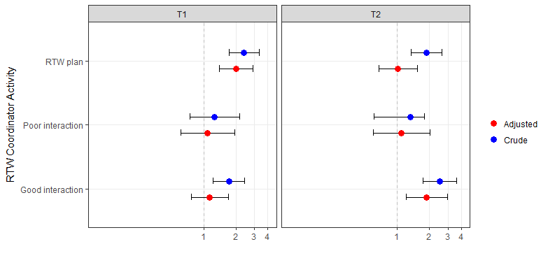
这里有一些代码可以让你开始。我使用position_dodge和coord_flip来保持错误条对之间的距离:
ggplot(rtwc,
       aes(y = or, ymin = low, ymax = hi, x = activity, group = mod)) +
  geom_hline(yintercept = 1, size = 0.25, linetype = "dashed", colour = "grey") +
  geom_errorbar(width = 0.2, position = position_dodge(0.5)) +
  geom_point(aes(col = mod), position = position_dodge(0.5),
             size = 3) +
  scale_x_discrete(name = "") +
  scale_y_log10(name = "", breaks = seq(0, 4)) +
  scale_color_manual(name = "", values = c("red", "blue")) + # change colours here
  expand_limits(y = c(0.1, 4)) + #adjust x axis range here
  facet_wrap(~surv) +
  coord_flip() +
  theme_bw() + #change look & feel here
  theme(panel.grid.minor = element_blank())
为了调整情节的外观和感觉,您可以查看ggplot 这里中的可用主题,以及ggthemes 这里中的更多主题。请不要使用Excel 2013主题。正如造物主所指出的,它的存在仅仅是为了讽刺的目的。
为了调整到点颜色,这里是一个方便参考颜色的名称。或者您可以使用RColorBrewer中的一个调色板,可以通过RColorBrewer::display.brewer.all()查看。
页面原文内容由Stack Overflow提供。腾讯云小微IT领域专用引擎提供翻译支持
原文链接:
https://stackoverflow.com/questions/45816981
复制相关文章
相似问题
腾讯云开发者
