
当在matplotlib中绘制时,正态分布显得过于密集。
当在matplotlib中绘制时,正态分布显得过于密集。
提问于 2017-09-07 15:31:26
我试图估计我的数据的概率密度函数。在我的例子中,数据是一个形状为8200 x 8100的卫星图像。下面,我向您介绍PDF的代码(函数'is_outlier‘是由一个家伙借用的,他在这里发布了这个代码)。正如我们所看到的,PDF在图1中太密集了。我想,这是由于卫星图像由成千上万的像素组成的。这很难看。
我的问题是,我怎样才能绘制一个不太密集的PDF?例如,如图2所示。
lst = 'satellite_img.tif' #import the image
lst_flat = lst.flatten() #create 1D array

#the function below removes the outliers
def is_outlier(points, thres=3.5):

    if len(points.shape) == 1:
        points = points[:,None]
    median = np.median(points, axis=0)
    diff = np.sum((points - median)**2, axis=-1)
    diff = np.sqrt(diff)
    med_abs_deviation = np.median(diff)

    modified_z_score = 0.6745 * diff / med_abs_deviation

    return modified_z_score > thres


lst_flat = np.r_[lst_flat]
lst_flat_filtered = lst_flat[~is_outlier(lst_flat)]
fit = stats.norm.pdf(lst_flat_filtered, np.mean(lst_flat_filtered), np.std(lst_flat_filtered))

plt.plot(lst_flat_filtered, fit)
plt.hist(lst_flat_filtered, bins=30, normed=True)
plt.show()
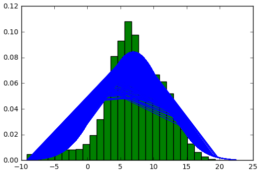
图1
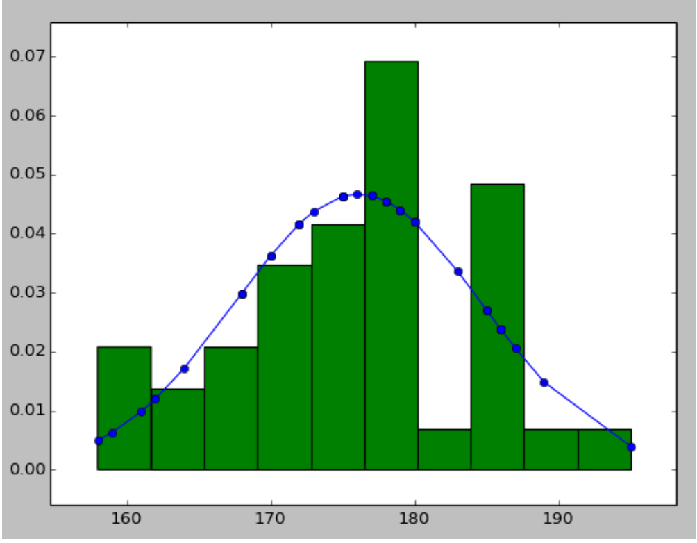
图2
回答 1
Stack Overflow用户
回答已采纳
发布于 2017-09-07 16:23:08
问题是PDF图中的x值没有排序,因此绘制的线在随机点之间来回移动,造成了您所看到的混乱。
有两种选择:
- 不要画线,只画点(如果你有很多点,那不是很好,但会确认我上面说的对不对): plt.plot(lst_flat_filtered,fit,'bo')
- 在计算
lst_flat_filtered数组并绘制它之前,对其进行排序: lst_flat = np.r_lst_flat lst_flat_filtered = np.sort(lst_flat~is_outlier(lst_flat)) #改变了该行fit = stats.norm.pdf(lst_flat_filtered,np.mean(lst_flat_filtered),np.std(lst_flat_filtered)) plt.plot(lst_flat_filtered,fit)
下面是一些显示这些行为的最小示例:
重复你的问题:
import numpy as np
import scipy.stats as stats
import matplotlib.pyplot as plt

lst_flat_filtered = np.random.normal(7, 5, 1000)

fit = stats.norm.pdf(lst_flat_filtered, np.mean(lst_flat_filtered), np.std(lst_flat_filtered))

plt.hist(lst_flat_filtered, bins=30, normed=True)

plt.plot(lst_flat_filtered, fit)

plt.show()
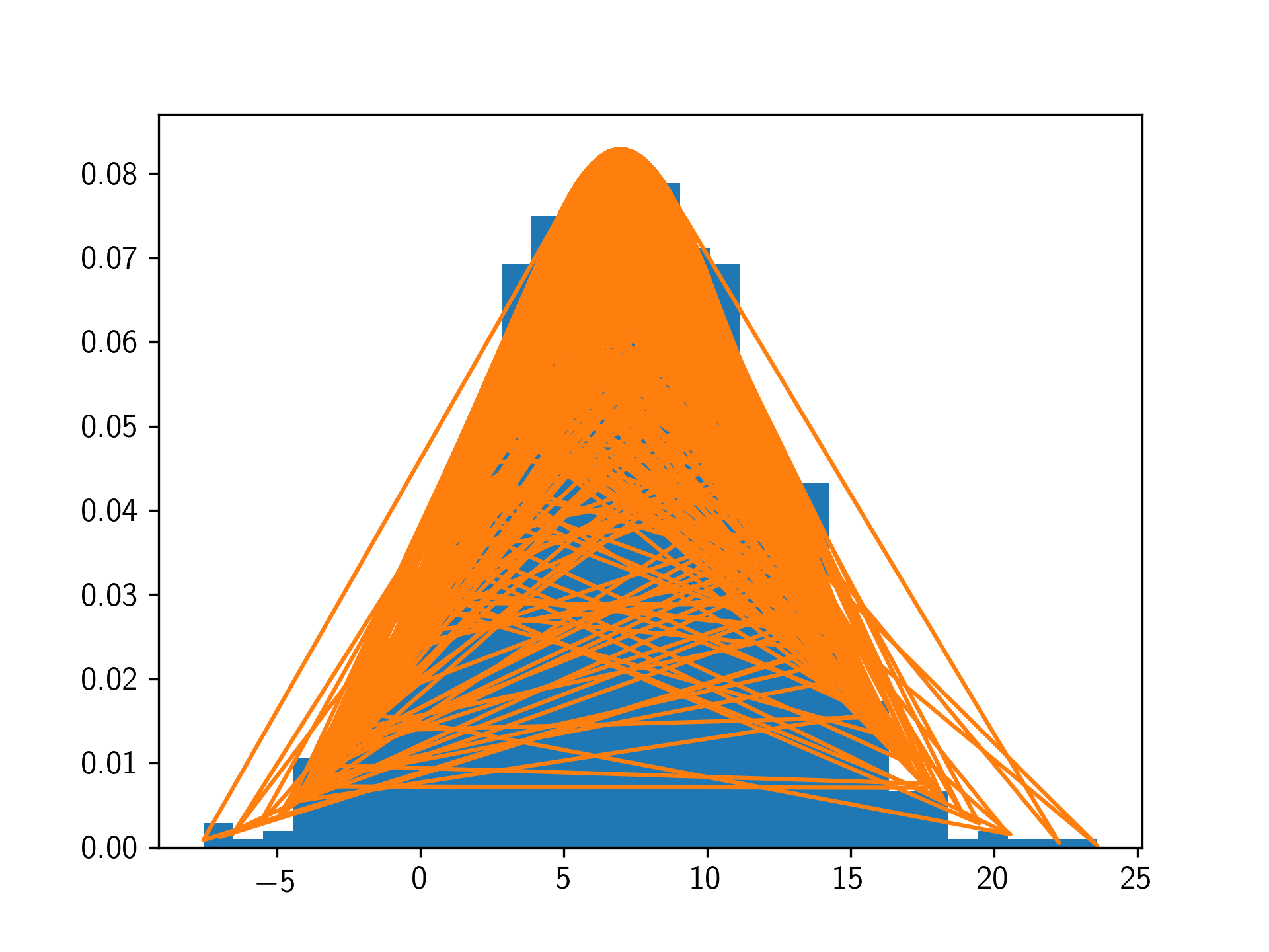
绘图点
import numpy as np
import scipy.stats as stats
import matplotlib.pyplot as plt

lst_flat_filtered = np.random.normal(7, 5, 1000)

fit = stats.norm.pdf(lst_flat_filtered, np.mean(lst_flat_filtered), np.std(lst_flat_filtered))

plt.hist(lst_flat_filtered, bins=30, normed=True)

plt.plot(lst_flat_filtered, fit, 'bo')

plt.show()
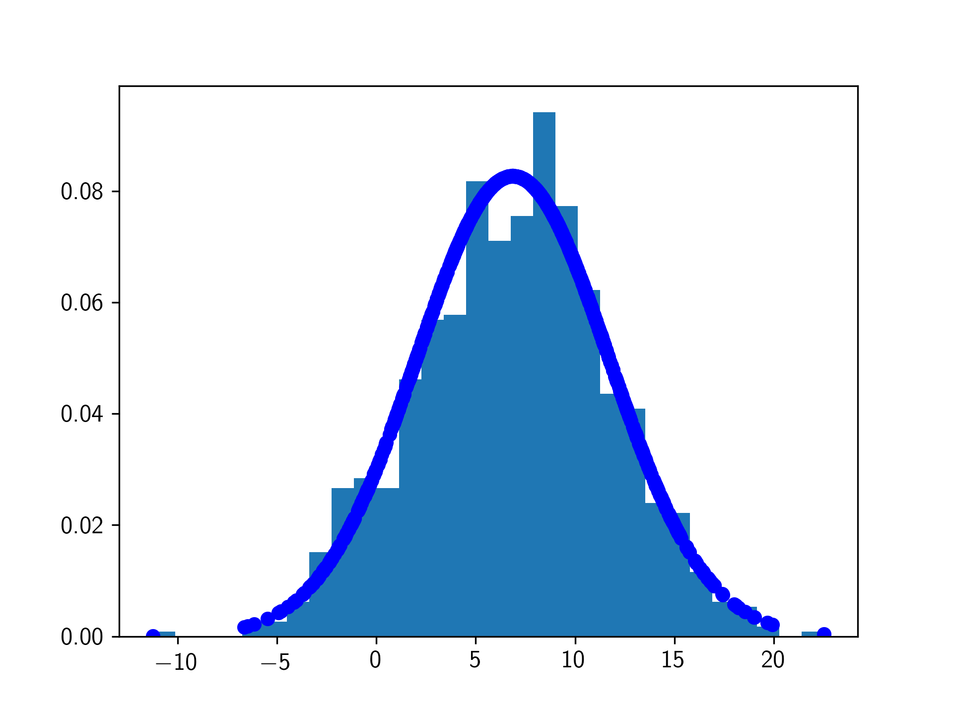
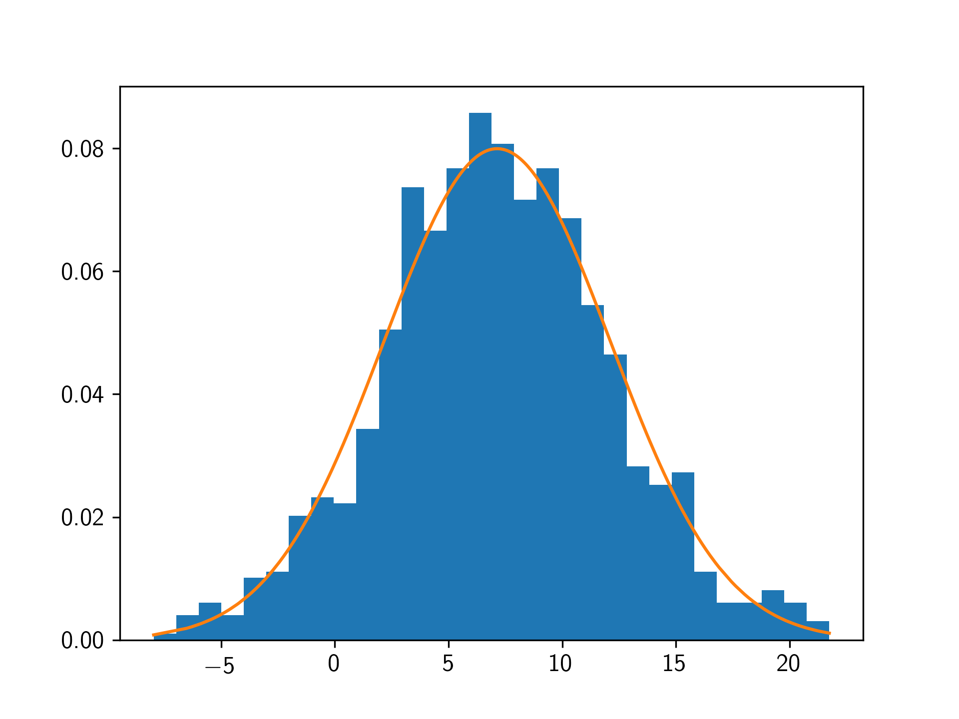
数据排序
import numpy as np
import scipy.stats as stats
import matplotlib.pyplot as plt

lst_flat_filtered = np.sort(np.random.normal(7, 5, 1000))

fit = stats.norm.pdf(lst_flat_filtered, np.mean(lst_flat_filtered), np.std(lst_flat_filtered))

plt.hist(lst_flat_filtered, bins=30, normed=True)

plt.plot(lst_flat_filtered, fit)

plt.show()
页面原文内容由Stack Overflow提供。腾讯云小微IT领域专用引擎提供翻译支持
原文链接:
https://stackoverflow.com/questions/46100208
复制相关文章
相似问题
腾讯云开发者

Copyright © 2013 - 2026 Tencent Cloud. All Rights Reserved. 腾讯云 版权所有
深圳市腾讯计算机系统有限公司 ICP备案/许可证号:粤B2-20090059 ![]() 粤公网安备44030502008569号
粤公网安备44030502008569号
腾讯云计算(北京)有限责任公司 京ICP证150476号 | 京ICP备11018762号