
选择放置条形图在r中闪闪发光
选择放置条形图在r中闪闪发光
提问于 2017-11-05 08:59:48
1.如何使用选择素放置和分组条形图生成selectinput=States,x轴=年龄组,y轴=人口,类型=男性和女性?
2.不知道如何选择如何选择由堆栈条形图构成的链接数据file.csv?
数据文件:
type    States          age    population
male    "TaipeiCity "   0~19    12345
male    "TaipeiCity "   20~39   54321
male    "TaipeiCity "   40~59   6789
male    "TaipeiCity "   60~79   9876
male    "TaipeiCity "   80~100  5566
female  "TaipeiCity "   0~19    123456
female  "TaipeiCity "   20~39   654321
female  "TaipeiCity "   40~59   987654
female  "TaipeiCity "   60~79   556655
female  "TaipeiCity "   80~100  111111
male    NewTaipeiCity   0~19    123
male    NewTaipeiCity   20~39   456
male    NewTaipeiCity   40~59   789
male    NewTaipeiCity   60~79   987
male    NewTaipeiCity   80~100  654
female  NewTaipeiCity   0~19    1234
female  NewTaipeiCity   20~39   5678
female  NewTaipeiCity   40~59   9876
female  NewTaipeiCity   60~79   5432
female  NewTaipeiCity   80~100  1995
代码:
library(shiny)
library(ggvis)
library(dplyr)
library(ggplot2)
library(RColorBrewer)
test <- read.csv("C:/Users/user/Documents/barchart/1995.csv")
ui <- shinyUI(fluidPage(
sidebarLayout(
sidebarPanel(
selectInput("bg_states", label = h3("region:"),c("TaipeiCity","NewTaipeiCity"))
),
mainPanel(
h3("Man and woman age stack bar graph"),
ggvisOutput("mytest")
)
)
))
server <- shinyServer(function(input,output){
mytest <- reactive({
ym <- unique(as.character(input$bg_states))
test %>%
group_by(age,type) %>%
summarise(population = n()) %>%
ggvis(~age,~population) %>%
layer_bars(fill = ~type,width = 0.5)
})
mytest %>% bind_shiny("mytest")
})
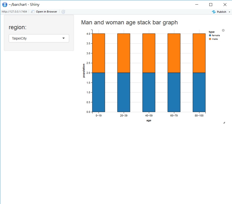
shinyApp(ui,server)屏幕:
Stack Overflow用户
回答已采纳
发布于 2017-11-07 12:28:38
我认为这将完成您希望它做的事情:数据摘要是不必要的。我在代码中保留了您的行,但做了评论。
library(shiny)
library(ggvis)
library(dplyr)
# library(ggplot2)
# library(RColorBrewer)
test <- read.table("testdata.txt", header = T)
ui <- shinyUI(fluidPage(
sidebarLayout(
sidebarPanel(
selectInput("bg_states", label = h3("region:"),c("TaipeiCity","NewTaipeiCity"))
),
mainPanel(
h3("Man and woman age stack bar graph"),
ggvisOutput("mytest")
)
)
))
server <- shinyServer(function(input,output){
mytest <- reactive({
# ym <- unique(as.character(input$bg_states))
test %>%
filter(States == input$bg_states) %>%
# group_by(age,type) %>%
# summarise(population = n()) %>%
ggvis(~age,~population) %>%
layer_bars(fill = ~type, width = 0.5)
})
mytest %>% bind_shiny("mytest")
})
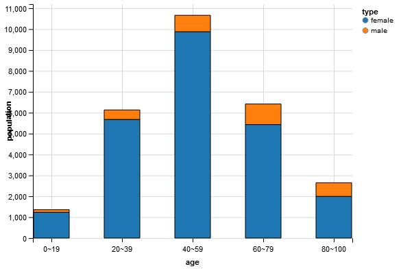
shinyApp(ui,server)结果:
页面原文内容由Stack Overflow提供。腾讯云小微IT领域专用引擎提供翻译支持
原文链接:
https://stackoverflow.com/questions/47119835
复制相关文章
相似问题
腾讯云开发者
