
实际上:用方框图中的示例名注释离群值
实际上:用方框图中的示例名注释离群值
提问于 2017-11-27 19:15:58
我正在尝试用ggplot创建一个方格图,并巧妙地使用dataset airquality,其中Month位于x轴上,Ozone值位于y轴上。我的目的是注释这个图,以便当我悬停在离群点上时,除了臭氧值之外,它还应该显示Sample名称:
library(tidyverse)
library(plotly)
library(datasets)
data(airquality)

# add months
airquality$Month <- factor(airquality$Month,
                           labels = c("May", "Jun", "Jul", "Aug", "Sep"))

# add sample names
airquality$Sample <- paste0('Sample_',seq(1:nrow(airquality)))

# boxplot
p <- ggplot(airquality, aes(x = Month, y = Ozone)) +
  geom_boxplot()
p <- plotly_build(p)
p
下面是创建的情节:
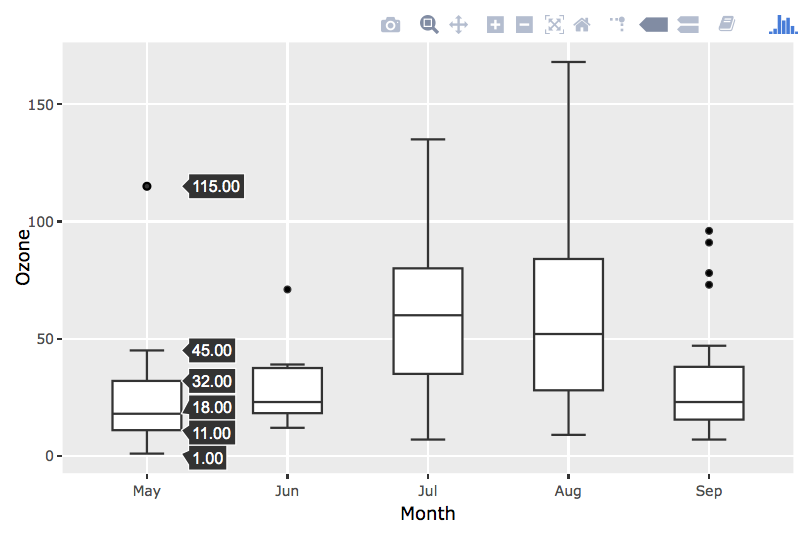
默认情况下,当我悬停在每个框上时,它会显示x轴变量的基本汇总状态。然而,我也想看到的是异常点样本是什么。例如,在五月上空徘徊时,它显示异常值115,但它并不表示它实际上是Sample_30。
如何将样本变量添加到异常点,以便同时显示异常值和示例名称?
回答 4
Stack Overflow用户
回答已采纳
发布于 2020-02-05 14:30:47
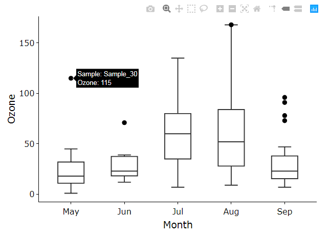
此方法将获得相同的结果,但不显示框图摘要统计值悬停。移除盒图层上的离群点和悬停,并用悬停信息覆盖只包含异常值的geom_point层。文中给出了这里中孤立点的定义。当处理更复杂的图形时,这种方法比其他解决方案工作得更好(例如,并排排列方框图)。有趣的是,用于此数据的ggplot方格图与ggplot图并不相同。8月上边的篱笆须比8月的上栅栏须延展得更远。
library(dplyr)
library(plotly)
library(datasets)
library(ggplot2)
data(airquality)

# manipulate data
mydata = airquality %>%
    # add months
    mutate(Month = factor(airquality$Month,labels = c("May", "Jun", "Jul", "Aug", "Sep")),
    # add sample names
           Sample = paste0('Sample_',seq(1:n())))%>%
    # label if outlier sample by Month
    group_by(Month) %>%
    mutate(OutlierFlag = ifelse((Ozone<quantile(Ozone,1/3,na.rm=T)-1.5*IQR(Ozone,na.rm=T)) | (Ozone>quantile(Ozone,2/3,na.rm=T)+1.5*IQR(Ozone,na.rm=T)),'Outlier','NotOutlier'))%>%
    group_by()


# boxplot
p <- ggplot(mydata, aes(x = Month, y = Ozone)) +
    geom_boxplot()+
    geom_point(data=mydata %>% filter(OutlierFlag=="Outlier"),aes(group=Month,label1=Sample,label2=Ozone),size=2)

output = ggplotly(p, tooltip=c("label1","label2"))

# makes boxplot outliers invisible and hover info off
for (i in 1:length(output$x$data)){
    if (output$x$data[[i]]$type=="box"){
        output$x$data[[i]]$marker$opacity = 0
        output$x$data[[i]]$hoverinfo = "none"
    }
}

# print end result of plotly graph
output
Stack Overflow用户
发布于 2018-12-21 04:58:30
我们几乎可以做到这样:
library(ggplot2)
library(plotly)
library(datasets)
data(airquality)
# add months
airquality$Month <- factor(airquality$Month,
                           labels = c("May", "Jun", "Jul", "Aug", "Sep"))
# add sample names
airquality$Sample <- paste0('Sample_',seq(1:nrow(airquality)))
# boxplot
gg <- ggplot(airquality, aes(x = Month, y = Ozone)) +
  geom_boxplot()
ggly <- ggplotly(gg)
# add hover info
hoverinfo <- with(airquality, paste0("sample: ", Sample, "</br></br>",
                                     "month: ", Month, "</br>",
                                     "ozone: ", Ozone))
ggly$x$data[[1]]$text <- hoverinfo
ggly$x$data[[1]]$hoverinfo <- c("text", "boxes")

ggly
不幸的是,悬停并不适用于第一个盒子情节.
Stack Overflow用户
发布于 2018-12-21 18:01:54
我成功地做到了这一点。
library(plotly)
library(shiny)
library(htmlwidgets)
library(datasets)

# Prepare data ----
data(airquality)
# add months
airquality$Month <- factor(airquality$Month,
                           labels = c("May", "Jun", "Jul", "Aug", "Sep"))
# add sample names
airquality$Sample <- paste0('Sample_', seq(1:nrow(airquality)))

# Plotly on hover event ----
addHoverBehavior <- c(
  "function(el, x){",
  "  el.on('plotly_hover', function(data) {",
  "    if(data.points.length==1){",
  "      $('.hovertext').hide();",
  "      Shiny.setInputValue('hovering', true);",
  "      var d = data.points[0];",
  "      Shiny.setInputValue('left_px', d.xaxis.d2p(d.x) + d.xaxis._offset);",
  "      Shiny.setInputValue('top_px', d.yaxis.l2p(d.y) + d.yaxis._offset);",
  "      Shiny.setInputValue('dx', d.x);",
  "      Shiny.setInputValue('dy', d.y);",
  "      Shiny.setInputValue('dtext', d.text);",
  "    }",
  "  });",
  "  el.on('plotly_unhover', function(data) {",
  "    Shiny.setInputValue('hovering', false);",
  "  });",
  "}")

# Shiny app ----
ui <- fluidPage(
  tags$head(
    # style for the tooltip with an arrow (http://www.cssarrowplease.com/)
    tags$style("
               .arrow_box {
                    position: absolute;
                  pointer-events: none;
                  z-index: 100;
                  white-space: nowrap;
                  background: rgb(54,57,64);
                  color: white;
                  font-size: 14px;
                  border: 1px solid;
                  border-color: rgb(54,57,64);
                  border-radius: 1px;
               }
               .arrow_box:after, .arrow_box:before {
                  right: 100%;
                  top: 50%;
                  border: solid transparent;
                  content: ' ';
                  height: 0;
                  width: 0;
                  position: absolute;
                  pointer-events: none;
               }
               .arrow_box:after {
                  border-color: rgba(136, 183, 213, 0);
                  border-right-color: rgb(54,57,64);
                  border-width: 4px;
                  margin-top: -4px;
               }
               .arrow_box:before {
                  border-color: rgba(194, 225, 245, 0);
                  border-right-color: rgb(54,57,64);
                  border-width: 10px;
                  margin-top: -10px;
               }")
  ),
  div(
    style = "position:relative",
    plotlyOutput("myplot"),
    uiOutput("hover_info")
  )
)

server <- function(input, output){
  output$myplot <- renderPlotly({
    airquality[[".id"]] <- seq_len(nrow(airquality))
    gg <- ggplot(airquality, aes(x=Month, y=Ozone, ids=.id)) + geom_boxplot()
    ggly <- ggplotly(gg, tooltip = "y")
    ids <- ggly$x$data[[1]]$ids
    ggly$x$data[[1]]$text <-
      with(airquality, paste0("<b> sample: </b>", Sample, "<br/>",
                              "<b> month: </b>", Month, "<br/>",
                              "<b> ozone: </b>", Ozone))[ids]
    ggly %>% onRender(addHoverBehavior)
  })
  output$hover_info <- renderUI({
    if(isTRUE(input[["hovering"]])){
      style <- paste0("left: ", input[["left_px"]] + 4 + 5, "px;", # 4 = border-width after
                      "top: ", input[["top_px"]] - 24 - 2 - 1, "px;") # 24 = line-height/2 * number of lines; 2 = padding; 1 = border thickness
      div(
        class = "arrow_box", style = style,
        p(HTML(input$dtext),
          style="margin: 0; padding: 2px; line-height: 16px;")
      )
    }
  })
}

shinyApp(ui = ui, server = server)

页面原文内容由Stack Overflow提供。腾讯云小微IT领域专用引擎提供翻译支持
原文链接:
https://stackoverflow.com/questions/47518245
复制相关文章
相似问题
腾讯云开发者
