
使用ggplot2 2的stat_density_2d只显示高密度区域
我想使用stat_density2D函数的分类变量,但限制我的绘图高密度区域,以减少重叠和增加可读性。
让我们以下面的数据为例:
plot_data <-
  data.frame(X = c(rnorm(300, 3, 2.5), rnorm(150, 7, 2)),
             Y = c(rnorm(300, 6, 2.5), rnorm(150, 2, 2)),
             Label = c(rep('A', 300), rep('B', 150)))

ggplot(plot_data, aes(X, Y, colour = Label)) + geom_point()
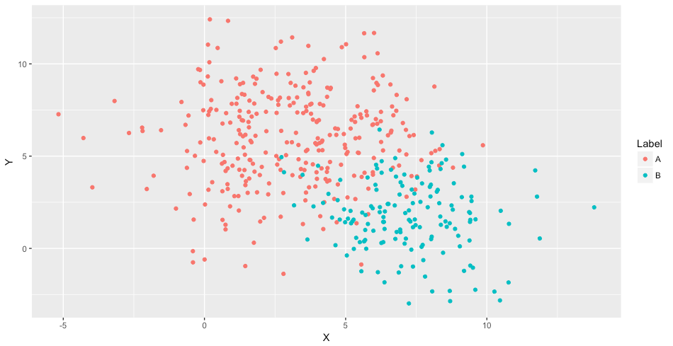
在二维密度图中,我们得到了重叠密度。
ggplot(plot_data, aes(X, Y)) +
  stat_density_2d(geom = "polygon", aes(alpha = ..level.., fill = Label))
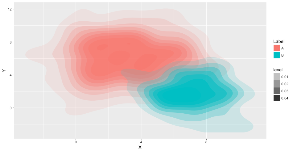
是否可能只绘制高密度区域(例如level>0.03)?我找到的唯一解决方案是“欺骗”并手动修改..levels..变量,无论是使用step函数还是任何电源转换,就像在这个简单的例子中一样。
ggplot(plot_data, aes(X, Y)) +
  stat_density_2d(geom = "polygon", aes(alpha = (..level..) ^ 2, fill = Label)) +
  scale_alpha_continuous(range = c(0, 1))
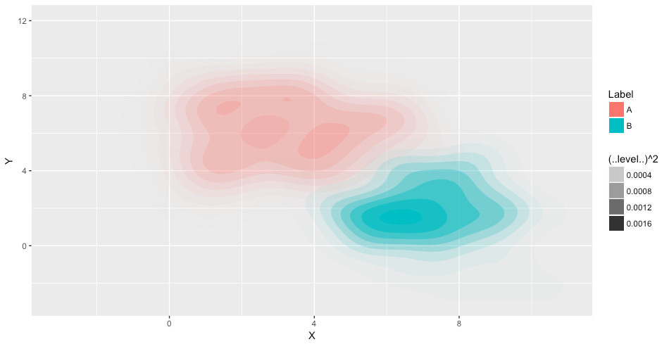
与修改..levels..变量不同,是否可以要求ggplot2 2/stat_Density2D函数只关注某个密度级别?我试过使用range或limits参数的scale_alpha_continuous函数,没有任何相关的结果.
谢谢!
回答 2
Stack Overflow用户
发布于 2018-01-17 22:15:20
选项1
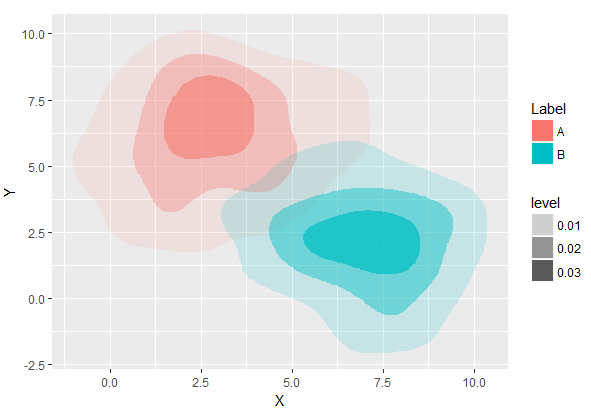
通过在stat_density_2d中添加参数bins,您肯定会以非常经济的方式避免过度绘制、控制和提请注意一些密度区域。
set.seed(123)
plot_data <-
  data.frame(
    X = c(rnorm(300, 3, 2.5), rnorm(150, 7, 2)),
    Y = c(rnorm(300, 6, 2.5), rnorm(150, 2, 2)),
    Label = c(rep('A', 300), rep('B', 150))
  )
ggplot(plot_data, aes(X, Y, group = Label)) +
  stat_density_2d(geom = "polygon",
                  aes(alpha = ..level.., fill = Label),
                  bins = 4)
选项2
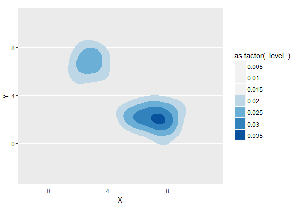
手动分配颜色,NA为那些水平,我们不想绘制。主要的缺点是,我们应该事先知道所需的等级和颜色的数量(或计算它们)。在我使用set.seed(123)的例子中,我们需要7。
ggplot(plot_data, aes(X, Y, group = Label)) +
  stat_density_2d(geom = "polygon", aes(fill = as.factor(..level..))) +
  scale_fill_manual(values = c(NA, NA, NA,"#BDD7E7", "#6BAED6", "#3182BD", "#08519C"))
Stack Overflow用户
发布于 2018-01-17 02:54:15
您必须手动生成2d内核密度,然后他们绘制结果。这样,您就可以选择每个点上的值,例如,避免重叠。以下是代码:
plot_data <-
  data.frame(X = c(rnorm(300, 3, 2.5), rnorm(150, 7, 2)),
             Y = c(rnorm(300, 6, 2.5), rnorm(150, 2, 2)),
             Label = c(rep('A', 300), rep('B', 150)))


library(ggplot2)
library(MASS)
library(tidyr)
#Calculate the range
xlim <- range(plot_data$X)
ylim <-range(plot_data$Y)


#Genrate the kernel density for each group
newplot_data <- plot_data %>% group_by(Label) %>% do(Dens=kde2d(.$X, .$Y, n=100, lims=c(xlim,ylim)))

#Transform the density in  data.frame
newplot_data  %<>%  do(Label=.$Label, V=expand.grid(.$Dens$x,.$Dens$y), Value=c(.$Dens$z)) %>% do(data.frame(Label=.$Label,x=.$V$Var1, y=.$V$Var2, Value=.$Value))

#Untidy data and chose the value for each point.
#In this case chose the value of the label with highest value
   newplot_data  %<>%   spread( Label,value=Value) %>%
        mutate(Level = if_else(A>B, A, B), Label = if_else(A>B,"A", "B"))
等高线图:
# Contour plot
ggplot(newplot_data, aes(x,y, z=Level, fill=Label, alpha=..level..))  + stat_contour(geom="polygon")
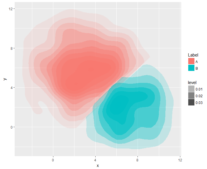
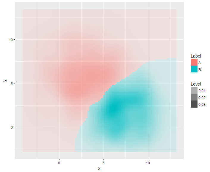
由于圆周误差,等高线图似乎有一定的重叠。我们可以试试光栅情节:
#Raster plot
ggplot(newplot_data, aes(x,y, fill=Label, alpha=Level))  + geom_raster()
https://stackoverflow.com/questions/48282989
复制相似问题
腾讯云开发者

Copyright © 2013 - 2026 Tencent Cloud. All Rights Reserved. 腾讯云 版权所有
深圳市腾讯计算机系统有限公司 ICP备案/许可证号:粤B2-20090059  粤公网安备44030502008569号
腾讯云计算(北京)有限责任公司 京ICP证150476号 | 京ICP备11018762号