
不知道为什么材料工具栏会被按下较小的分辨率
不知道为什么材料工具栏会被按下较小的分辨率
提问于 2018-02-16 02:27:31
https://stackblitz.com/edit/angular-5p7xog?file=app%2Fsidenav-responsive-example.html
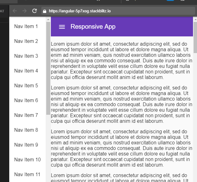
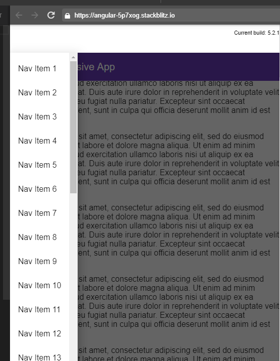
我正在改变一个侧面的例子,发现在角度材料页。sidenav在更大的分辨率上工作得很好,但是一旦你缩小了,标题就会弹出,在它上方留下空格。有谁能解释一下这里发生的事情和可能的解决办法吗?
回答 1
Stack Overflow用户
回答已采纳
发布于 2018-02-16 03:03:03
之所以会发生这种情况,是因为您在移动视图中显式地将56 in设置为边距。
  <mat-sidenav-container class="example-sidenav-container"
                         [style.marginTop.px]="mobileQuery.matches ? 56 : 0">
这很好,但因为元素的位置被更改为固定的。您需要将顶部设置为0,否则它将取页边距顶部。
将工具栏样式修改为
.example-is-mobile .example-toolbar {
  position: fixed;
  /* Make sure the toolbar will stay on top of the content as it scrolls past. */
  z-index: 2;
  top: 0;
}页面原文内容由Stack Overflow提供。腾讯云小微IT领域专用引擎提供翻译支持
原文链接:
https://stackoverflow.com/questions/48819271
复制相关文章
相似问题
腾讯云开发者
