
在R中逐行绘制数据帧
在R中逐行绘制数据帧
提问于 2018-03-03 13:55:45
我有张像这样的桌子
         hashtag  Daily_Freq men women
          #a          10       6     4
          #b          15       5    10
          #c          20       8    12
我想为每个数据帧行,即每个标签,男性和女性的频率绘制图表。在这种情况下,我想要绘制3个酒吧,每一个有两列-一个为男性,一个为女性频率。我该怎么做?
回答 3
Stack Overflow用户
回答已采纳
发布于 2018-03-03 14:11:35
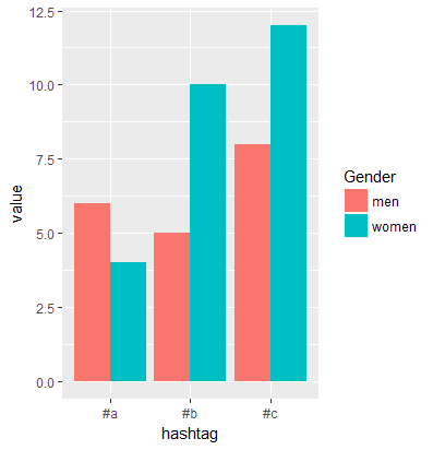
一种解决方案是将gather和ggplot2用作:
#data
df <- read.table(text = "hashtag  Daily_Freq men women
'#a'          10       6     4
'#b'          15       5    10
'#c'          20       8    12", header = T, stringsAsFactors = F)

library(tidyverse)
df <- df %>% select(-Daily_Freq) %>%
         gather(key = Gender, value, -hashtag)

library(ggplot2)
ggplot(df, aes(x=hashtag, y=value, fill=Gender)) +
geom_bar(stat='identity', position='dodge')
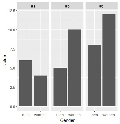
选项2
ggplot(df, aes(x=Gender, y=value)) +
  geom_bar(stat='identity', position='dodge') + facet_grid(~ hashtag)
Stack Overflow用户
发布于 2018-03-03 15:15:58
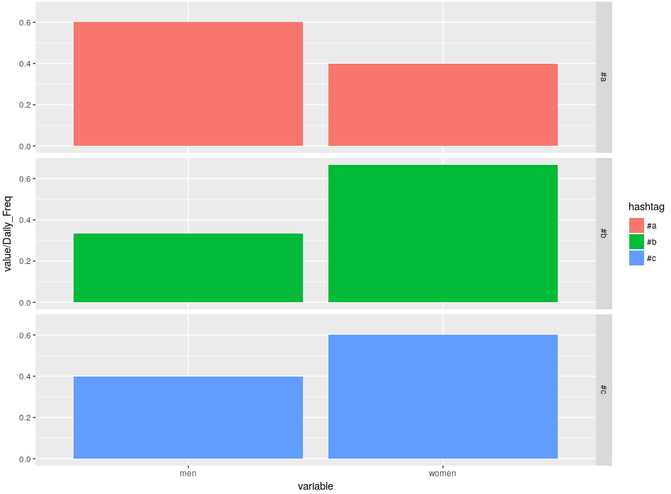
利用来自melt的reshape2的解决方案如下:
library(ggplot2)
library(reshape2)

df <- read.table(text = "hashtag  Daily_Freq men women
                    '#a'          10       6     4
                    '#b'          15       5    10
                    '#c'          20       8    12",
                 header = TRUE)

ds <- melt(df, id.var = c("hashtag", "Daily_Freq"))

p <- ggplot(ds, aes(x=variable, y=value/Daily_Freq))
p <- p + geom_bar(stat='identity',
                  position='dodge',
                  aes(fill=hashtag))
p <- p + scale_colour_discrete()
p <- p + facet_grid(hashtag ~. )
show(p)
作为产出,
Stack Overflow用户
发布于 2018-03-03 18:13:35
在使用barplot()之前创建一个命名矩阵
使用apply(),您的表可以转换为一个2x3矩阵,每个性别1行,以及每个唯一的hashtag值一列。
然后,将新创建的矩阵提供到height参数中的barplot()中。
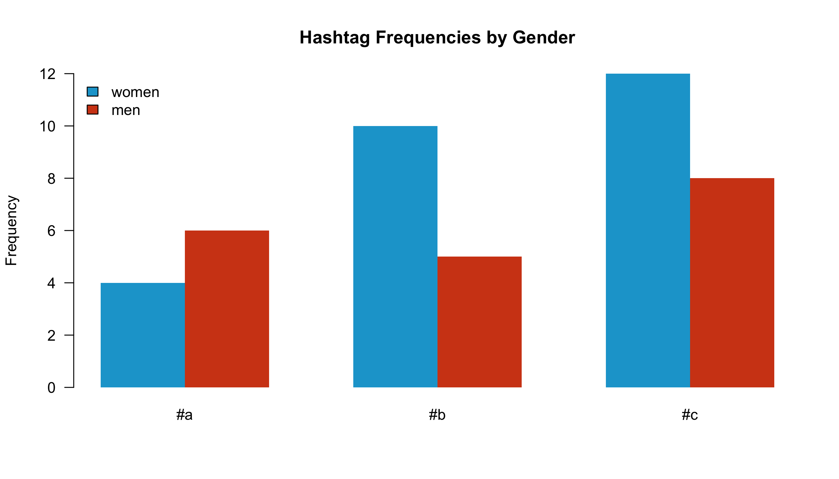
# load data
df <-
    read.table(
        text = "hashtag  Daily_Freq men women
                    '#a'          10       6     4
                    '#b'          15       5    10
                    '#c'          20       8    12"
        , header = TRUE
        , stringsAsFactors = FALSE
    )

# we want three barcharts
# one for unique hashtag
# and each with two columns
# one for men and one for women
gendered.frequencies.by.hashtag <-
    apply( X = df
               , MARGIN = 1
               , FUN = function( i )
                   as.numeric(
                       c( i[["women"]], i[["men"]] )
                       )
    )
# name the rows
rownames( x = gendered.frequencies.by.hashtag ) <-
    c( "women", "men" )

# name the columns
colnames( x = gendered.frequencies.by.hashtag ) <-
    unique( df$hashtag )

# create complementary color scheme
color.scheme <- c( "#18A4D2", "#D24618" )

# plot the matrix
png(
    filename = "Gendered_Freq_by_HT.png"
    , res = 300
    , units = "px"
    , height = 1600
    , width = 2800
)
barplot(
    height = gendered.frequencies.by.hashtag
    , names.arg = colnames( gendered.frequencies.by.hashtag )
    , legend.text = TRUE
    , args.legend = list(
        x = "topleft"
        , bty = "n"
    )
    , col = color.scheme
    , border = NA
    , beside = TRUE
    , las = 1
    , ylim = c( 0, max( gendered.frequencies.by.hashtag ) )
    , main = "Hashtag Frequencies by Gender"
    , ylab = "Frequency"
)
# shut down plot device
dev.off()

# end of script #页面原文内容由Stack Overflow提供。腾讯云小微IT领域专用引擎提供翻译支持
原文链接:
https://stackoverflow.com/questions/49084901
复制相关文章
相似问题
腾讯云开发者
