
如何使背景图像在没有裁剪的情况下获得全宽度?
如何使背景图像在没有裁剪的情况下获得全宽度?
提问于 2018-04-24 17:05:43
我们使用下面的代码将图像设置为背景图像,并将文本放在其上方。是否有一种方法可以将图像显示为不需要“裁剪”的背景,而不考虑图像顶部内容的高度?
发生的一种模式是,随着内容的增长,图像的高度也会增加。如果解决方案要求我们摆脱它,那么我对此没有意见。
注意:图像并不总是相同的大小。
当前结果
期望的结果
.banner {
  position: relative;
  display: block;
}

.banner:after {
  content: '';
  width: 100%;
  height: 100%;
  position: absolute;
  bottom: 0;
  left: 0;
}

.banner__image {
  width: 100%;
  height: 100%;
  background-position: center;
  background-size: cover;
  position: absolute;
  top: 0;
  left: 0;
  z-index: 1;
}

.banner__content {
  padding: 200px;
  position: relative;
  max-width: 900px;
  text-shadow: 0 0 20px rgba(0,0,0,.6);
  margin: 0 auto;
  padding: 0 15px;
  z-index: 2;
  color: white;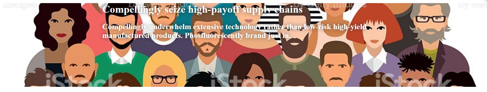
}<div class="banner">
<div class="banner__image" style="background-image: url('https://media.istockphoto.com/vectors/people-large-group-vector-id519533182')"></div>
<div class="banner__content">
<h1>Compellingly seize high-payoff supply chains</h1>
<h2>Compellingly underwhelm extensive technology rather than low-risk high-yield manufactured products. Phosfluorescently brand just in.</h2>
</div>
</div>
回答 5
Stack Overflow用户
回答已采纳
发布于 2018-04-24 17:12:55
通过在padding-bottom值中使用百分比值,百分比是根据元素的width计算的,而不是人们可能认为的来自height的百分比。
这意味着
padding-bottom: 42.773%; /* (438 × 100 / 1024) */..。将始终有一个最小的高度,允许它显示未裁剪的图像(在您的例子中有1024px×438px)。
.min-ratio {
  padding-bottom: 42.7%;  /* (height × 100 / width) */
  background-size: contain;
  background-position: bottom center;
  background-repeat: no-repeat;
  width: 100%;
  position: relative;
}

.banner__content {
  position: absolute;
  background-color: #00000065;
  color: white;
  top: 0;
  bottom: 0;
  left: 0;
  right: 0;
  display: flex;
  align-items: center;
  justify-content: center;
  flex-direction: column;
  padding: 0 3rem;
}

@media(max-width: 600px) {
  .banner__content {
    position: static;
  }
  .min-ratio {
    background-size: cover;
    padding-bottom: 0;
  }
}

.banner__content>* {
  align-self: stretch;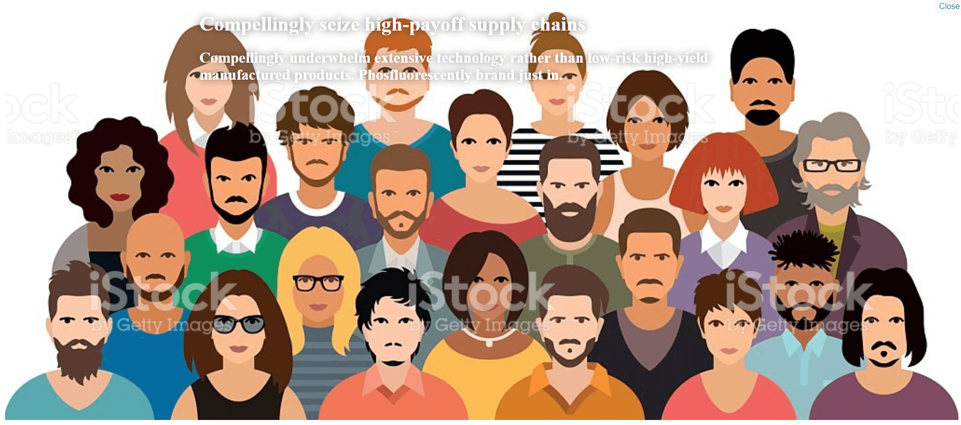
}<div class="min-ratio" style="background-image: url(https://media.istockphoto.com/vectors/people-large-group-vector-id519533182)">
<div class="banner__content">
<h1>Compellingly seize high-payoff supply chains</h1>
<h2>Compellingly underwhelm extensive technology rather than low-risk high-yield manufactured products. Phosfluorescently brand just in.</h2>
</div>
</div>
但是,您需要停止图像垂直重复,使用background-repeat:no-repeat,这样当div变得太高时(例如,在移动上),它就不会重复图像。
上述技术允许您在元素上设置最小比率,而不必在不同的width响应间隔中硬编码@media或height值。
由于堆栈片段向下看,下面是小提琴:https://jsfiddle.net/websiter/mek0chne/4/
Stack Overflow用户
发布于 2018-04-24 17:16:48
您可以在.banner中使用填充物
.banner {
  position: relative;
  display: block;
  padding : 50px 0;
}Stack Overflow用户
发布于 2018-04-24 17:17:30
如果您不知道图像的高度是多少,可以使用图像代替背景的div,并将其位置设置为小提琴。
.banner {
  position: relative;
  display: block;
}

.banner:after {
  content: '';
  width: 100%;
  height: 100%;
  position: absolute;
  bottom: 0;
  left: 0;
}

.banner__image {
  width: 100%;
  height: 100%;
  background-position: center;
  background-size: cover;
  position: absolute;
  top: 0;
  left: 0;
  z-index: 1;
}

.banner__content {
  padding: 200px;
  position: relative;
  max-width: 900px;
  text-shadow: 0 0 20px rgba(0,0,0,.6);
  margin: 0 auto;
  padding: 0 15px;
  z-index: 2;
  color: white;
}

#bg{
  position: absolute;
  width: 100%;
}<div class="banner">
<!--
<div class="banner__image" style="background-image: url('https://media.istockphoto.com/vectors/people-large-group-vector-id519533182')"></div>
-->
<img src="https://media.istockphoto.com/vectors/people-large-group-vector-id519533182" id="bg"/>
<div class="banner__content">
<h1>Compellingly seize high-payoff supply chains</h1>
<h2>Compellingly underwhelm extensive technology rather than low-risk high-yield manufactured products. Phosfluorescently brand just in.</h2>
</div>
</div>
页面原文内容由Stack Overflow提供。腾讯云小微IT领域专用引擎提供翻译支持
原文链接:
https://stackoverflow.com/questions/50007304
复制相关文章
相似问题
腾讯云开发者
