
Plotly.js创建堆栈和分组条形图
Plotly.js创建堆栈和分组条形图
提问于 2018-05-02 15:01:02
如何在Plotly.js上创建带分组和堆叠条的条形图?我需要这样的结构:有堆叠和分组图表的条形图
回答 2
Stack Overflow用户
回答已采纳
发布于 2018-05-03 01:51:05
通过创建每个组作为子图,可以在Plotly.js中创建分组和堆叠条形图。它并不像设置一个顶级功能一样简单,比如“barmode”:“stacked+grouped”,但是因为它更简单,所以它提供了更多的选项。
请参阅https://community.plot.ly/t/combination-of-grouped-and-stacked-bar-chart/2154
在这里,每个子图引用一个共享的公共yaxis和它自己的xaxis。每个X轴都得到一个“域”,这里表示整个底部轴宽度的一部分。第一组得到0.0,0.33,第二组得到0.34,0.66,第三组得到0.67,1.0。
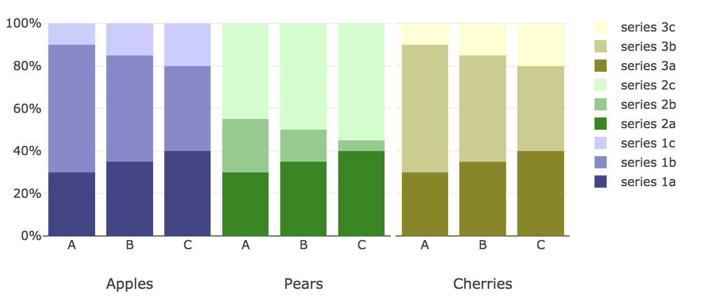
   Plotly.newPlot(
  "myDiv",
  [
    {
      x: ["A", "B", "C"],
      y: [0.3, 0.35, 0.4],
      type: "bar",
      name: "series 1a",
      xaxis: 'x1',
      barmode: 'stack',
      marker: {color: '#448'}
    },
    {
      x: ["A", "B", "C"],
      y: [0.6, 0.50, 0.40],
      type: "bar",
      name: "series 1b",
      xaxis: 'x1',
      barmode: 'stack', marker: {color: '#88C'}
    },
    {
      x: ["A", "B", "C"],
      y: [0.1, 0.15, 0.20],
      type: "bar",
      name: "series 1c",
      xaxis: 'x1',
      barmode: 'stack',
      marker: {color: '#CCF'}
    },
    {
      x: ["A", "B", "C"],
      y: [0.3, 0.35, 0.4],
      type: "bar",
      name: "series 2a",
      xaxis: 'x2',
      barmode: 'stack', marker: {color: '#080'}
    },
    {
      x: ["A", "B", "C"],
      y: [0.25, 0.15, 0.05],
      type: "bar",
      name: "series 2b",
      xaxis: 'x2',
      barmode: 'stack', marker: {color: '#8c8'}
    },
    {
      x: ["A", "B", "C"],
      y: [0.45, 0.50, 0.55],
      type: "bar",
      name: "series 2c",
      xaxis: 'x2',
      barmode: 'stack', marker: {color: '#CFC'}
    },
     {
      x: ["A", "B", "C"],
      y: [0.3, 0.35, 0.4],
      type: "bar",
      name: "series 3a",
      xaxis: 'x3',
      barmode: 'stack', marker: {color: '#880'}
    },
    {
      x: ["A", "B", "C"],
      y: [0.6, 0.50, 0.40],
      type: "bar",
      name: "series 3b",
      xaxis: 'x3',
      barmode: 'stack', marker: {color: '#CC8'}
    },
    {
      x: ["A", "B", "C"],
      y: [0.1, 0.15, 0.20],
      type: "bar",
      name: "series 3c",
      xaxis: 'x3',
      barmode: 'stack', marker: {color: '#FFC'}
    },
  ],
  {
    barmode: "stack",
    yaxis: {tickformat: '%'},
    xaxis: {
      domain: [0, 0.33],
      anchor: 'x1',
      title: 'Apples'
    },
    xaxis2: {
      domain: [0.33, 0.66],
      anchor: 'x2', title: 'Pears'
    },
    xaxis3: {
      domain: [0.67, 1.0],
      anchor: 'x3', title: 'Cherries'
    }
  }
);Stack Overflow用户
发布于 2022-02-03 03:46:09
更新的答案到2021年 Plotly.js现在允许嵌套的分类轴,而不需要创建带有专用轴的子图(参见https://plotly.com/python/categorical-axes/)
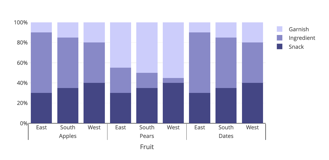
上面的图表
Plotly.newPlot(
  "myDiv",
  [
    {
      x: [
        ["Apples","Apples","Apples","Pears","Pears","Pears","Dates","Dates","Dates"],
        ["East", "South","West","East", "South","West","East", "South","West"]
      ],
      y: [0.3, 0.35, 0.4,0.3, 0.35, 0.4,0.3, 0.35, 0.4],
      type: "bar",
      name: "Snack",
      marker: {color: '#448'}
    },
    {
      x: [
        ["Apples","Apples","Apples","Pears","Pears","Pears","Dates","Dates","Dates"],
        ["East", "South","West","East", "South","West","East", "South","West"]
      ],
      y: [0.6, 0.50, 0.40,0.25, 0.15, 0.05,0.6, 0.50, 0.40],
      type: "bar",
      name: "Ingredient",
      marker: {color: '#88C'}
    },
    {
      x: [
        ["Apples","Apples","Apples","Pears","Pears","Pears","Dates","Dates","Dates"],
        ["East", "South","West","East", "South","West","East", "South","West"]
      ],
      y: [0.1, 0.15, 0.20,0.45, 0.50, 0.55,0.1, 0.15, 0.20],
      type: "bar",
      name: "Garnish",
      marker: {color: '#CCF'}
    }
  ],
  {
    barmode: "stack",
    yaxis: {tickformat: '%'},
    xaxis: {
      type: 'multicategory',
      title: 'Fruit'
    },
    yaxis: {
      type: '',
      range: [0,1],
      tickformat: "0.0%"
    }
  }
);页面原文内容由Stack Overflow提供。腾讯云小微IT领域专用引擎提供翻译支持
原文链接:
https://stackoverflow.com/questions/50137757
复制相关文章
相似问题
腾讯云开发者
