
Pyplot / Matplotlib:如何实现压缩的y轴
Pyplot / Matplotlib:如何实现压缩的y轴
提问于 2018-05-10 21:55:02
我正在使用拟图来创建一个基于Walter/Lieth可视化的剪贴画。
正如你在图片上看到的(上面的链接),从100开始,右y轴被压缩。他们的视觉距离变得越来越小,而他们的数值间隔变得更大。
我想不出如何在拟图中实现这一点。我知道如何设置滴答值来创建自定义刻度,但当然它们总是等距的。正如您在我的图中所看到的,右边y轴上绘制的空间对应于值的间隔:
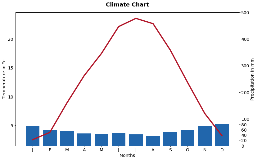
也许有人可以提示一下如何实现上述两个链接中所显示的效果。
干杯!
回答 2
Stack Overflow用户
回答已采纳
发布于 2018-05-10 21:59:58
给你举个例子:
import matplotlib.pyplot as plt
axes = plt.axes()
axes.set_xlim([-10, 10]) #whatever, optional
axes.set_ylim([0, 1.0]) # whatever, optional
axes.set_xticks([-5, -4, -3, -2, -1, 0, 1, 2, 3, 4, 5])
axes.set_yticks([0, 10, 20, 30, 40, 50, 60, 70, 80, 90, 100,150,200,300])
plt.plot(x, norm.pdf(x)) #random filler
plt.plot(x, norm.pdf(x, 70.0, 0.1)) #another absolutely random filler
plt.show()
我的例子只显示了如何调整Y坐标滴答,正如您想知道的那样。很抱歉显然没能帮上忙。我一点也不明白否决的原因。我想可能会有更好的答案。
对于实际的样本(数据)压缩,有几种方法:
- 使用一个函数来缩放数据。可能是分步骤定义的。即对于0
- 使用日志秤( demo.html )
Stack Overflow用户
发布于 2018-05-11 14:53:33
“任择议定书”所作的答复,排除了他们的问题:
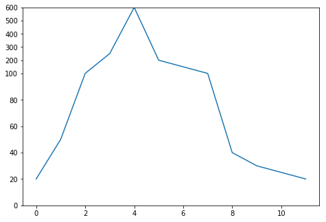
这里的解决方案是一个基于Attersons答案的解决方案的示例。标度函数取自这应答。
from matplotlib import pyplot as plt

def scale(val, src, dst):
        """
        Scale the given value from the scale of src to the scale of dst.
        """
        return ((val - src[0]) / (src[1]-src[0])) * (dst[1]-dst[0]) + dst[0]

# Actual data
data = [20, 50, 100, 250, 600, 200, 150, 100, 40, 30, 25, 20]

source_scale = (100, 600) # Scale values between 100 and 600
destination_scale = (100, 150) # to a scale between 100 and 150

# Apply scale to all items of data that are above or equal to 100
data_scaled = [x if x < 100 else scale(x, source_scale, destination_scale) for x in data]

# Set up a simple plot
fig = plt.figure()
ax = plt.Axes(fig, [0.,0.,1.,1.])
fig.add_axes(ax)

# Set the y-ticks to a custom scale
ax.set_yticks([0,20,40,60,80,100,110,120,130,140,150])
ax.set_ylim(0, 150)
# Set the labels to the actual values
ax.set_yticklabels(["0","20","40","60","80","100","200","300","400","500","600"])

ax.plot(data_scaled)
页面原文内容由Stack Overflow提供。腾讯云小微IT领域专用引擎提供翻译支持
原文链接:
https://stackoverflow.com/questions/50282054
复制相关文章
相似问题
腾讯云开发者

Copyright © 2013 - 2026 Tencent Cloud. All Rights Reserved. 腾讯云 版权所有
深圳市腾讯计算机系统有限公司 ICP备案/许可证号:粤B2-20090059  粤公网安备44030502008569号
腾讯云计算(北京)有限责任公司 京ICP证150476号 | 京ICP备11018762号