
用新浪图样显示多个因素
注意:,在与Z. Lin讨论之后,更新了这篇文章。最初,我将问题简化为两个因素的设计(参见“原始问题”一节)。然而,我的实际数据由四个因素组成,需要facet_grid。因此,我为下面的四因素设计提供了一个示例(请参阅“编辑”一节)。
原始问题
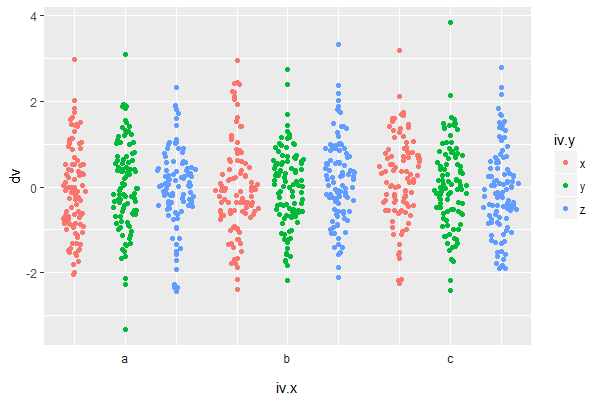
假设我有一个双因子设计,其中dv是我的因变量,iv.x和iv.y是我的因子/自变量。一些快速样本数据:
DF <- data.frame(dv = rnorm(900),
                 iv.x = sort(rep(letters[1:3], 300)),
                 iv.y = rep(sort(rep(rev(letters)[1:3], 100)), 3))
我的目标是将每一种情况分别显示出来,就像小提琴的情节一样:
ggplot(DF, aes(iv.x, dv, colour=iv.y)) + geom_violin() 我最近遇到了新浪的阴谋,我也想在这里做同样的事情。不幸的是,新浪的阴谋并没有做到这一点,而是崩溃了数据。
ggplot(DF, aes(iv.x, dv, colour=iv.y)) + geom_sina()显式调用位置躲避也于事无补,因为这会产生错误消息:
ggplot(DF, aes(iv.x, dv, colour=iv.y)) + geom_sina(position = position_dodge(width = 0.5))新浪网的作者们已经在2016年意识到了这个问题:https://github.com/thomasp85/ggforce/issues/47
我的问题更多的是时间问题。我们很快就想提交一份手稿,而新浪的情节将是显示我们数据的一个很好的方式。有人能想出一个解决方案来解决新浪的情节,我仍然可以显示两个因素,如上面的小提琴情节的例子吗?
编辑
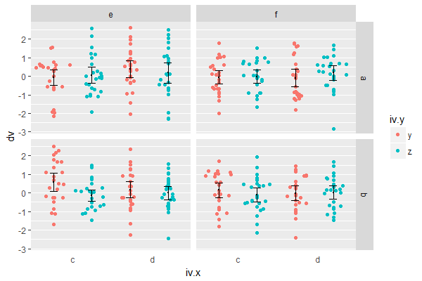
四因素设计的样本数据:
    DF <- data.frame(dv=rnorm(400),
             iv.w=sort(rep(letters[1:2],200)),
             iv.x=rep(sort(rep(letters[3:4],100)), 2),
             iv.y=rep(sort(rep(rev(letters)[1:2],50)),4),
             iv.z=rep(sort(rep(letters[5:6],25)),8))
以小提琴为例,我想用新浪的情节来创作:
    ggplot(DF, aes(iv.x, dv, colour=iv.y)) +
      facet_grid(iv.w ~ iv.z) +
      geom_violin(aes(y = dv, fill = iv.y),
          position = position_dodge(width = 1))+
      stat_summary(aes(y = dv, fill = iv.y), fun.y=mean, geom="point",
          colour="black", show.legend = FALSE, size=.2,
          position=position_dodge(width=1))+
      stat_summary(aes(y = dv, fill = iv.y), fun.data=mean_cl_normal, geom="errorbar",
          position=position_dodge(width=1), width=.2, show.legend = FALSE,
colour="black", size=.2) 回答 1
Stack Overflow用户
发布于 2018-05-18 11:30:19
编辑的解决方案,因为OP澄清了需要方面:
ggplot(DF, aes(x = interaction(iv.y, iv.x),
               y = dv, fill = iv.y, colour = iv.y)) +
  facet_grid(iv.w ~ iv.z) +
  geom_sina() +
  stat_summary(fun.y=mean, geom="point",
               colour="black", show.legend = FALSE, size=.2,
               position=position_dodge(width=1))+
  stat_summary(fun.data=mean_cl_normal, geom="errorbar",
               position=position_dodge(width=1), width=.2,
               show.legend = FALSE,
               colour="black", size=.2) +
  scale_x_discrete(name = "iv.x",
                   labels = c("c", "", "d", "")) +
  theme(panel.grid.major.x = element_blank(),
        axis.text.x = element_text(hjust = -4),
axis.ticks.x = element_blank())这种方法没有使用面来模拟颜色之间的闪避,而是创建了一个新的变量interaction(colour.variable, x.variable)来映射到x轴。
scale_x_discrete() & theme()中的其余代码用于隐藏默认的x轴标签/滴答/网格行。
axis.text.x = element_text(hjust = -4)是一种将x轴标签移动到(近似于)正确位置的黑客.它是丑陋的,但考虑到用例是一个手稿提交,我认为大小的情节将是固定的,你只需要调整它一次。
原始解
假设您的情节不需要面设置,则可以使用facet模拟外观:
ggplot(DF, aes(x = iv.y, y = dv, colour = iv.y)) +
  geom_sina() +
  facet_grid(~iv.x, switch = "x") +
  labs(x = "iv.x") +
  theme(axis.text.x = element_blank(),      # hide iv.y labels
        axis.ticks.x = element_blank(),     # hide iv.y ticks
        strip.background = element_blank(), # make facet strip background transparent
        panel.spacing.x = unit(0, "mm"))    # remove horizontal space between facets
https://stackoverflow.com/questions/50410085
复制相似问题
腾讯云开发者
