
修改地形图代码,使之成为一个g图。
修改地形图代码,使之成为一个g图。
提问于 2018-05-23 18:56:03
我有以下数据
[1] 0.09733344 0.17540020 0.14168188 0.54093074 0.78151039 0.28068527 [7] 1.96164429 0.33743328 0.05200734 0.09103039 0.28842044 0.09240131 [13] 0.09143535 0.38142022 0.11700952
基于此,我进行了贝叶斯推断,并用下面的代码绘制了一个图
f_theta<-function(theta,Data){
(theta^length(Data) )*exp(-theta*sum(Data))}
theta<-seq(1,20,length=100)
a=b=0.001
plot(theta,dgamma(theta,a,b),type="l",col="red",
ylim=c(0,2),tck=-0.01,cex.lab=0.8,cex.axis=0.8)
lines(theta,dgamma(theta,length(Data)+a,sum(Data)+b),col="green",lty=1)
lines(theta,f_theta(theta,Data=Data),lty=1,col="blue")
legend('topright',legend=c("Prior","Post","Likelihood")
 ,col=c("red","green","blue","purple"),lty=1,bty="n",cex=0.8)
但我看到了下面的图表

其中有代码
# ggplot2 examples
library(ggplot2)

# create factors with value labels
mtcars$gear <- factor(mtcars$gear,levels=c(3,4,5),
labels=c("3gears","4gears","5gears"))
mtcars$am <- factor(mtcars$am,levels=c(0,1),
labels=c("Automatic","Manual"))
mtcars$cyl <- factor(mtcars$cyl,levels=c(4,6,8),
labels=c("4cyl","6cyl","8cyl"))

# Kernel density plots for mpg
# grouped by number of gears (indicated by color)
qplot(mpg, data=mtcars, geom="density", fill=gear, alpha=I(.5),
main="Distribution of Gas Milage", xlab="Miles Per Gallon",
ylab="Density")
但是我不太熟悉ggplot库和图表,我希望得到一些帮助,以适应我的代码,并制作一个类似于最后一个的图形。
Stack Overflow用户
回答已采纳
发布于 2018-05-24 02:15:12
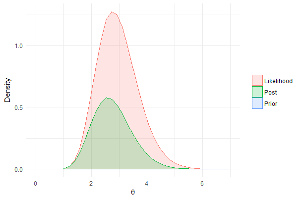
ggplot()假设您的数据是一种特定的格式(有时称为“长”,但ggplot()的作者不喜欢这种描述),所以让我们首先将它们放入这种格式:
Data2 = data.frame(
    theta = rep(theta, 3),
    WhichDistribution = c(rep("Prior",length(theta)), rep("Post",length(theta)), rep("Likelihood",length(theta))),
    Density = c(dgamma(theta,a,b), dgamma(theta,length(Data)+a,sum(Data)+b), f_theta(theta,Data=Data))
)然后我们可以构造一个ggplot()命令。ggplot()需要数据、美学和几何。您的数据将是刚刚构建的数据框架。美学一般是指数据的质量将如何影响图形(轴上的是什么,决定组的是什么等等),而几何图形是一种图形(不是很好的措辞,抱歉)。
ggplot(Data2, aes(x=theta, y=Density, group=WhichDistribution, color=WhichDistribution, fill=WhichDistribution))+
    # position="identity" in order to not stack the densities
    geom_area(alpha=.2, position="identity") +
    # gets rid of the title on the legend
    theme(legend.title = element_blank())+
    # make the horizontal axis label pretty
scale_x_continuous(expression(theta))您可以更改alpha以调整透明度。如果您希望水平轴不一直到20,请在scale_x_continuous()中更改它。
ggplot(Data2, aes(x=theta, y=Density, group=WhichDistribution, color=WhichDistribution, fill=WhichDistribution))+
    # position="identity" in order to not stack the densities
    geom_area(alpha=.2, position="identity") +
    # gets rid of the title on the legend
    theme(legend.title = element_blank())+
    # make the horizontal axis label pretty
    scale_x_continuous(expression(theta), limits=c(0,7))
qplot()是一个快速的绘图函数,它似乎妨碍了人们学习ggplot()语言,所以您可能想要避免它。
页面原文内容由Stack Overflow提供。腾讯云小微IT领域专用引擎提供翻译支持
原文链接:
https://stackoverflow.com/questions/50495590
复制相关文章
相似问题
腾讯云开发者
