
如何设计衬垫-工具栏的全宽度屏幕
如何设计衬垫-工具栏的全宽度屏幕
提问于 2018-06-27 08:39:51
在这里,我使用的是Angular-Material,其中我的环境是:Angular CLI: 6.0.5、Node: 10.1.0、OS: win32 x64、Angular: 6.0.3,我想要这样的输出:
为了实现完全相同的顶部导航条,我有如下的mat-toolbar:
In .html
 <mat-toolbar class="topbar telative mat-toolbar mat-primary mat-toolbar-single-row" color="primary"  ng-reflect-color="primary" style="flex-direction: row; box-sizing: border-box; display: flex;position: fixed;" [class.mat-elevation-z24]="isActive">
    <button mat-icon-button (click)="snav.toggle()"><mat-icon>menu</mat-icon>
    </button>
    <h1 class="example-app-name">Admin Panel</h1>
 </mat-toolbar>
In .ts
我只拥有isActive的一个属性
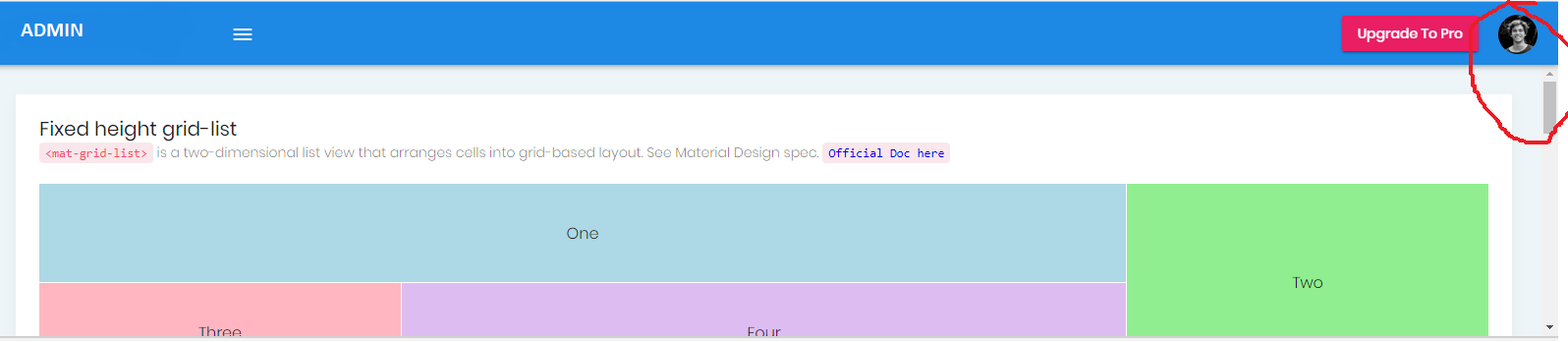
isActive = true;我的输出是绝对好的,但是mat-toolbar没有覆盖屏幕的全部宽度,因此垂直滚动条就出现在mat-toolbar的一侧。我想有滚动条在我的mat-toolbar下方,如上图所示。如何将mat-toolbar的宽度设置为全屏。
回答 2
Stack Overflow用户
发布于 2018-08-03 09:23:36
若要将mat-toolbar宽度设置为100%,可以在css文件中进行类似操作。
.fixed-header {
    position: fixed;
    top: 0;
    left: 0;
    z-index: 2;
    width: 100% !important;
}Stack Overflow用户
发布于 2019-02-14 10:09:52
在您的style.css中添加此body{margin:0}
页面原文内容由Stack Overflow提供。腾讯云小微IT领域专用引擎提供翻译支持
原文链接:
https://stackoverflow.com/questions/51058232
复制相关文章
相似问题
腾讯云开发者
